City of Newcastle
Uniting council’s services for the city under one recognisable brand
Case study
The City of Newcastle hadn’t updated its brand identity since 1993. In 2018 Headjam were engaged to help better reflect the services the organisation provides its rate payers, local businesses and members of the Newcastle community. A lot had changed in the city and for the council in the 25 years since their old brand was built, and Headjam was tasked with strategically redesigning the City of Newcastle’s Brand and Communication tools to reflect the new vision for the city and building frameworks for all other facility brands that fall under the city's brand.
Background
Before engaging Headjam, the City of Newcastle hadn’t updated its brand identity since 1993. In 2018 Headjam were engaged to help better reflect the services the organisation provides its rate payers, local businesses and members of the Newcastle community. A lot had changed in the city and for the council in the 25 years since their old brand was built, with a new and serious focus on the cities vision to create 'a smart, liveable, sustainable, global city’.
Objective
- Strategically redesign the City of Newcastle’s brand and communication tools to reflect the new vision for the city.
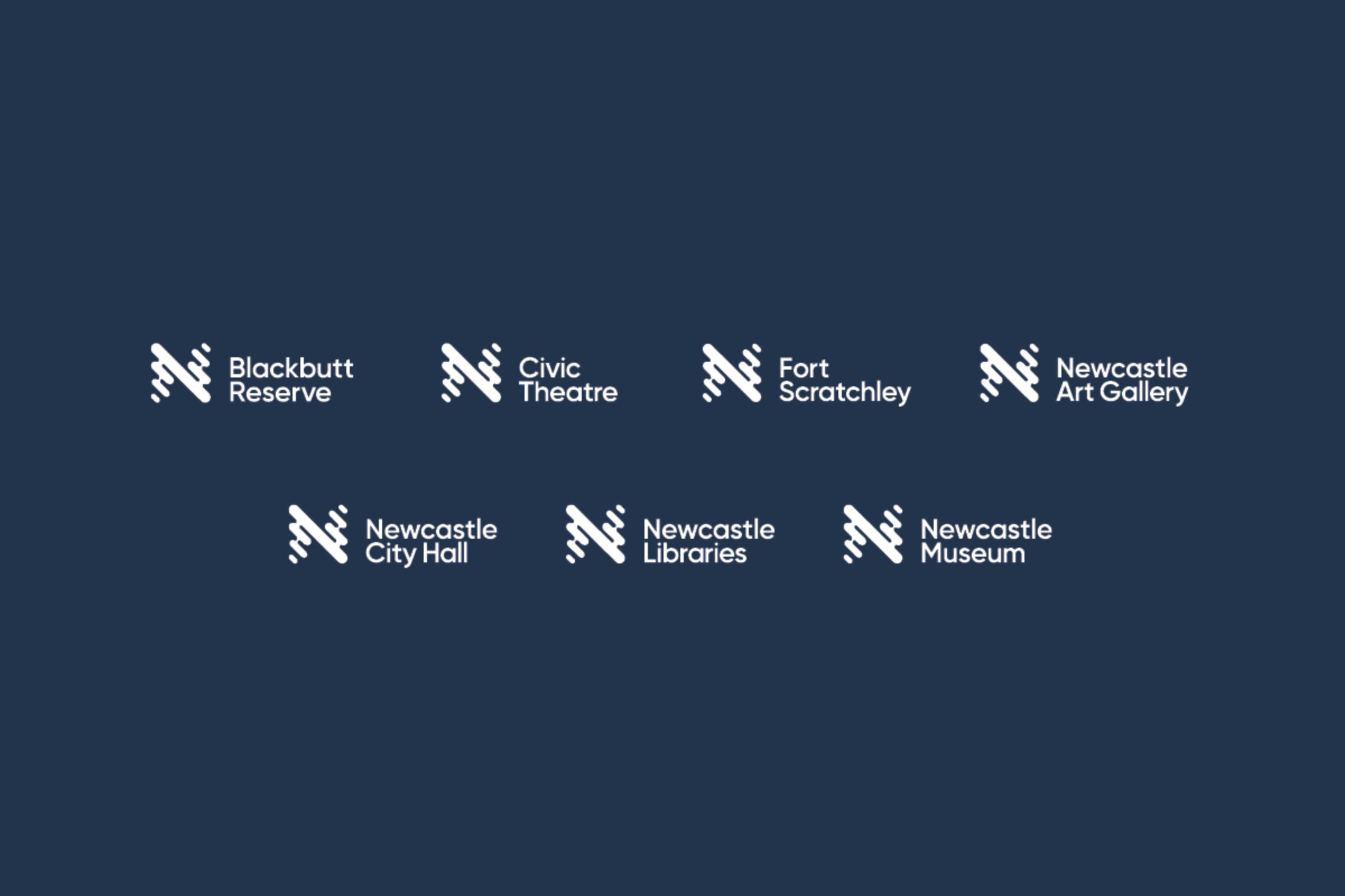
- Building frameworks for all other facility brands to fall under the City of Newcastle brand, with the aim of showcasing the world class facilities on offer, such as the art gallery, libraries, museums, waste recycling facilities and beaches among many others.
Target Audience
Newcastle rate payers, residents and local businesses.
Consumer Proposition
A progressive future city.
Desired Consumer Response
’Newcastle is a great Australian city’.
‘I never knew the City of Newcastle provided those services’.
Creative Solution
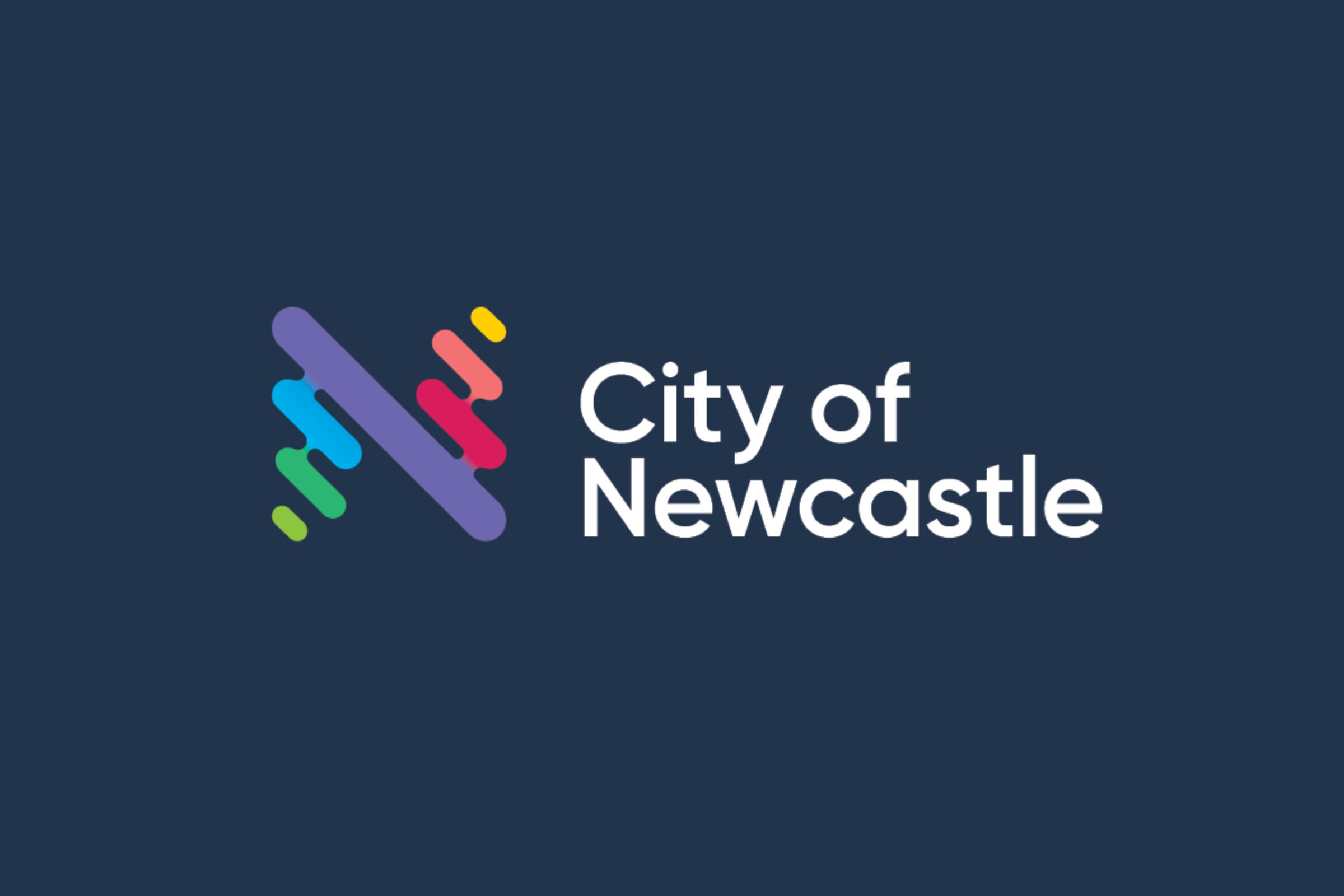
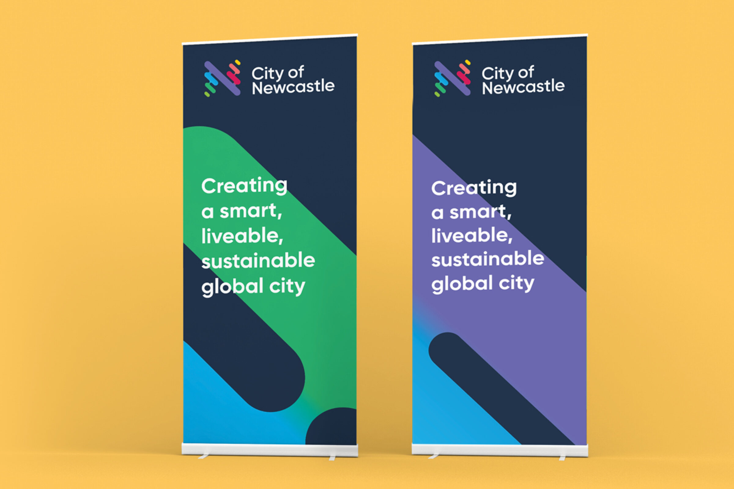
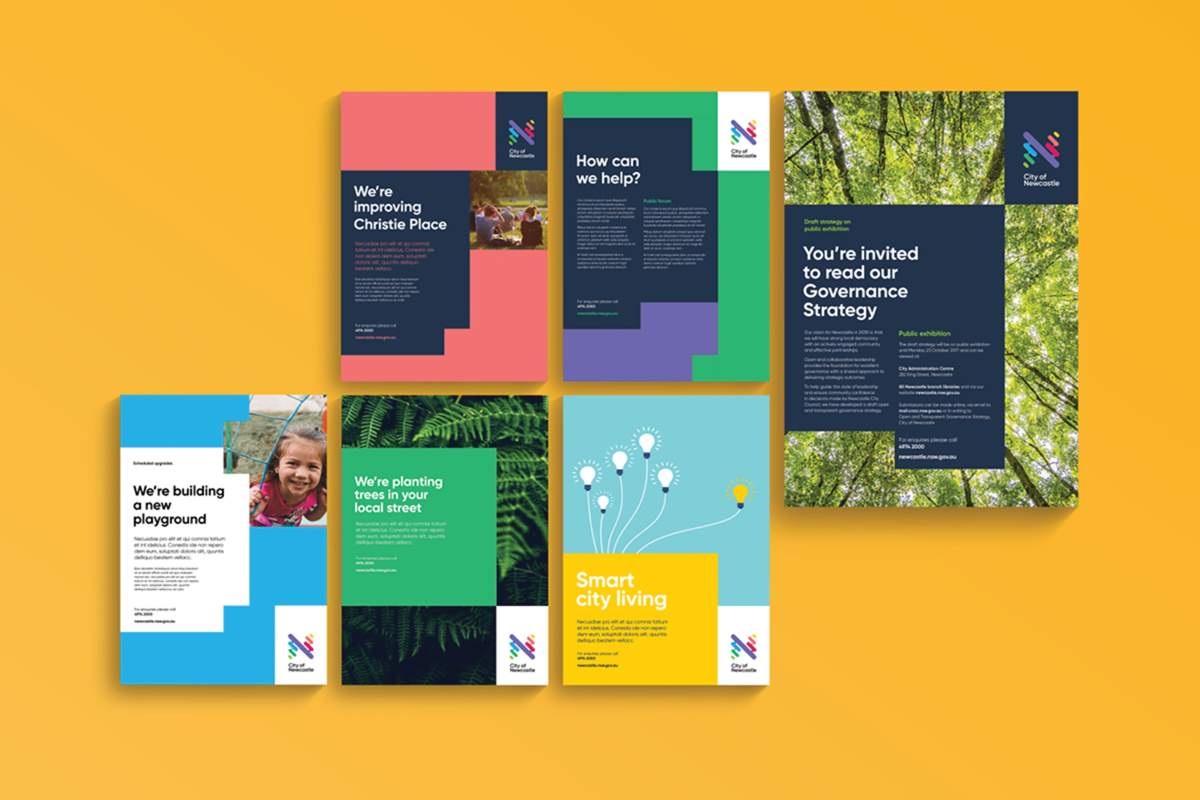
A lot of influence was drawn from the cultural conversations with the local Guraki Committee. The environmental features that stood out for them included the curves of the river and coastline, mountains and lakes that surround us. Newcastle is many things, but it is undeniably a city that meets the sea - a fact that seems to permeate all of Newcastle's culture, lifestyles and communities. The design draws inspiration from the ripples of water to shape the 'N'.
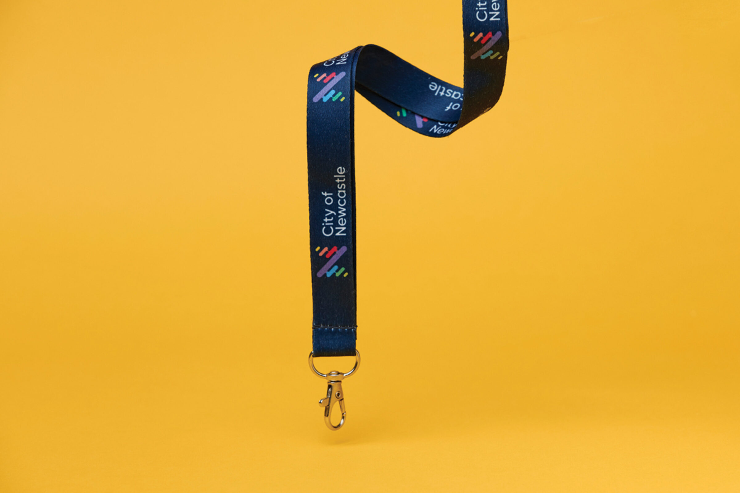
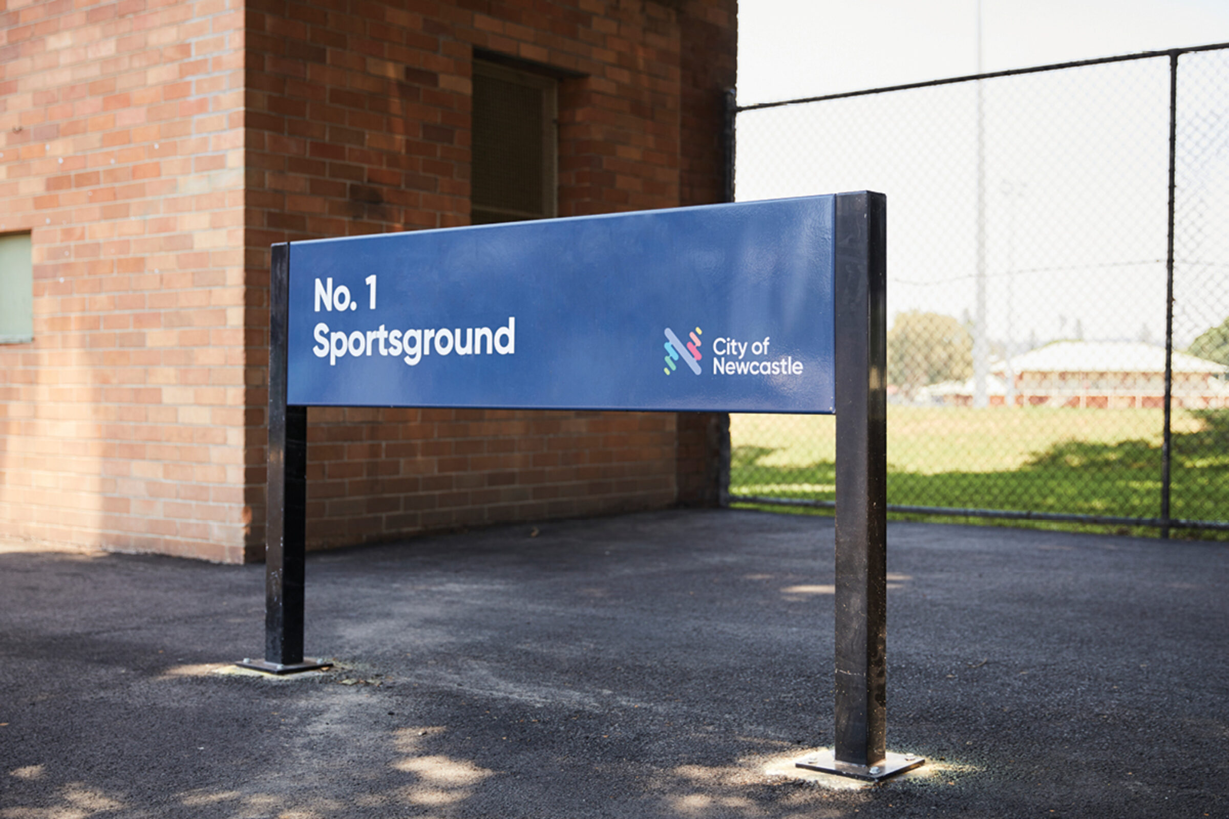
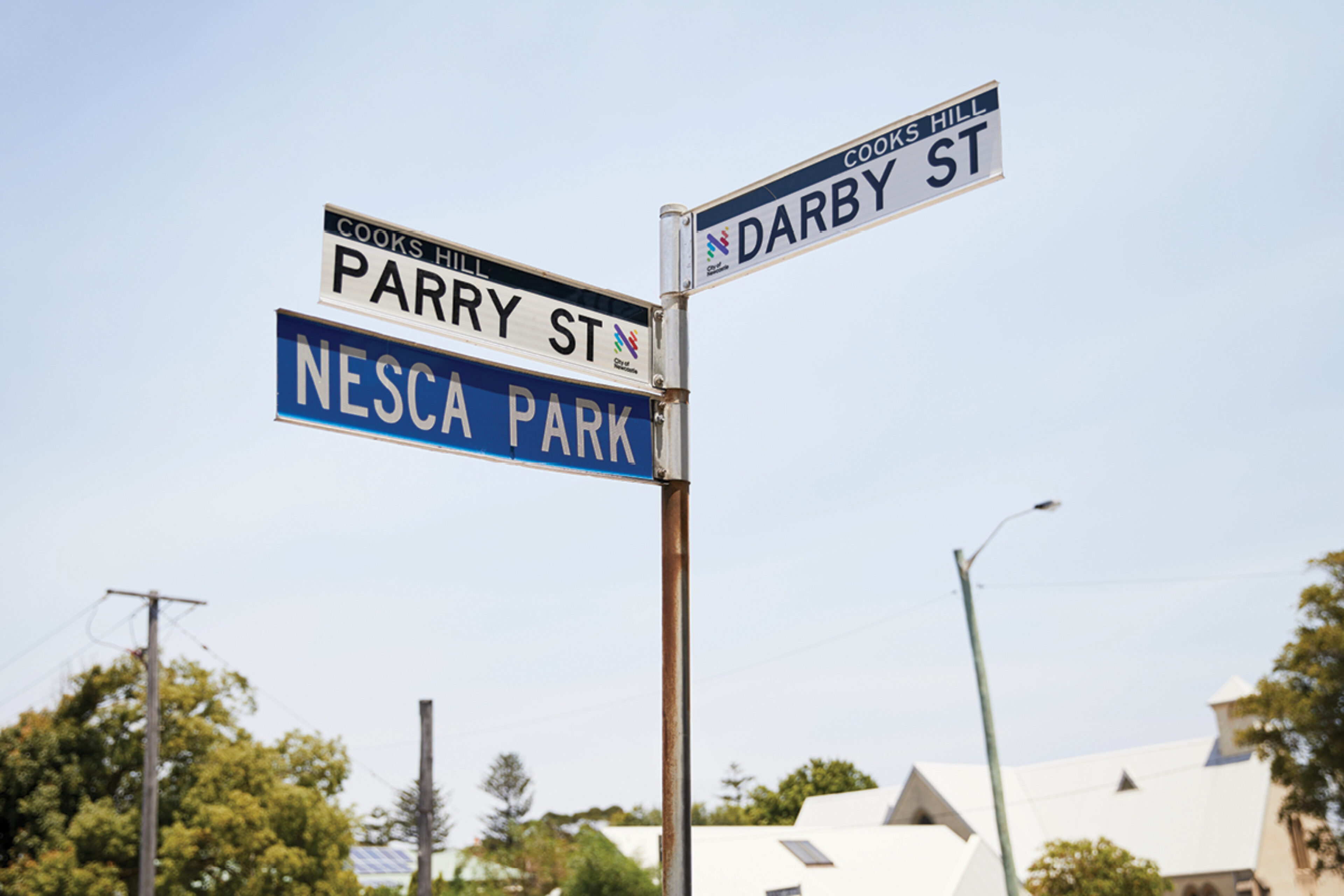
The 'N' brand mark was then used across each council facility, clearly uniting them as part of a larger family.
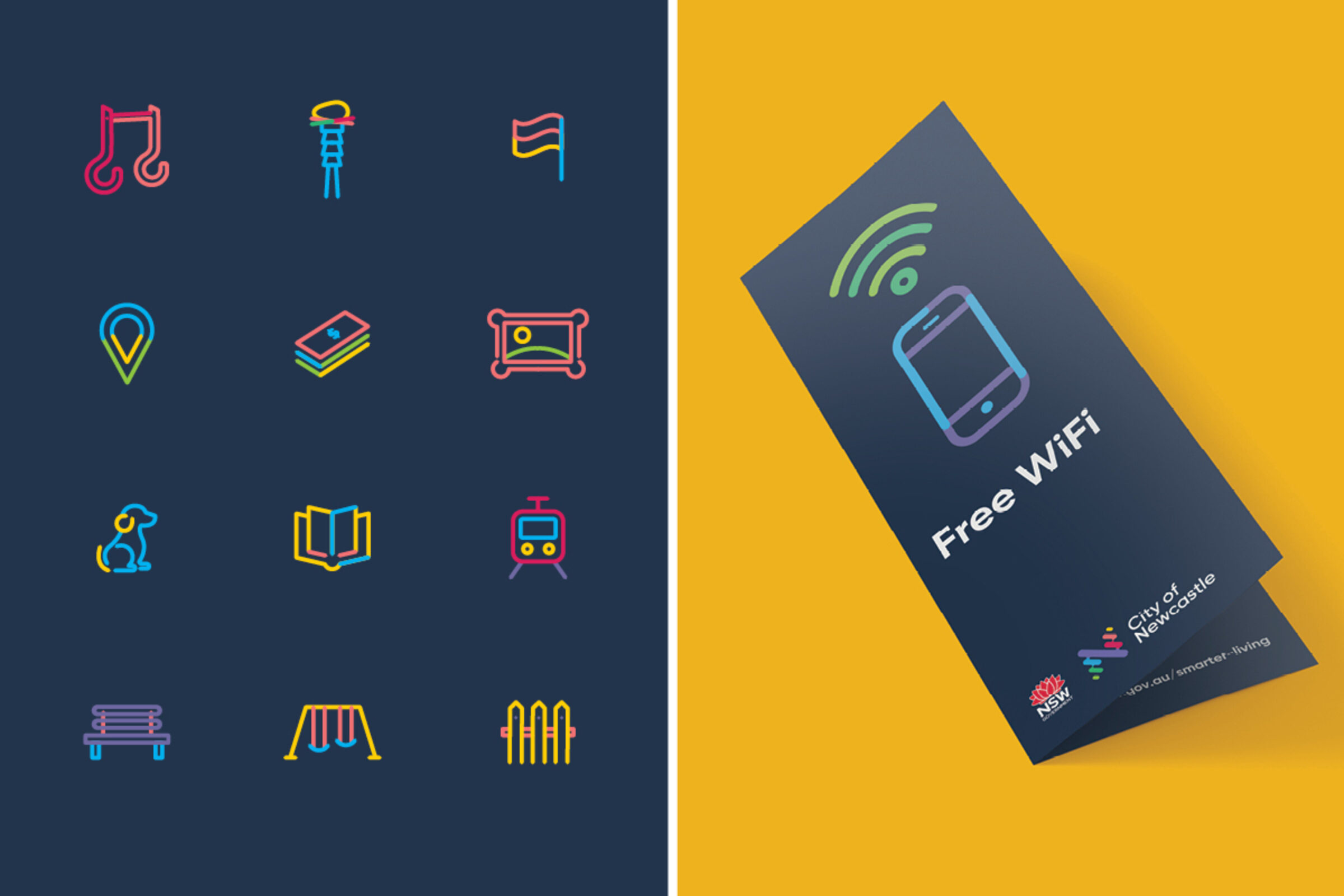
The colour palette also takes inspiration from the natural environment, the ocean, sandy beaches, the bush, the many parks and the magnificent sunrises.
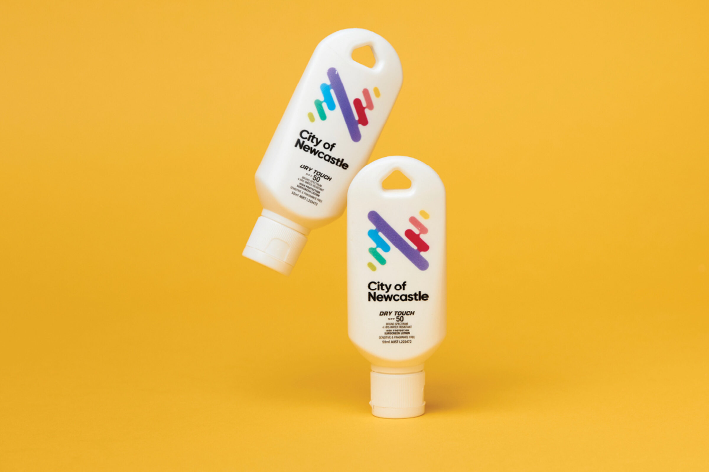
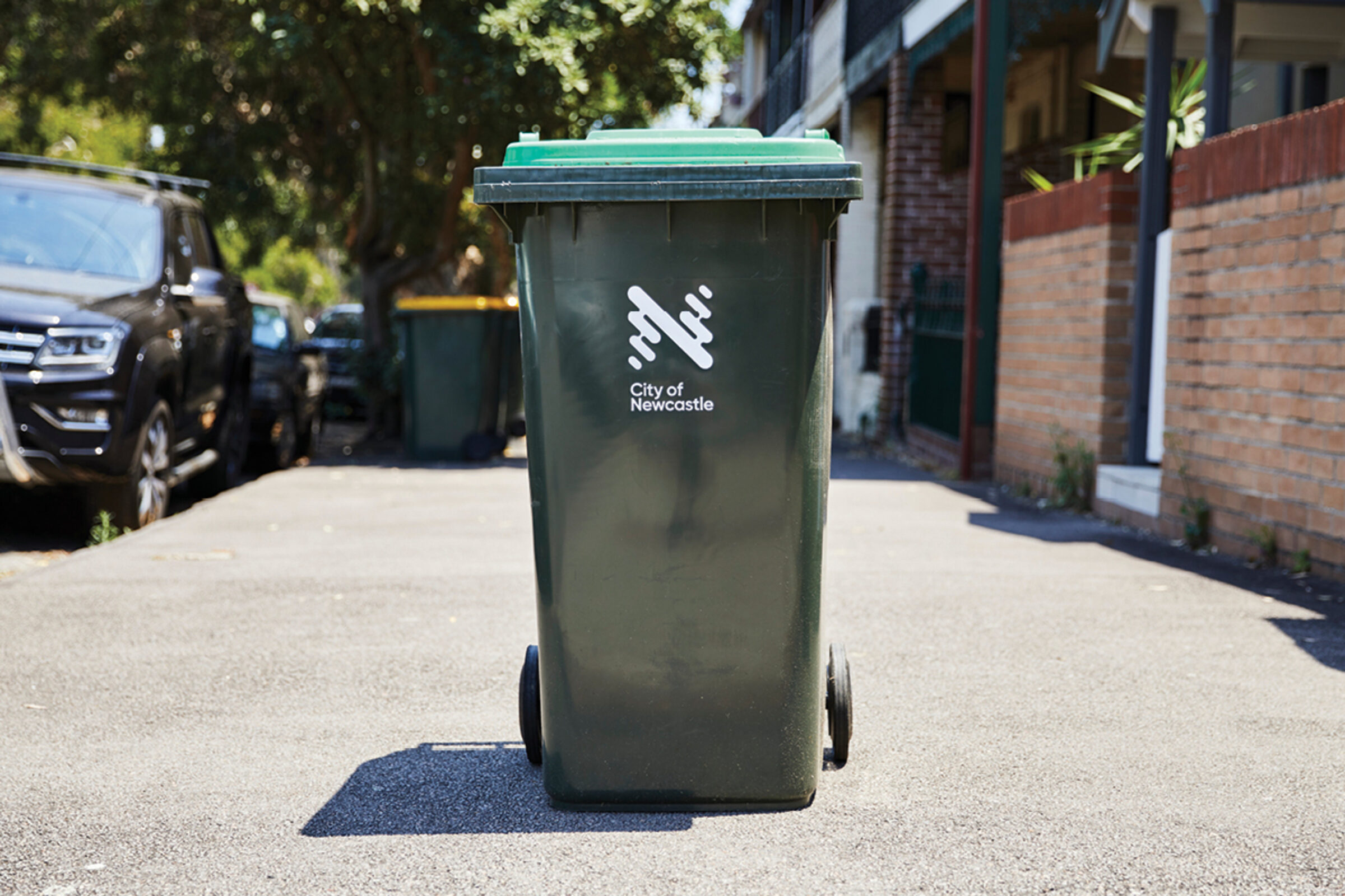
The logo itself had to look good in colour printed huge on banners and on brochures, but also stand as a strong, one-colour icon stamped onto garbage bins (arguably one of the most visible iterations of the brand).
This project was created in collaboration with the City of Newcastle's in-house communications team. Their insights and knowledge of what design systems needed to be developed as well as their design contributions to the project were invaluable.
Evaluation
The brand has been successfully rolled out across all local facilities, service areas, way finding, street signs and even roughly 75,000 bins across Newcastle households, it’s seen practically everywhere across thousands of locations in the city and has been broadly well adopted by the community.
Newcastle is Australia’s seventh largest city, and as people choose to relocate from other areas of the country and the globe it is continuing to grow and diversify.
Client
City of Newcastle
Project
Rebranding