BAMM
An identity for an art museum in a bank
Case study
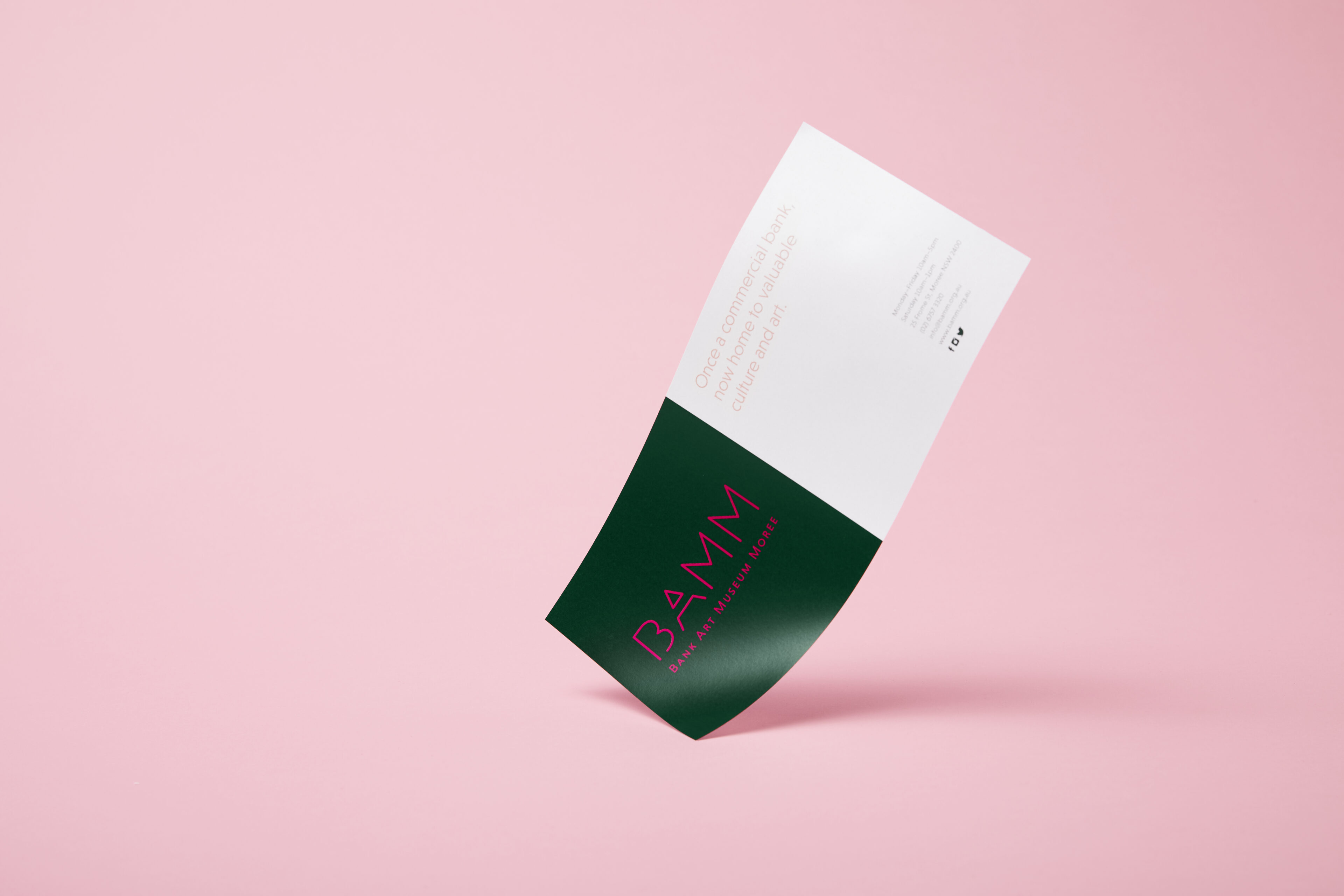
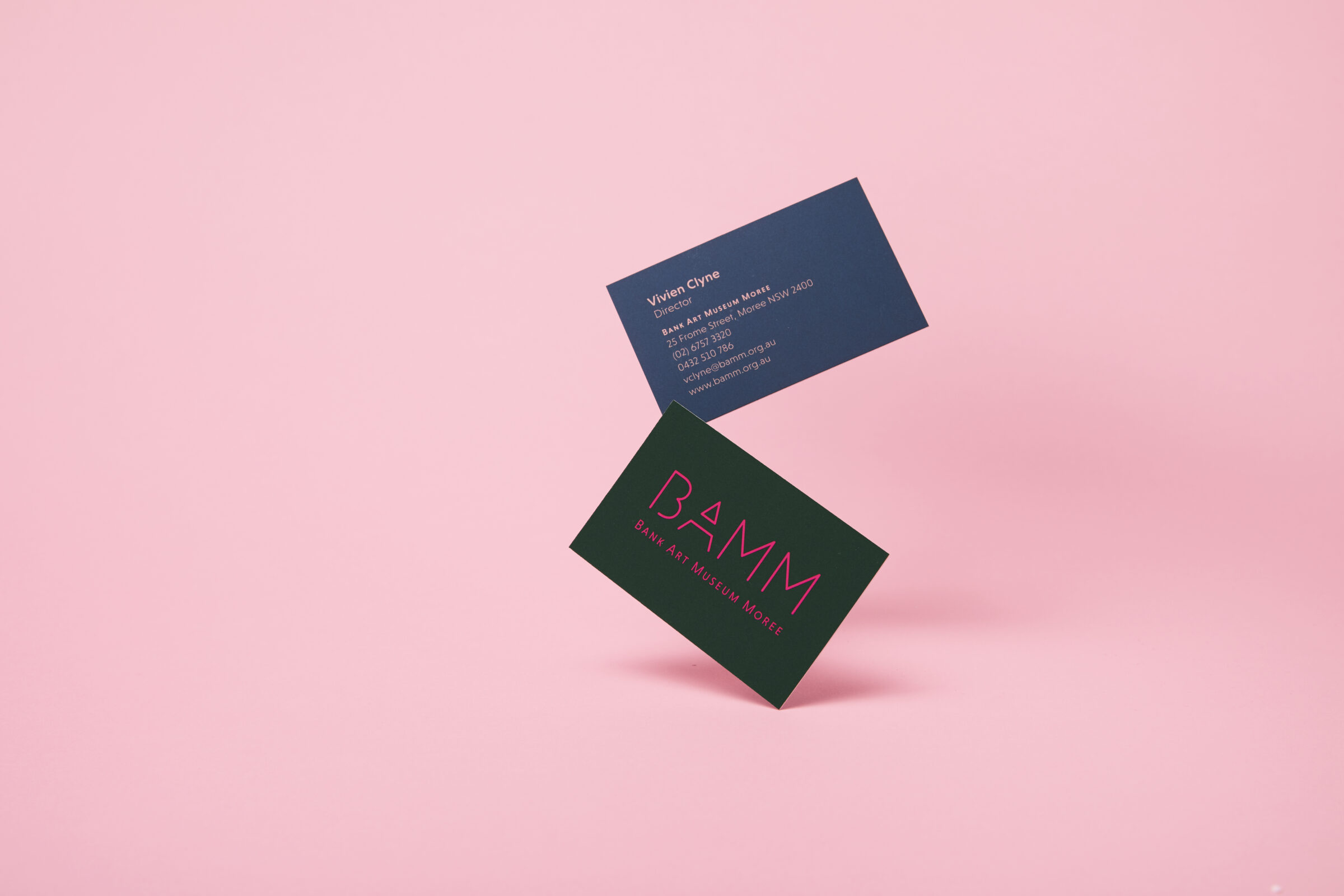
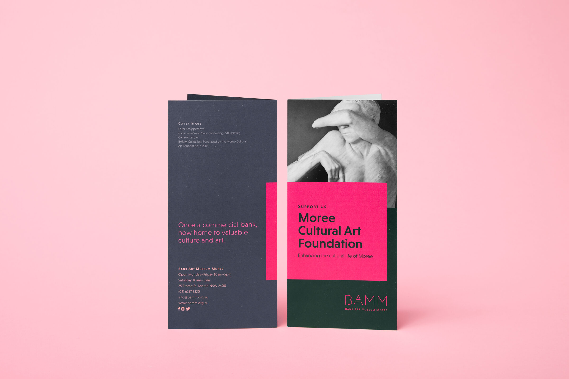
The name was arguably the most important part of this process. Formerly "Moree Plains Gallery", the rename to "Bank Art Museum Moree" along with the punchy acronym "BAMM" represented the institution's own progression through history: bank, to art gallery, to museum, to the future, with Moree grounding it all at the end.
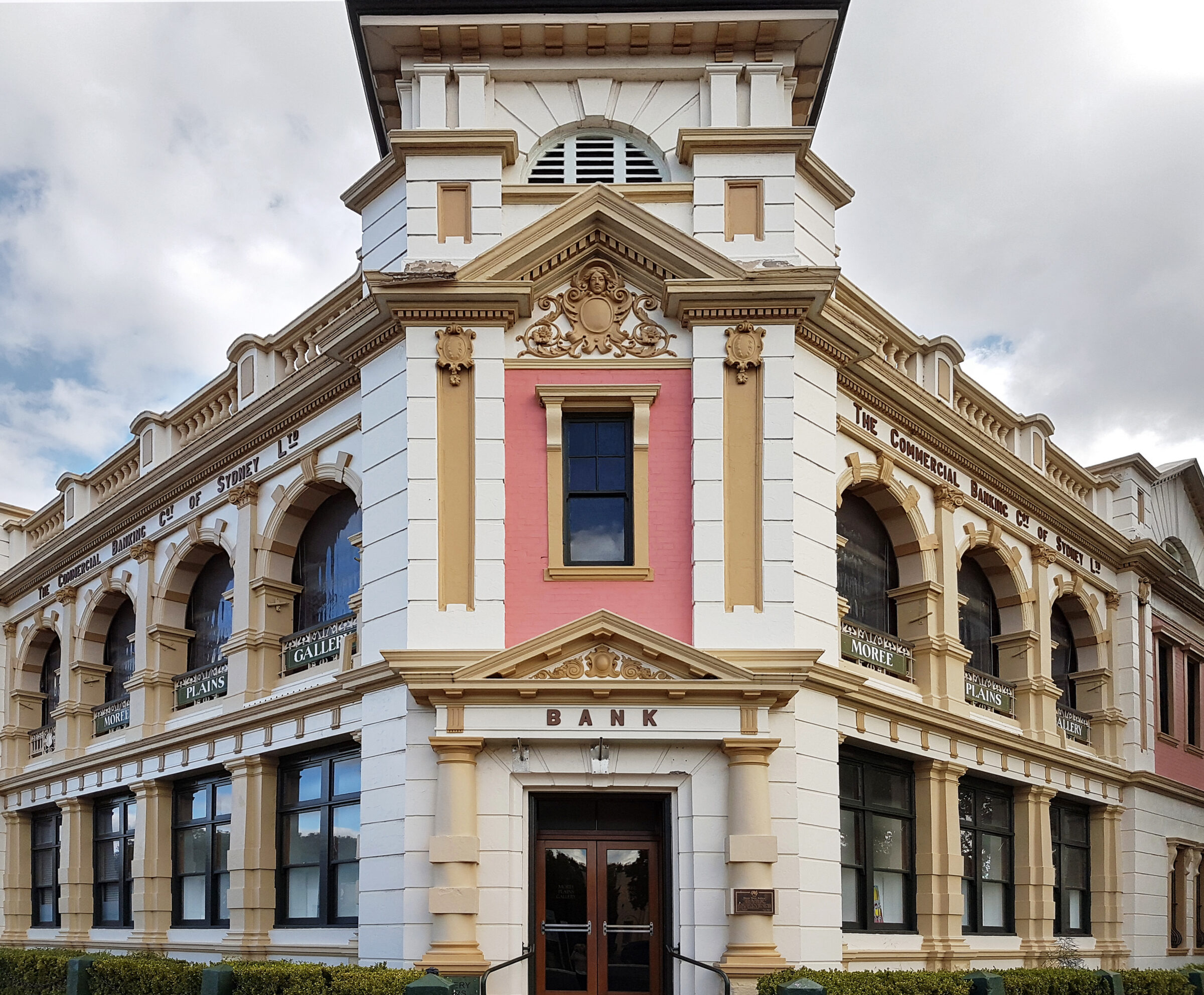
Their colour scheme was also crafted in order to reflect their history while staying distinct and recognisable, highlighting the pinky peach tones of the building’s original heritage paint.
Background
Moree Plains Gallery, through the permanent collection, changing exhibitions and diverse public programs, strives to stimulate knowledge and to widen horizons. They are inspired by the far-reaching plains of the Moree region, which is metaphorically represented through the Gallery’s aim to expand and broaden people’s cultural vision across the wider community. Moree Plains Gallery aims to provide a gateway to art and museum pieces that the local community wouldn’t be able to experience if the gallery wasn’t there.
Headjam have worked with Moree Plains Gallery since 2009 when we originally created a very basic website for the gallery. Since then the Gallery has had exciting new leadership in Director Vivien Clyne whose background and experience at both Tamworth regional gallery as well as her early work at The University of Queensland’s Art Museum brings a new, exciting and youthful touch to Moree Plains. Vivien is joined by another young talent Hannah Williamson, who has taken on the role of Curator for the gallery, her background in contemporary art in Brisbane again bringing a new dynamic to the gallery that hasn’t previously existed.
Headjam were engaged to bring to life Vivien and Hannah’s vision through a re-launch of the space, the name, and the visual communication of the Gallery.
Objective
To re-launch the gallery as a highly recognised regional gallery, and prepare it for the future. This was done through a multi-step process: We analysed the name, with the intention of making a change. We had to discuss and come up with a brand identity for the gallery, with all requisite signage and collateral. A website redevelopment was also commenced, along with a solidification of their fundraising and promotion models.
Target Audience
The local population within the North West NSW region interested in art (people travel a long distance for their shows).
A range of tourists from around Australia (Moree is a very big tourist attraction due to their artesian springs).
Consumer Proposition
A portal to a new world of art and culture.
Desired Consumer Response
New visitors: I am intrigued to visit the Art Museum for the first time.
Existing visitors: Moree Plains Art Museum produce incredible shows.
Creative Solution
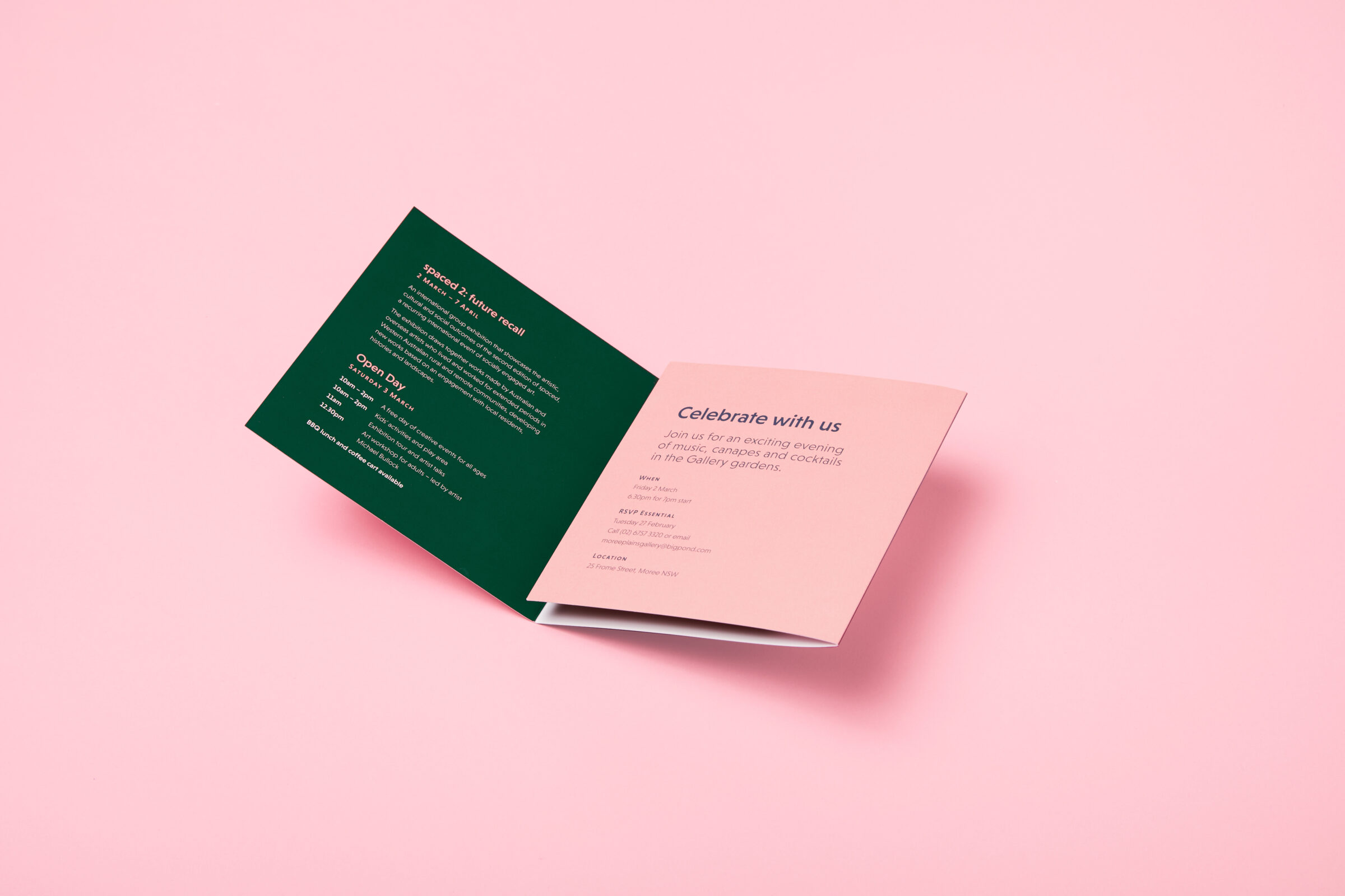
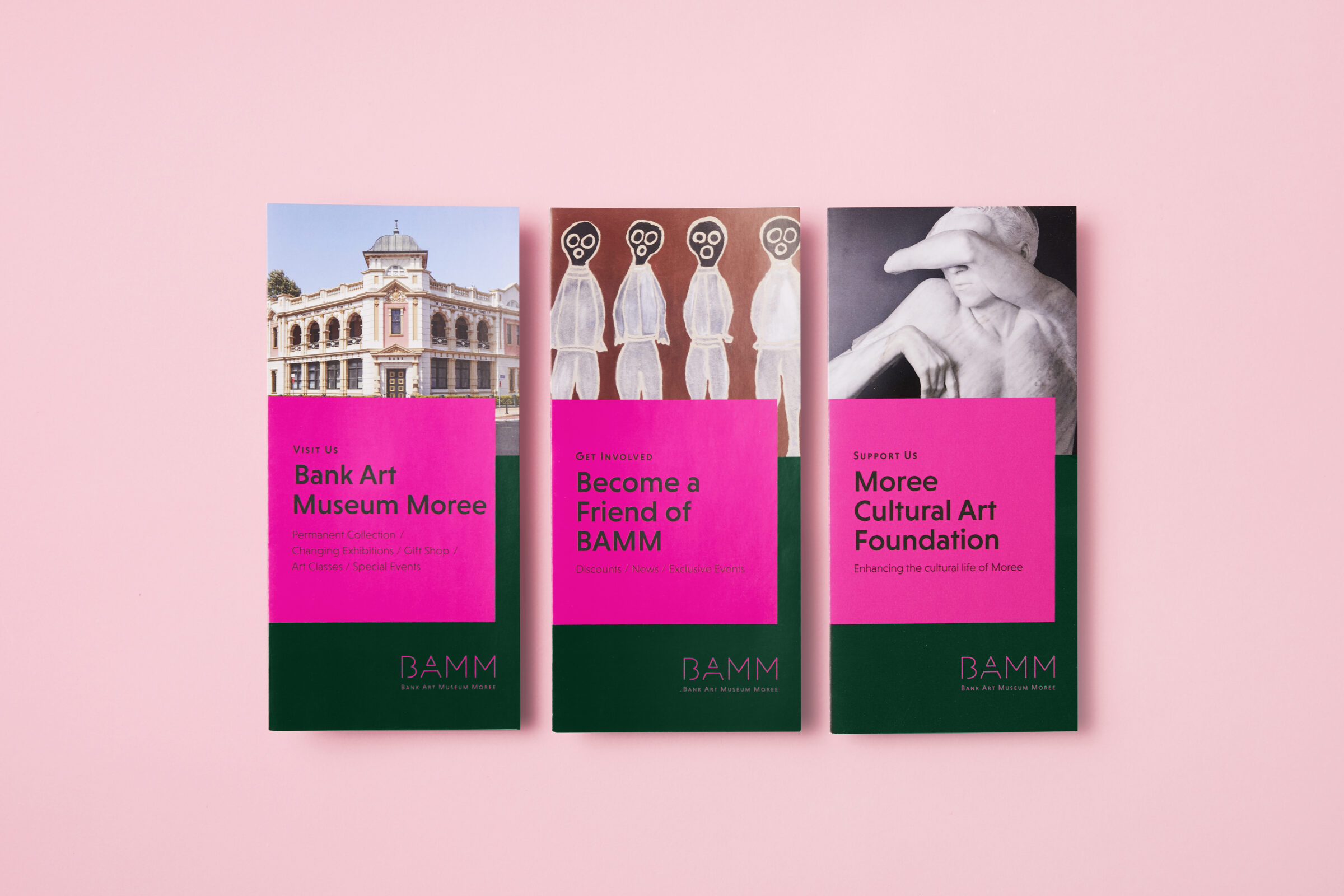
The name was arguably the most important part of the process. The word Gallery was discussed to be replaced with “Art Museum” to better reflect the fact that Moree Plains have a vast collection of artefacts, along with the fact that there is no museum within the region, meaning they could fill both roles. Their exhibition focusses on contemporary art but their collection also includes a significant holding of Aboriginal artefacts. Through over 15 iterations, and rigorous workshops and explorations, the Bank Art Museum Moree was decided on. This was due to it’s memorable and punchy connotations, with this also being reflected in the acronym – BAMM. It also represents a progression: bank, to art gallery, to museum, to the future, with Moree grounding it all at the end.
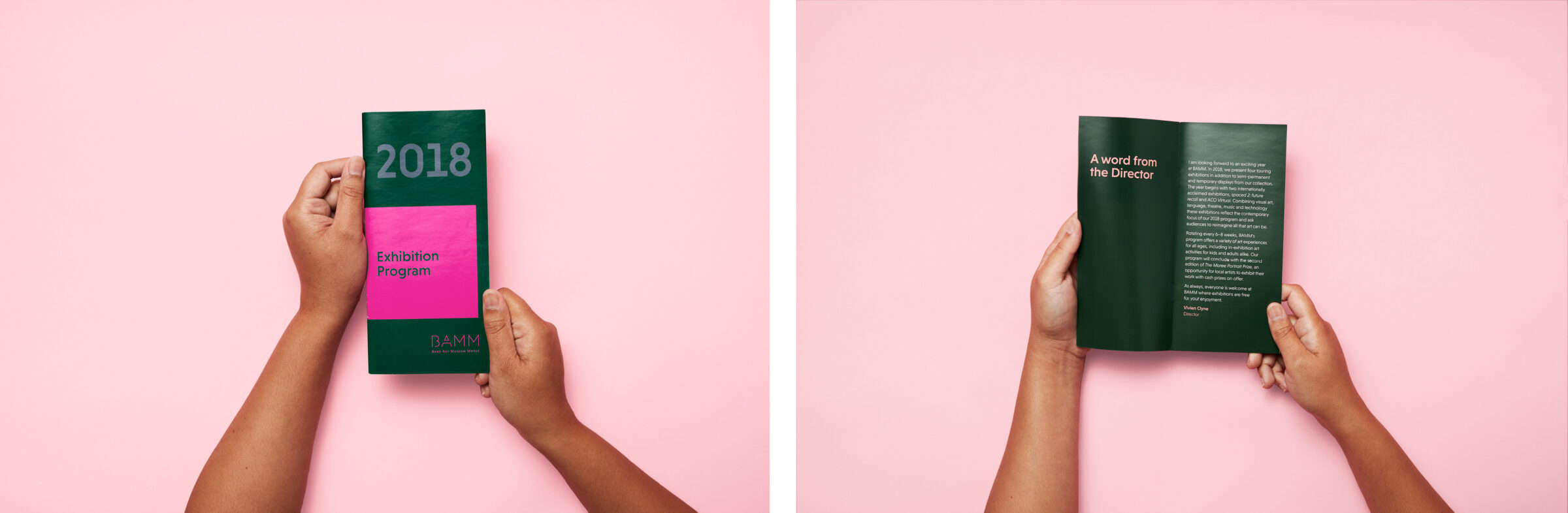
Their colour scheme was also crafted in order to reflect their history while staying distinct and recognisable. Green, blue, peach, and pink were the greatest fit for these criteria, mirroring the green of the trees and hedges around the building, the blue of the sky, and the peach of the building’s paint. The pink was included for the distinctive flavour it added. The colours were bold and also felt like a nod to the Australian landscape in general.
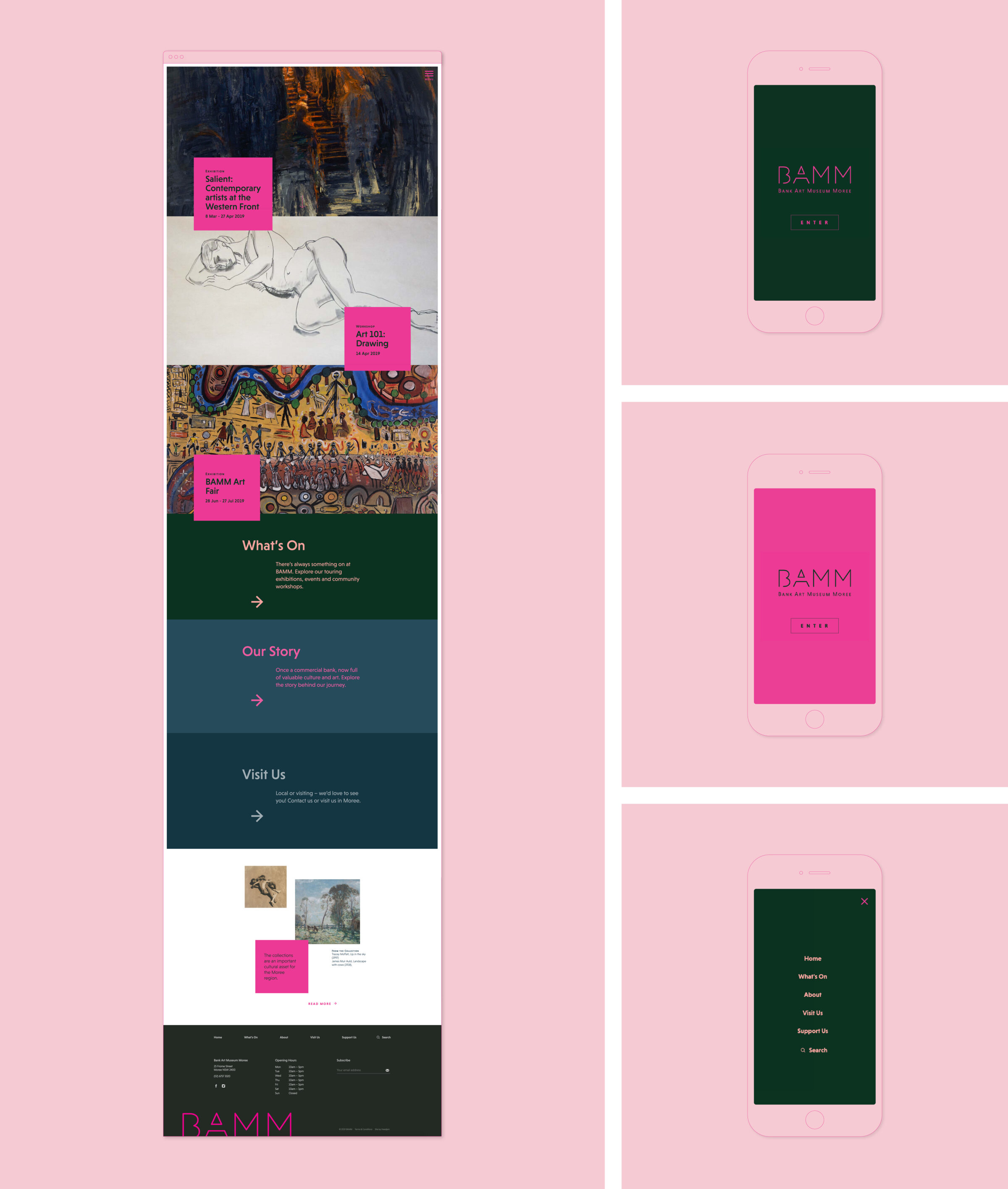
The website was also overhauled in accordance with the new brand and name. Colours were replaced, navigation was transformed, and, most importantly, new animation techniques were utilised to bring the website to life in a digital space.
Evaluation
Relaunching BAMM to the local community in Moree was an incredibly rewarding experience for both Headjam and the gallery team, after around 18 months of work. Re-positioning and renaming the organisation as a space for contemporary art, whilst still retaining its connection to the local art community has been received well. To support this, website interaction has increased by over 18% in the first 12 months; this is accounted for by a combination of time on page and volume of content consumed by each visitor NOT visitor numbers. Physical foot traffic walking into the gallery has doubled from an average of 7,000 visitors per annum to around 14,000 visitors during its first full year; a testament to the gallery’s team and board’s dedication to implementing the new strategy.
The gallery has also been successful in continuing to secure additional Create NSW grant funds, which has enabled it to continue to put on great traveling exhibitions for the local community; bringing important work from large institutions to the region, which has enabled local accessibility for the first time.
Client
BAMM
Project
Brand and website
Processes used in this project
Branding, Brand identity, Brand management, Brand positioning, Brand strategy, Logo design, Graphic design, Digital signage, Signage, Typography design, Marketing, Digital marketing, Social media marketing, Print media, Project management, Web and digital, Website design, Website development
The website was also overhauled in accordance with the new brand and name. Colours were replaced, navigation was transformed, and, most importantly, new animation techniques were utilised to bring the website to life in a digital space.
The challenge was to design a site that would best showcase the beautiful big images of artwork and still allow a strong sense of branding for the gallery.