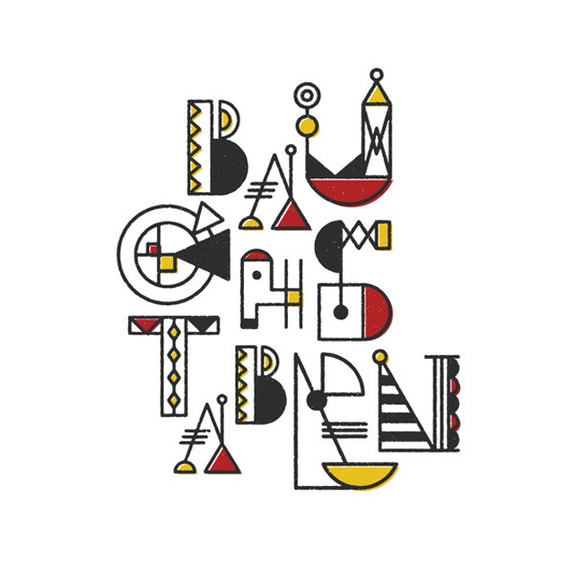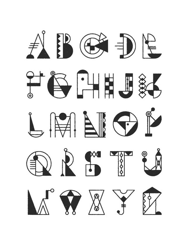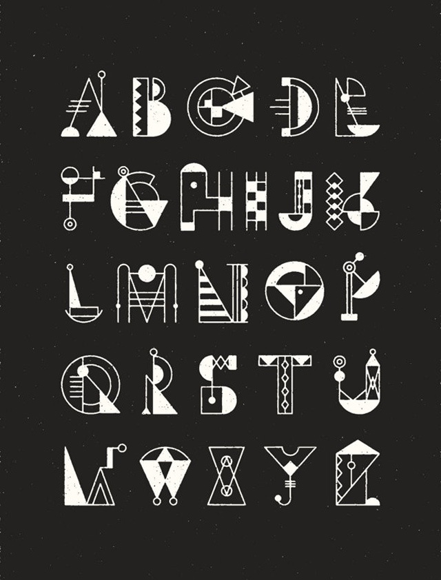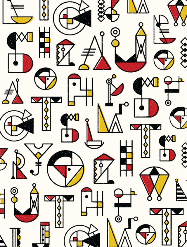
Graphic and Web Designer Nana Nozaki has created a typography based on The Bauhaus, the German architectural method from the 1920s which combines fine art and design education. She's cleverly named this typeface Bauchstaben, a name inspired by the German word combination of Bau (meaning building and construction) and buchsteben (meaning alphabet and letter).
This display typeface is fun with an emphasis on structure, function and build. We love how she limits the colour palette to black, white, red and yellow, and also the subtle references to hand tools, scaffolding and ladders. Like much of the work influenced by Bauhaus, her typography is also very geometric and industrial.
Nana is Japanese, currently living in Brooklyn; she describes herself as "obsessed with typography". You can follow her on Twitter to see what she's got on next.