Black, White & Restive
Capturing tension for a Newcastle Art Gallery exhibition catalogue
Case study
Headjam worked with the prestigious Newcastle Art Gallery to create the exhibition identity and supporting collateral for the incredible Black, White & Restive exhibition.
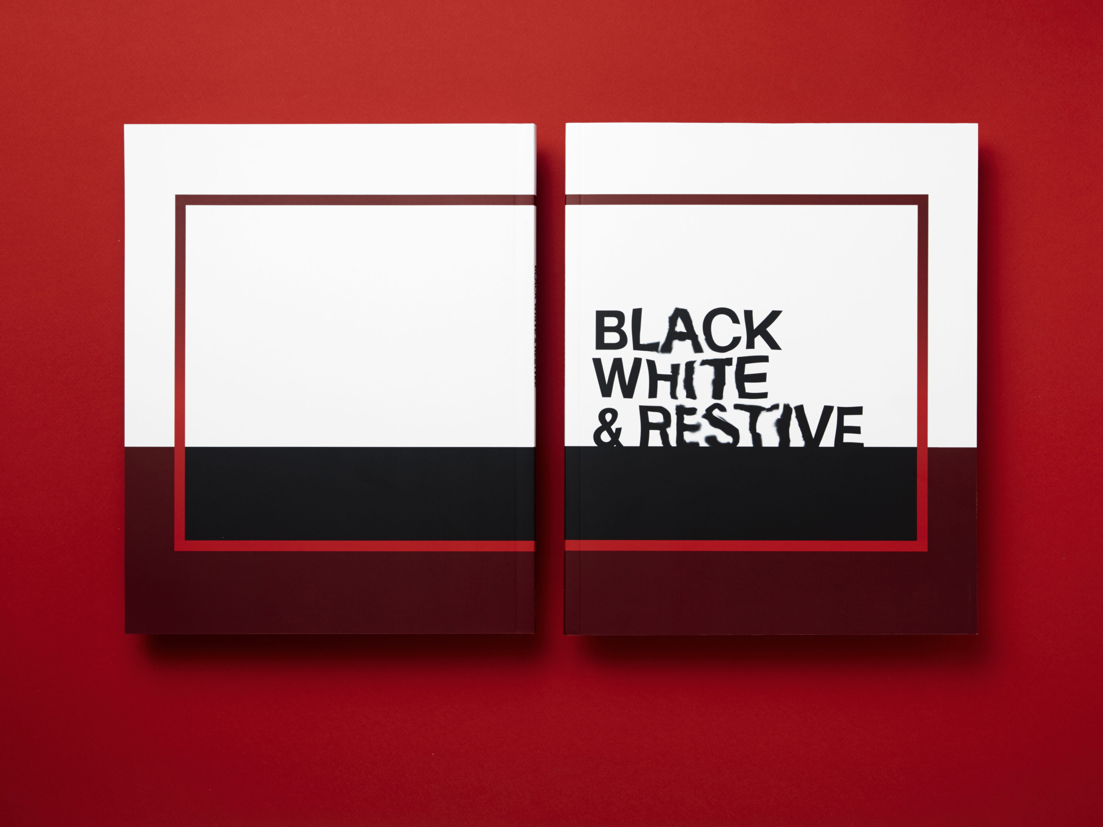
When we reviewed the content for the exhibition and catalogue, we found key themes around tension that ran throughout the essays written for Black, White & Restive. In response we created a custom designed typeface to capture and express this complex idea of cross-cultural tension. We stripped back the colour palette to it simplest form, reflecting the past, present and future.
Read Hide the full case studyBackground
Black, White & Restive was an incredible and ambitious exhibition that took place at the Newcastle Art Gallery from 28 May – 7 August 2016. The exhibition examined the artistic exchanges and at times uneasy tensions of cross-cultural art practice between Aboriginal and non-Aboriginal artists.
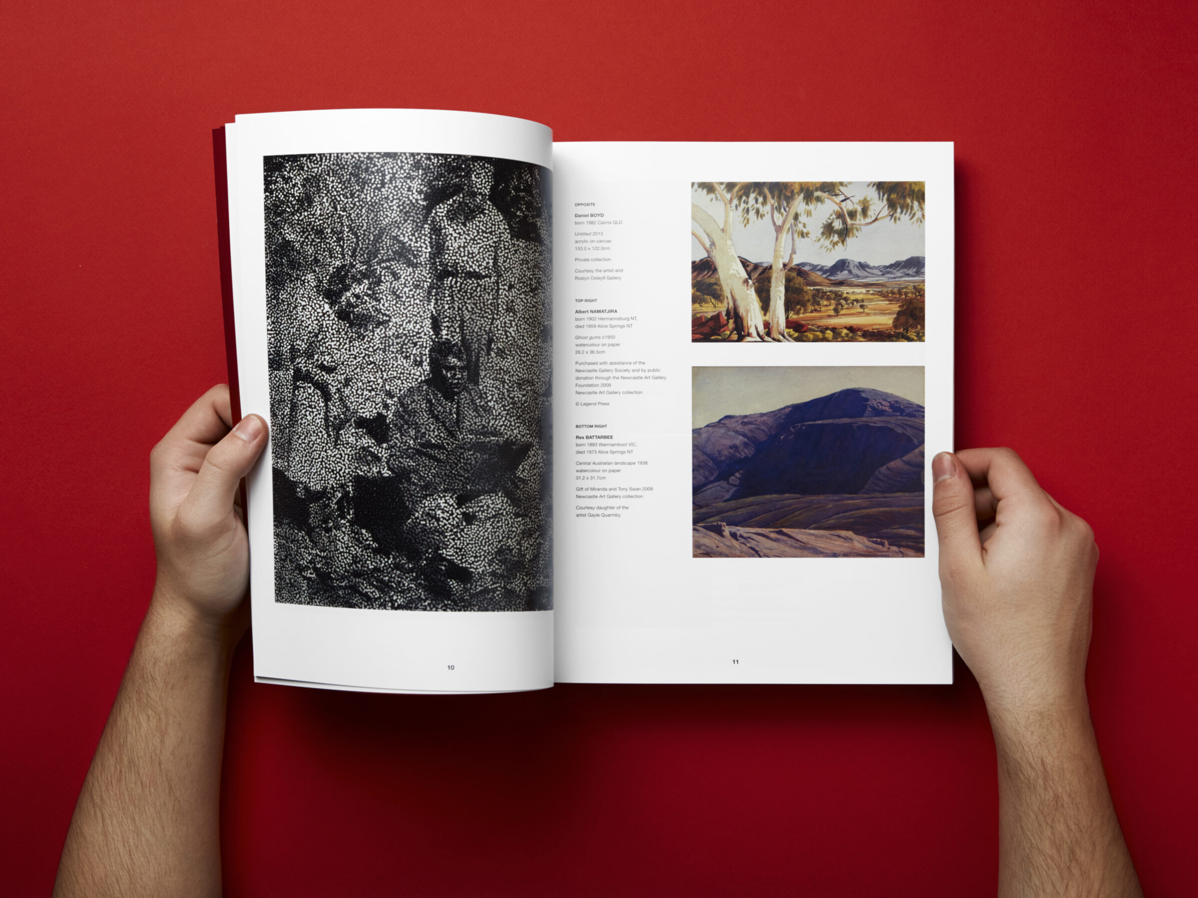
Celebrating the work of sixty-seven artists displayed over all floors of the gallery, exhibition curator Dr Una Rey brought together a diverse and complex range of works, from direct collaborations to shared – sometimes contested – stylistic and conceptual influences.
Headjam were excitingly engaged to collaborate with the Newcastle Art Gallery team and the Curator Dr Una Rey, to develop the exhibition identity for the exhibition itself, as well as the exhibition catalogue.
Objective
To visually create an identity and design that reflected the tensions outlined in the exhibition.
Target Audience
The Newcastle population and all walks of life. Art lovers, non-art lovers, those who are and are not interested in the topic of cross-cultural practices.
Consumer Proposition
Immersive cross-cultural exploration.
Desired Consumer Response
'I am immersed, effected and having a conversation'.
Creative Solution
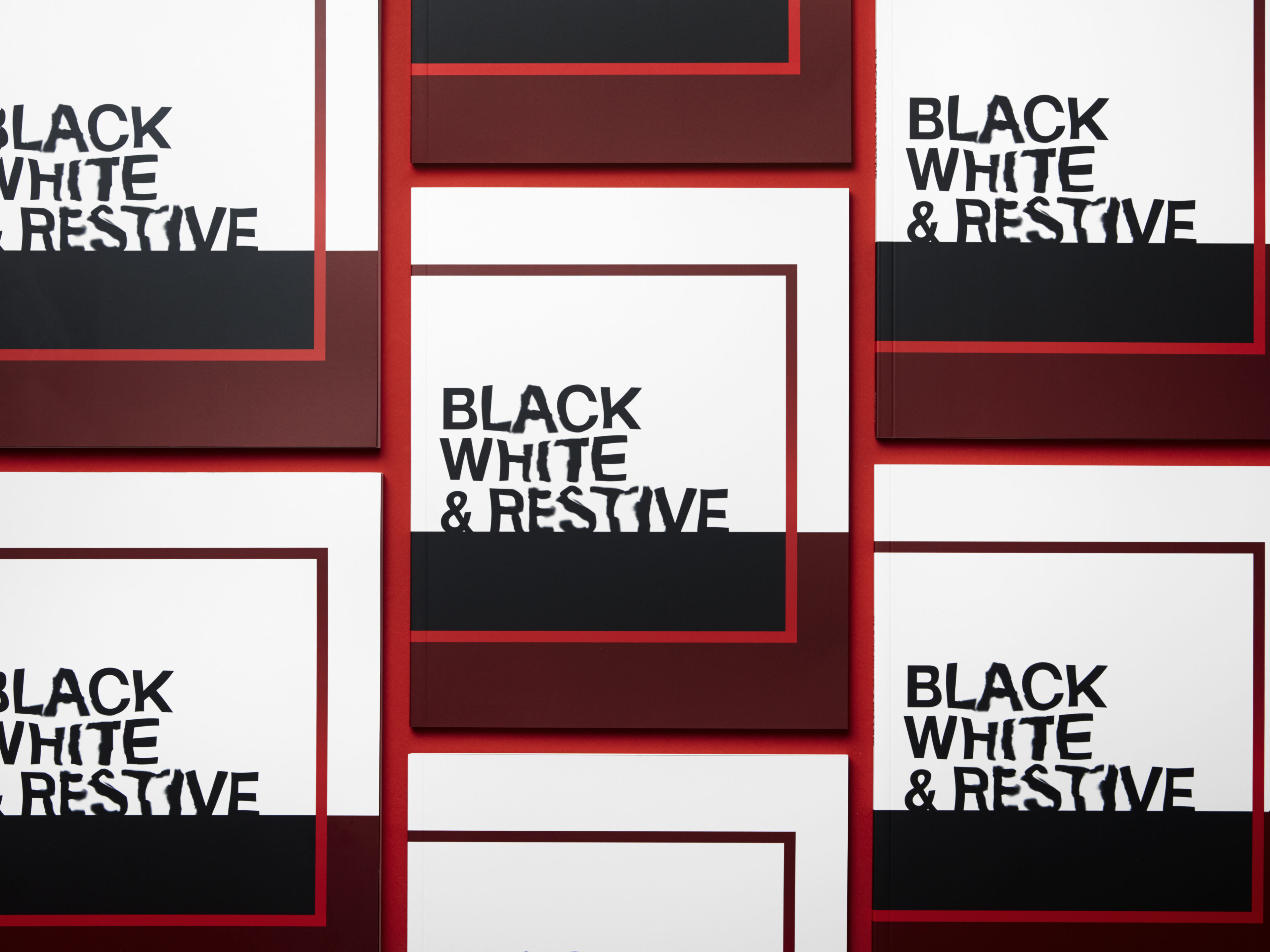
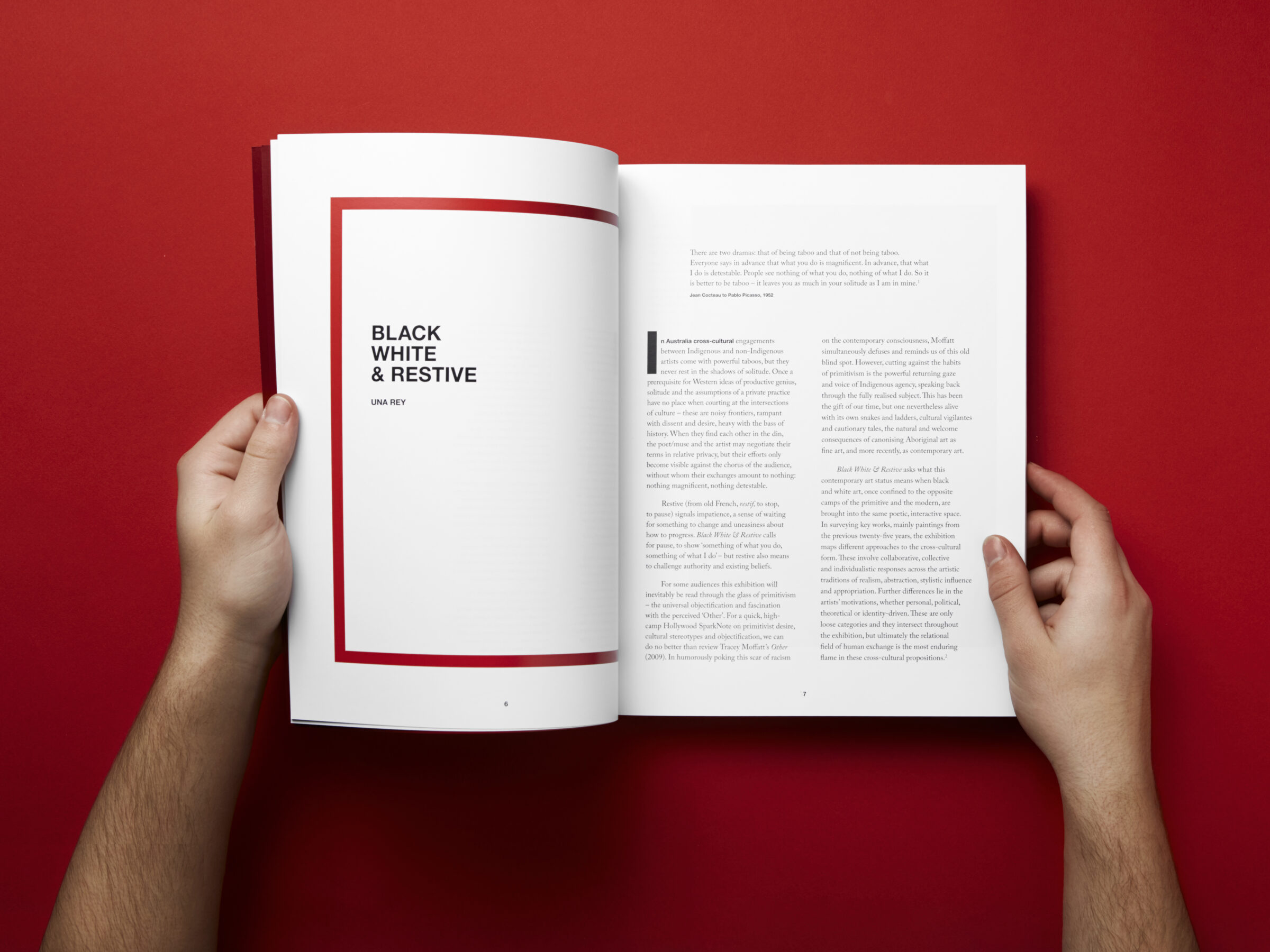
When we reviewed the content for the exhibition and catalogue, we found key themes around tension that ran throughout the essays written for Black, White & Restive. In response to this theme, we created a custom designed typeface to capture and express this complex idea of cross-cultural tension. We created a relationship between the words ‘Black’, ‘White’, ‘& Restive’ to visually represent tension, disturbance and the exchange which occurs between the two – a direct reflection of the works carefully curated for the exhibition.
Stripped back to its purest form, the colour palette is a reflection of the past, present and future. Graphic elements were also incorporated throughout the design to speak of these themes and represent the exhibition itself and the space in which this cross-cultural exploration was to occur. These elements were designed to complement, create interest and give a visual impact.
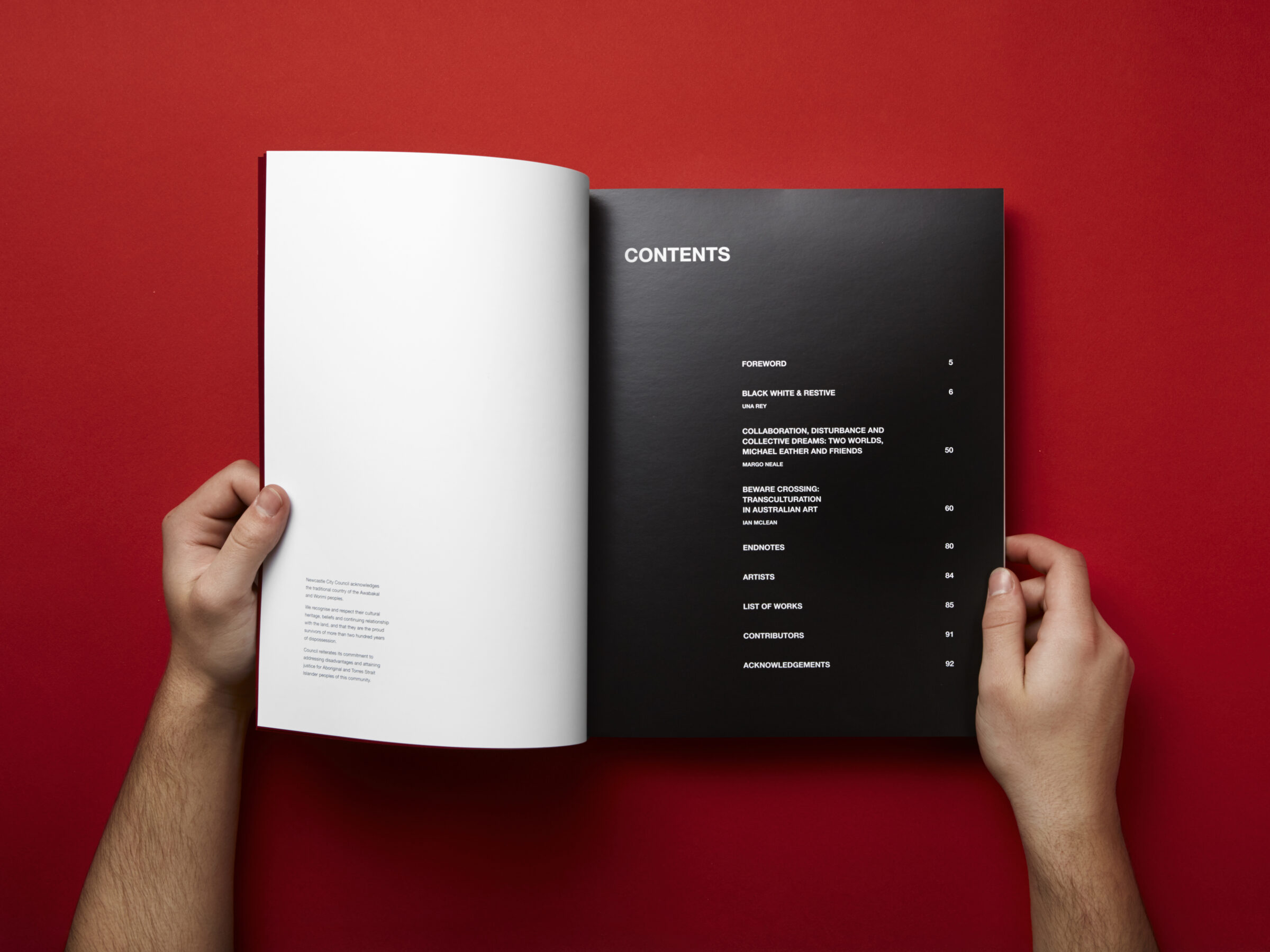
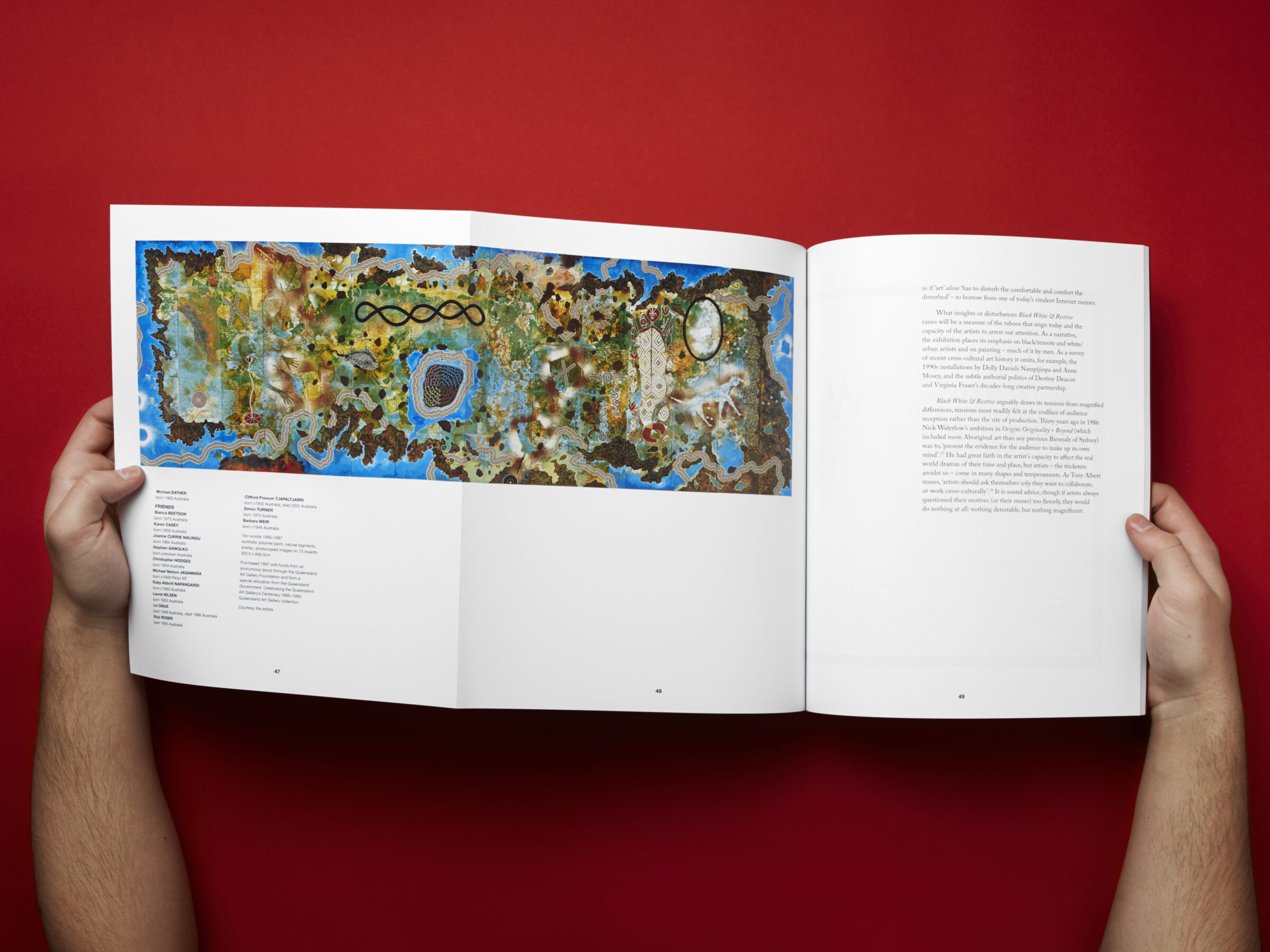
The result was a striking 96-page catalogue that captured the essence of the exhibition and gave justice to the incredible works of art, which we were so lucky to represent in this way.
Evaluation
A total of 155 Black, White & Restive catalogues were purchased by the general public, with another 145 complimentary copies given to lenders, sponsors and funding bodies.
600 people attended the opening night of the exhibition, with a total of 11,553 visitors attending the exhibition over the duration of the show.
Client
Newcastle Art Gallery
Project
Black, White & Restive exhibition catalogue book design
Processes used in this project
Branding, Brand identity, Logo design, Graphic design, Illustrations, Print media, Book design, Print design, Print management, Print production, Project management