High Tea with Mrs Woo
Case study
Some brands are already brilliant and just need a little refining in order to continue their growth. High Tea with Mrs Woo is one of them Read Hide the full case studyBackground
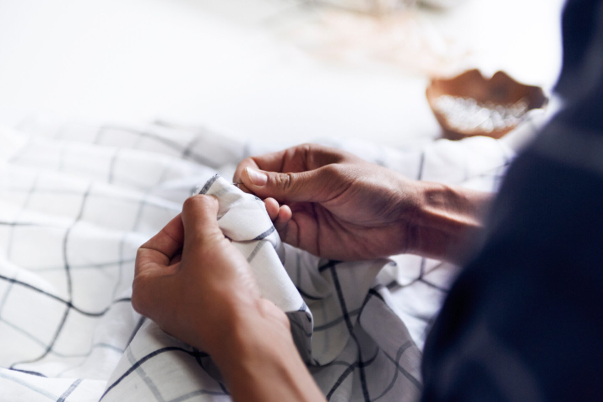
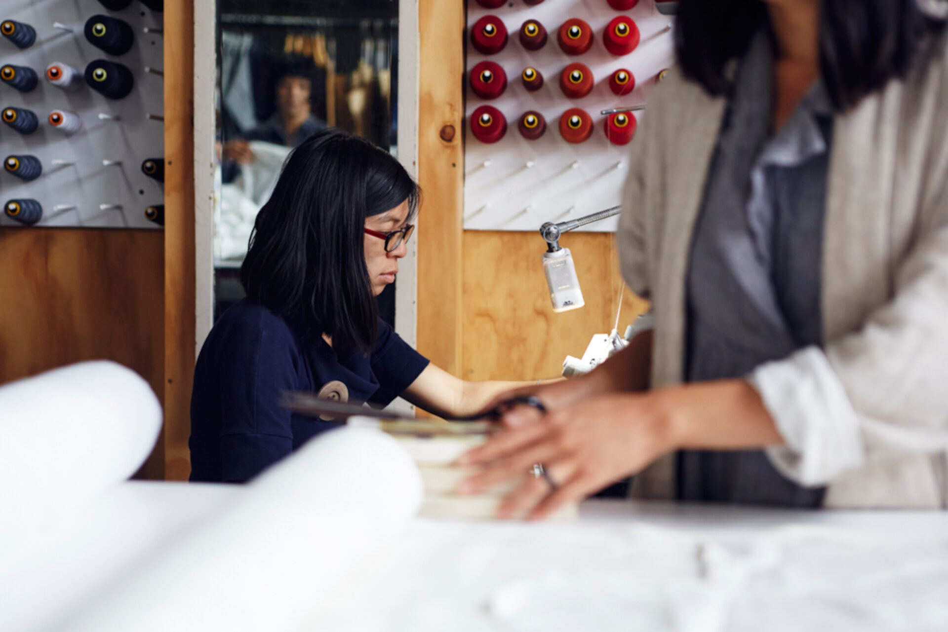
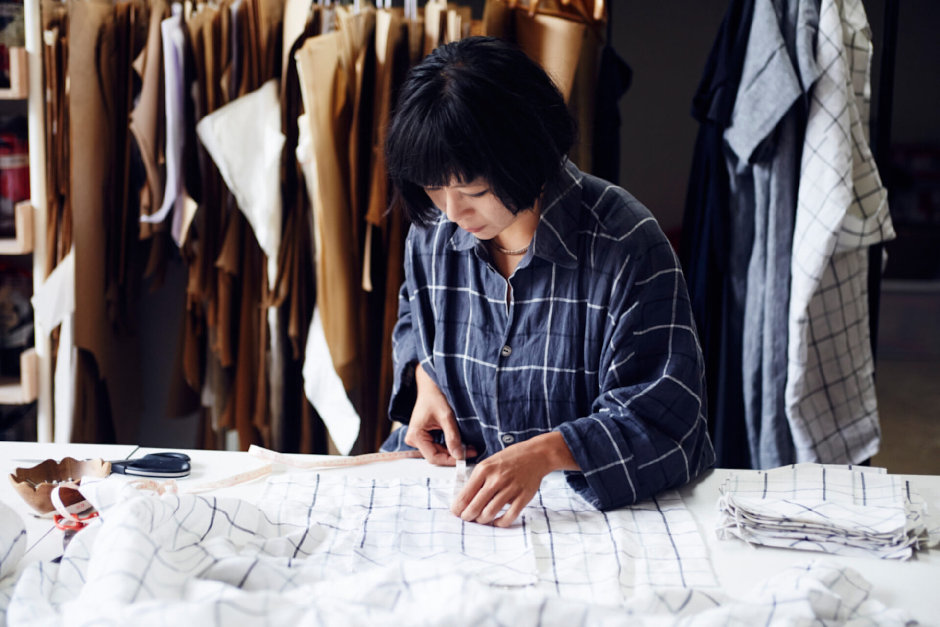
High Tea with Mrs Woo is a high-end unique womenswear company that design, pattern-make, sample and hand-make their designs from their studio-workshop in Newcastle NSW; maintaining a small and sustainable scale of production. They use natural fabrics for their designs such as linen, cotton, wool and silk, and have a flagship store in Newcastle NSW, as well as an online store for people around the country and the world to view and buy their products.
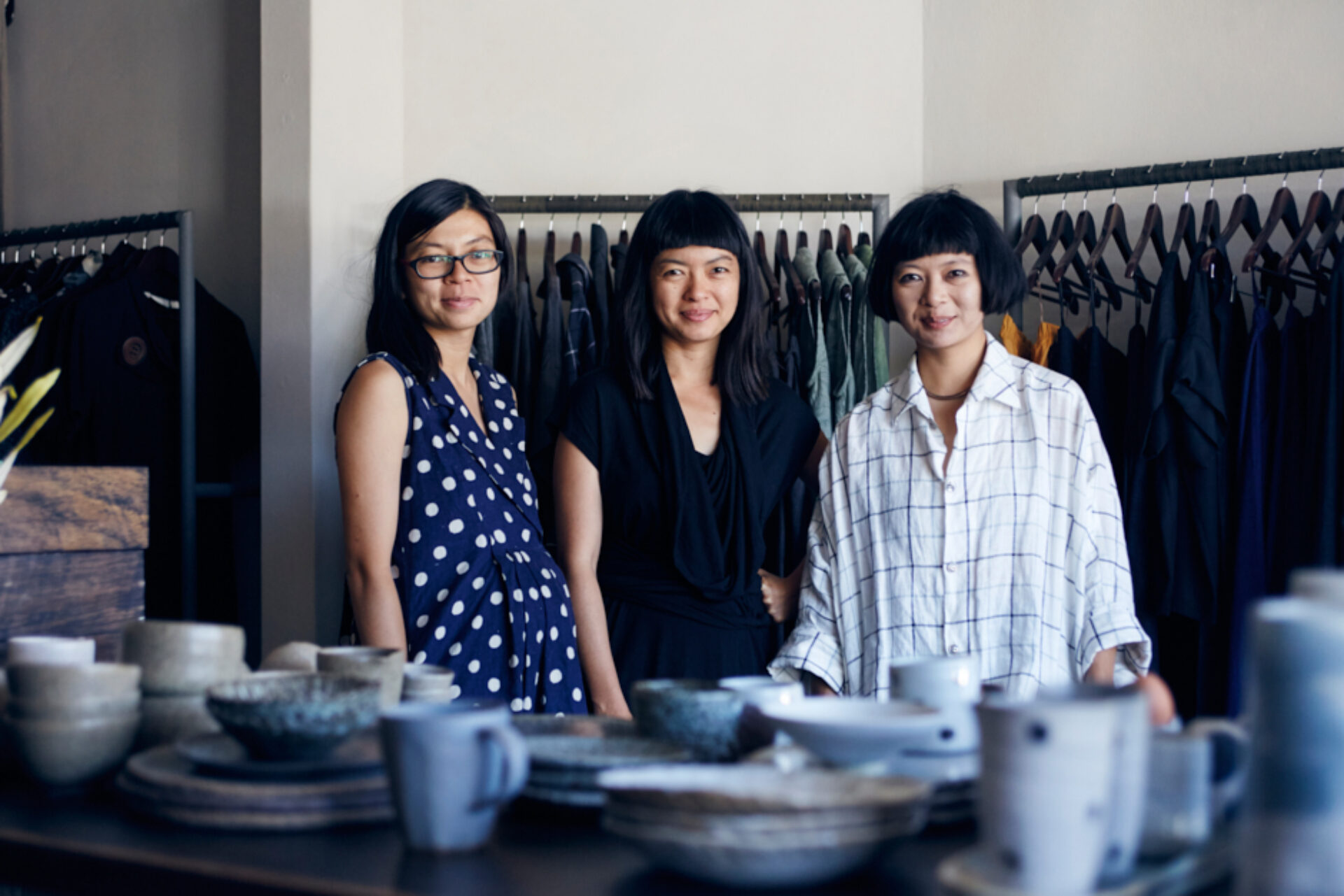
Owned by three sisters; Rowena, Juliana and Angela Foong, these talented ladies have travelled the globe with their brand, partaking in some of the world’s largest fashion shows.
All three sisters now have families of their own, and engaged Headjam to help increase sales for their business in a sustainable long-term way, ensuring that their future is secure.
Objective
To increase online sales and by default, increase overall turnover and profitability of the High Tea with Mrs Woo business.
Target Audience
The primary audience that use High Tea’s products are categorised as follows:
Over 55 yrs - Women
40 - 55 yrs - Women
25 - 40 yrs - Women
The secondary audience is partners of the above audience.
Consumer Proposition
Clothiers of distinction.
Desired Consumer Response
‘High Tea with Mrs Woo produce beautiful clothes I want to buy’.
Creative Solution
Headjam are long-term friends of High Tea with Mrs Woo, so being asked to assist with the long-term strategy of the brand was a real honour and one that we didn’t take lightly.
The Foong sisters ooze grace and effortless style. They live and breathe their brand, and strive to achieve absolute perfection through every hand-crafted, timeless piece of clothing they make. They use superior tailoring techniques to ensure the perfect fit of their garments, and are not apologetic for the limited supply, which ultimately enables them to take their time weaving their love and passion into each individual item of clothing that they make. This is what makes them so unique, so authentic.
Our approach was to firstly address the business and look at how it was currently operating. We looked at how the sisters structurally released their clothes throughout the year, which in-turn leads in to how they market these different releases both online and in-person through verbally communicating to customers, family or friends.
The existing structure of the business was a two-tiered Basic range and Signature range of clothes. We recommended changing this to a three tiered structure of Signature, Seasonal and Limited Edition. The Signature range is where we suggested all of the super successful pieces end up and typically will contain all of the basic staple products. The Seasonal range is where the magic happens. Twice a year, we suggested selecting fabrics and hand-making produce for the new seasonal ranges. And finally, the Limited Edition range is the range that contains an explosion of all of their creative minds combined; the high-end run is limited and once the pieces are all sold, they’re gone forever.
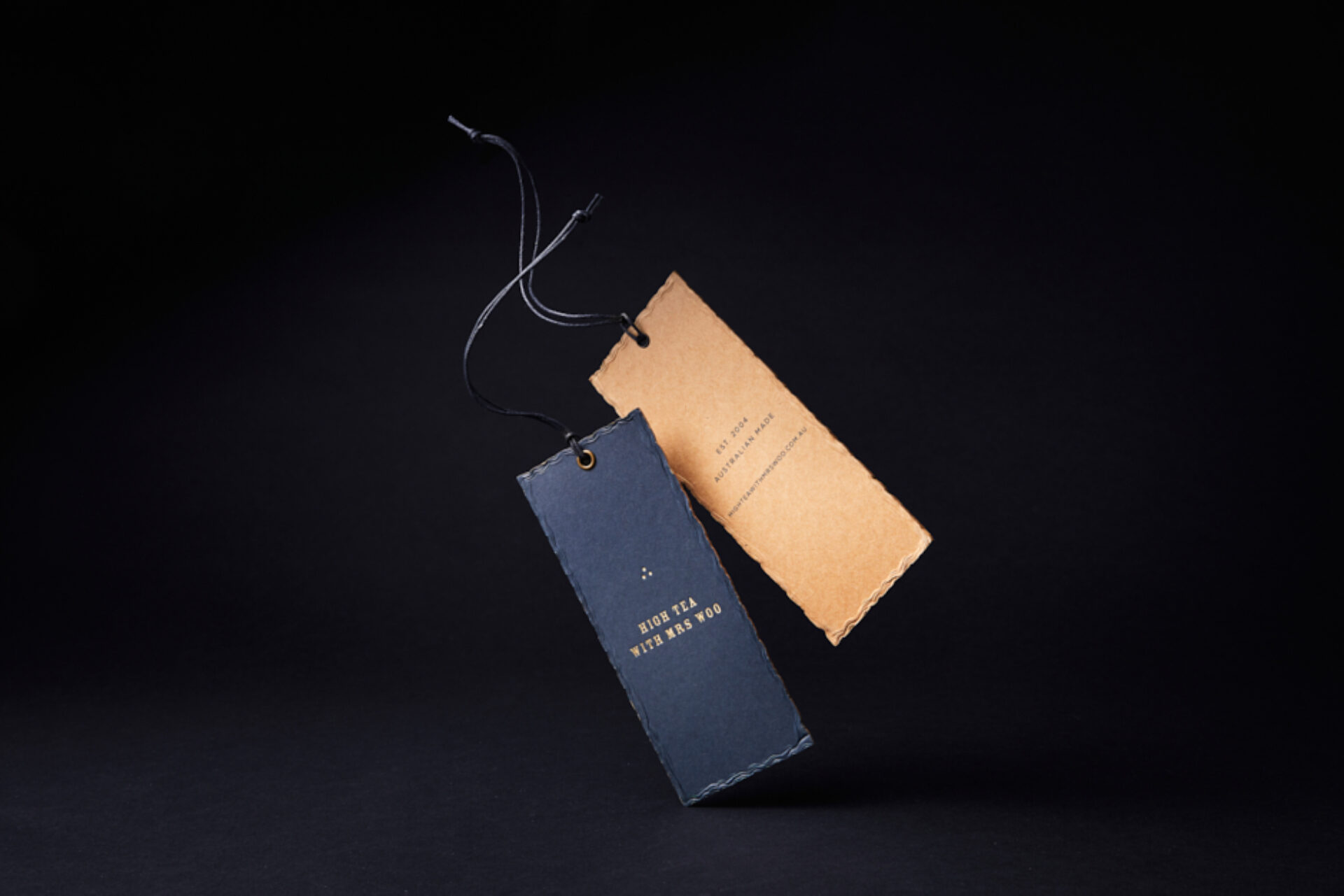
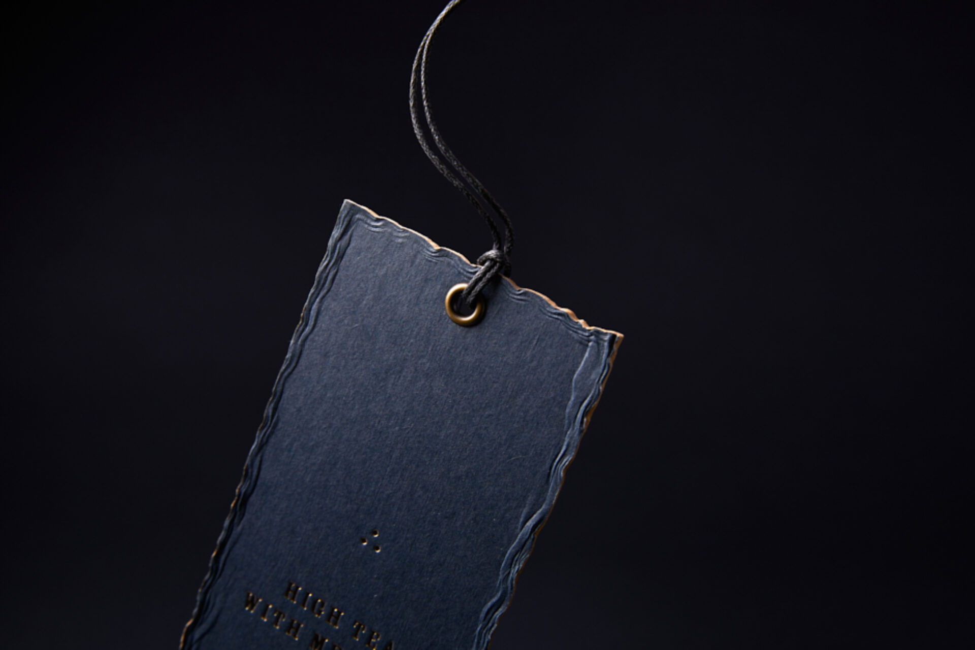
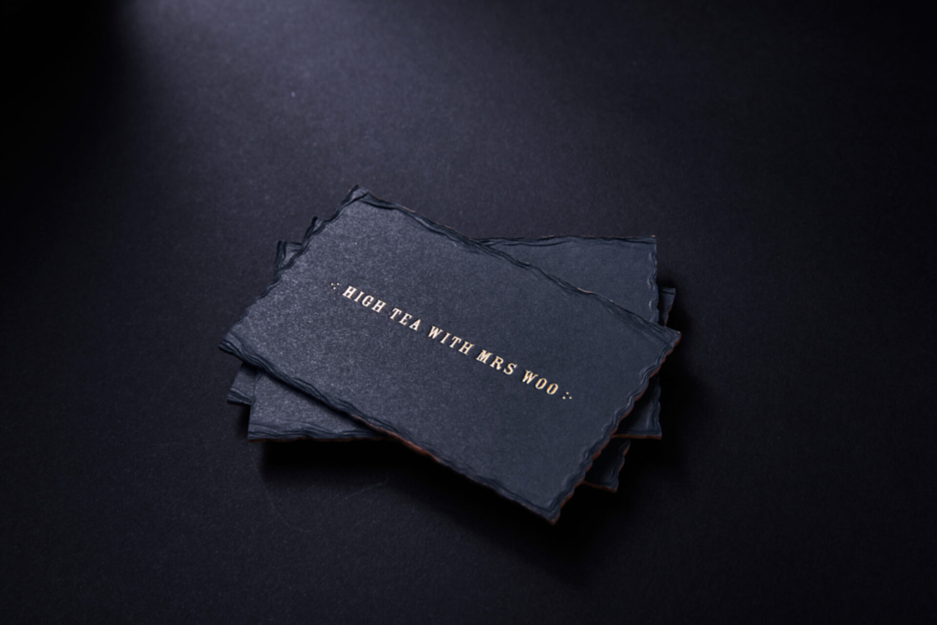
For the new brand look and feel, we focussed on the inspirational craft and passion of the sisters making their clothes by hand. The fabrics and textures play a big part in the garments the sisters create and we continued this consideration to the textures of all collateral designed, from the paper of the swing tags to the material of the signage.
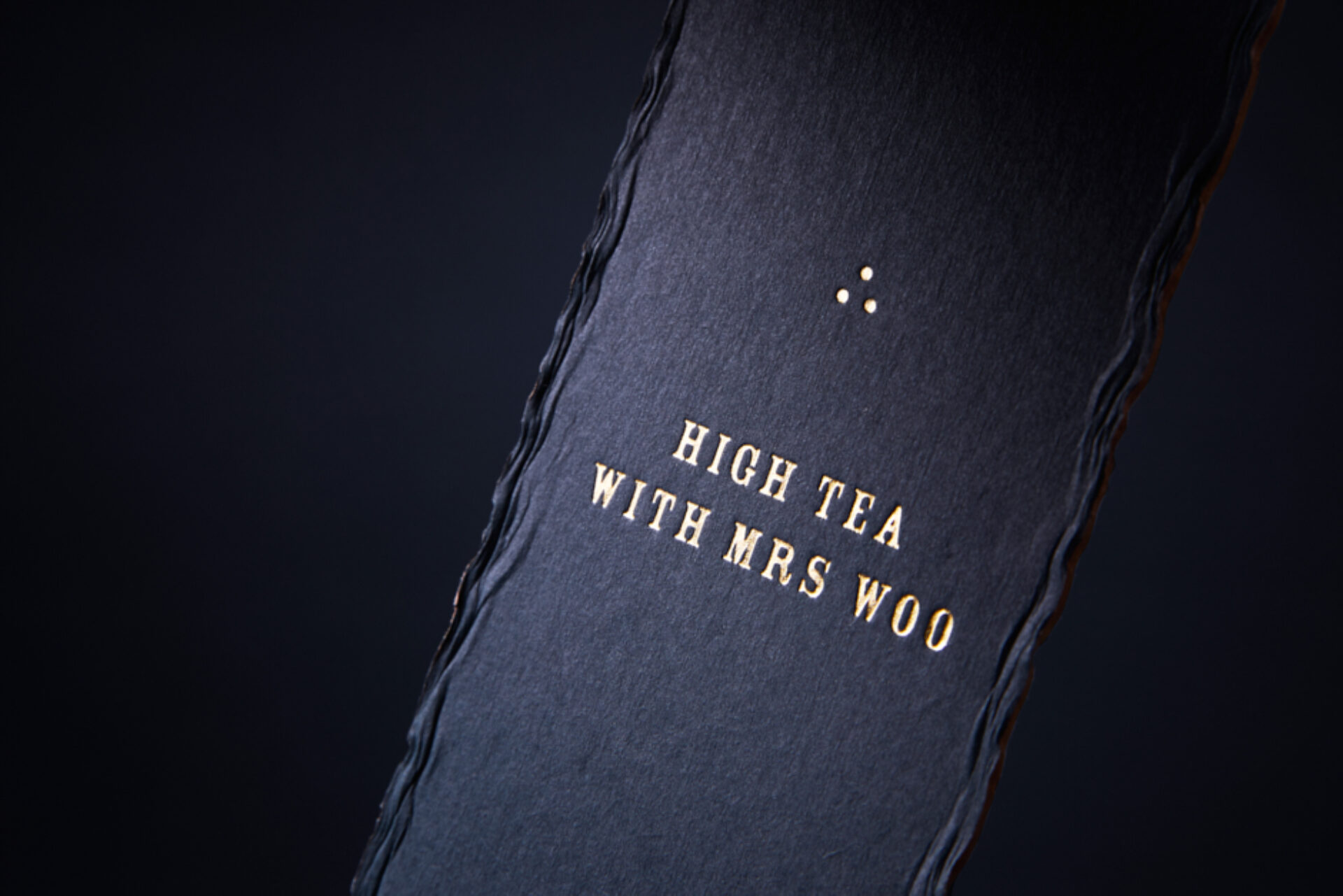
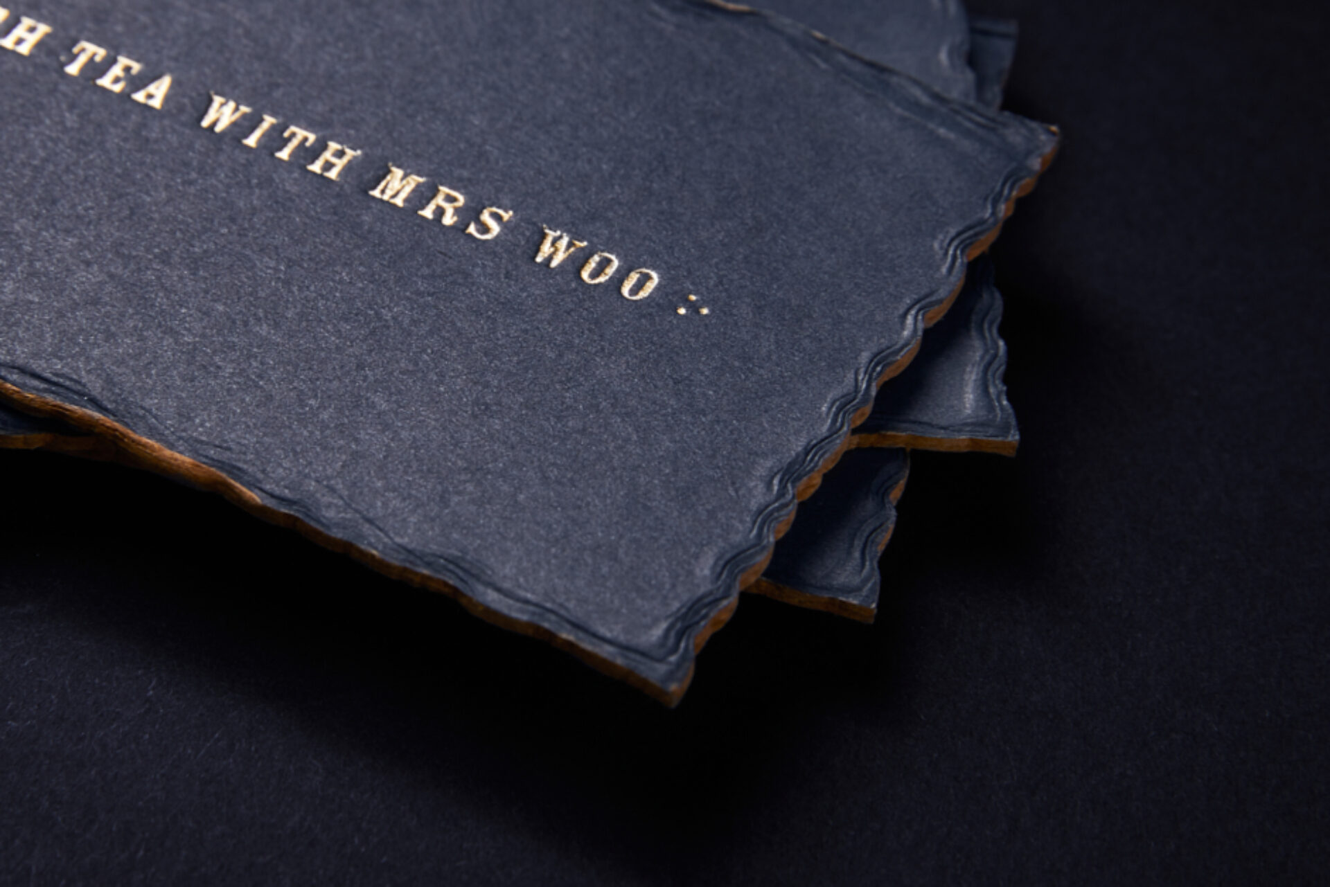
The brand colours we chose were contrasting and stylish. A dark inky colour expresses a depth, maturity and layers, and gold represents how special and unique the garments are.
We were so inspired by the three sisters themselves. Three, in this case, is most definitely a magic number! The number three symbolises a harmony that includes and synthesises two opposites. It is The Triad, being the number of the whole as it contains the beginning, a middle and an end. The symbol of three is the triangle, or three points. In Japanese map symbols, the three dot symbol can represent either ‘place of historic, cultural, scenic interest, or… tea plantation’, which was a perfect symbol for High Tea with Mrs Woo!
In terms of the logo, we wanted to take what the sisters currently had and build on that to include an element that represents the three of them, so we maintained their font choice of the current logo and added the three dots as a detail at each end of the logo.
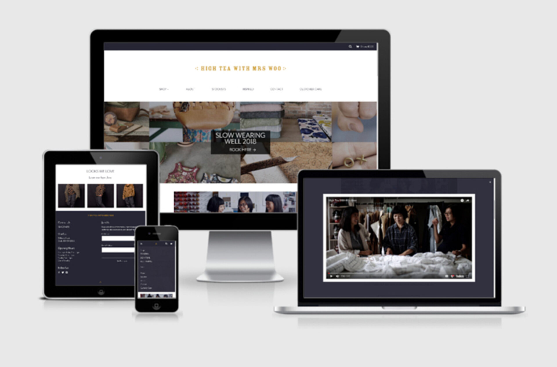
We produced a beautiful collateral suite of business cards, letterhead, postcard, swing tags, woven labels, carry bags, packaging and stickers.
We designed and developed a beautiful responsive e-commerce website to give High Tea with Mrs Woo a strong presence in the online marketplace, providing a highly enjoyable online shopping experience for High Tea with Mrs Woo’s worldwide fashion followers.
Client
High Tea with Mrs Woo
Project
Branding, website and collateral
Processes used in this project
Product photography, Studio photography, Branding, Brand identity, Graphic design, Web and digital, E-commerce website design, E-commerce website development