Colourworks
Brand evolution for a company that went from photocopiers to software solutions
Case study
Colourworks was approaching 30 years in business, it had evolved from a company only supplying and servicing printers and scanners to a company that is also a software developer and has developed a range of software that integrates with the hardware to manage repetitive tasks such as workflows, quote approvals, invoicing and payments.
Headjam was engaged to reposition the brand, to move the company beyond just ‘hardware’ to be viewed as an innovative company and a leader in print and digital document management support. Our goal was to reposition Colourworks to be the leader in print and document management support.
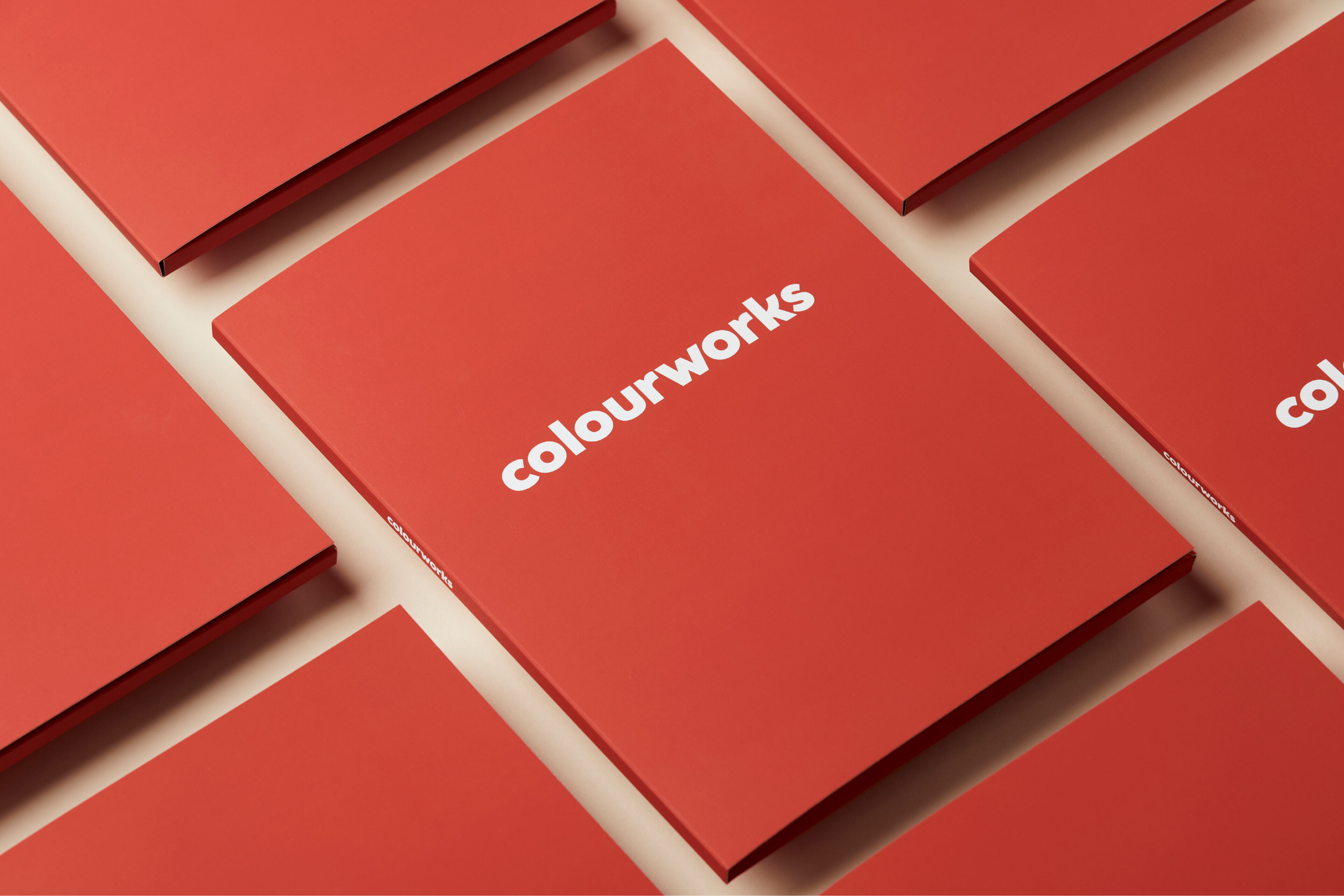
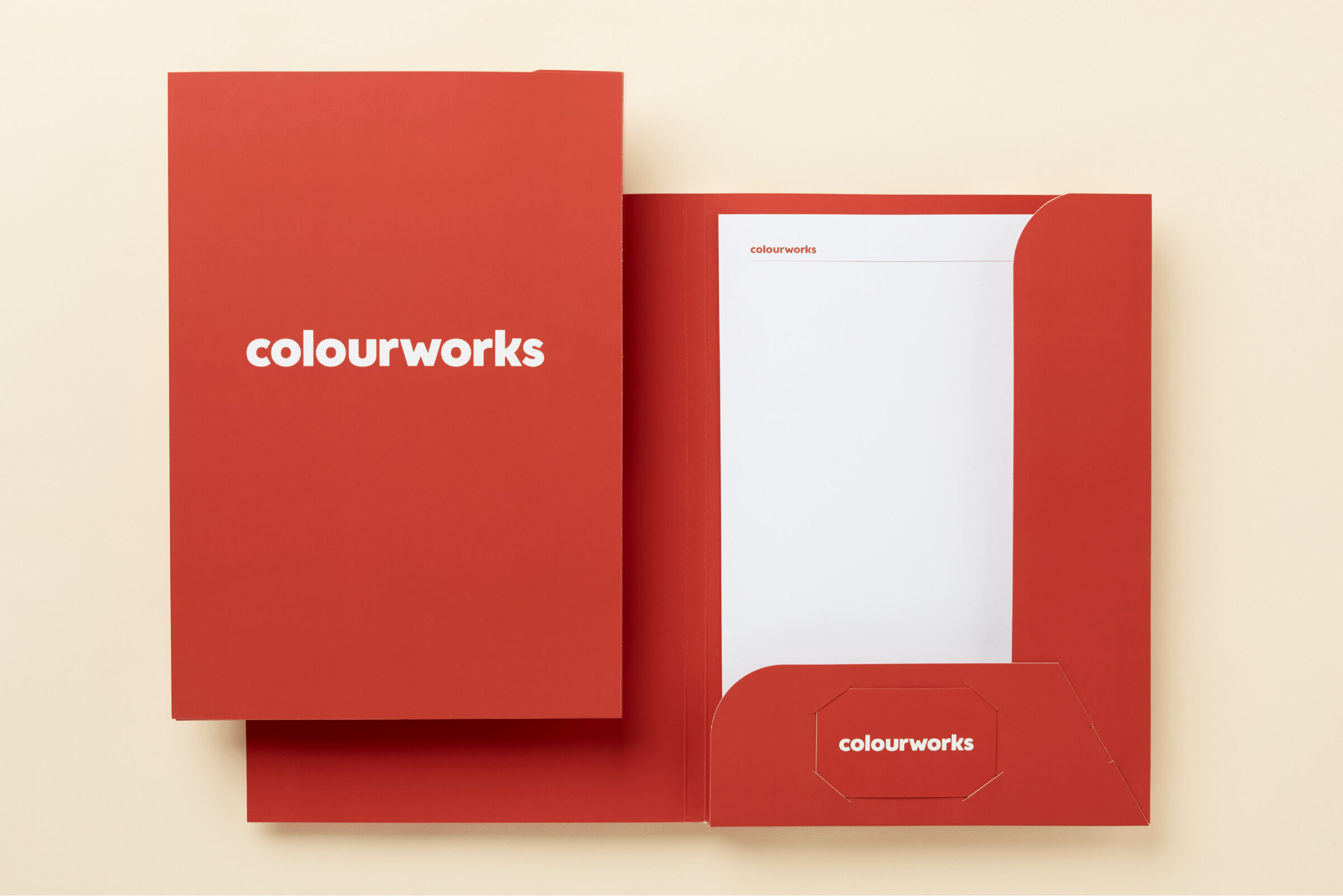
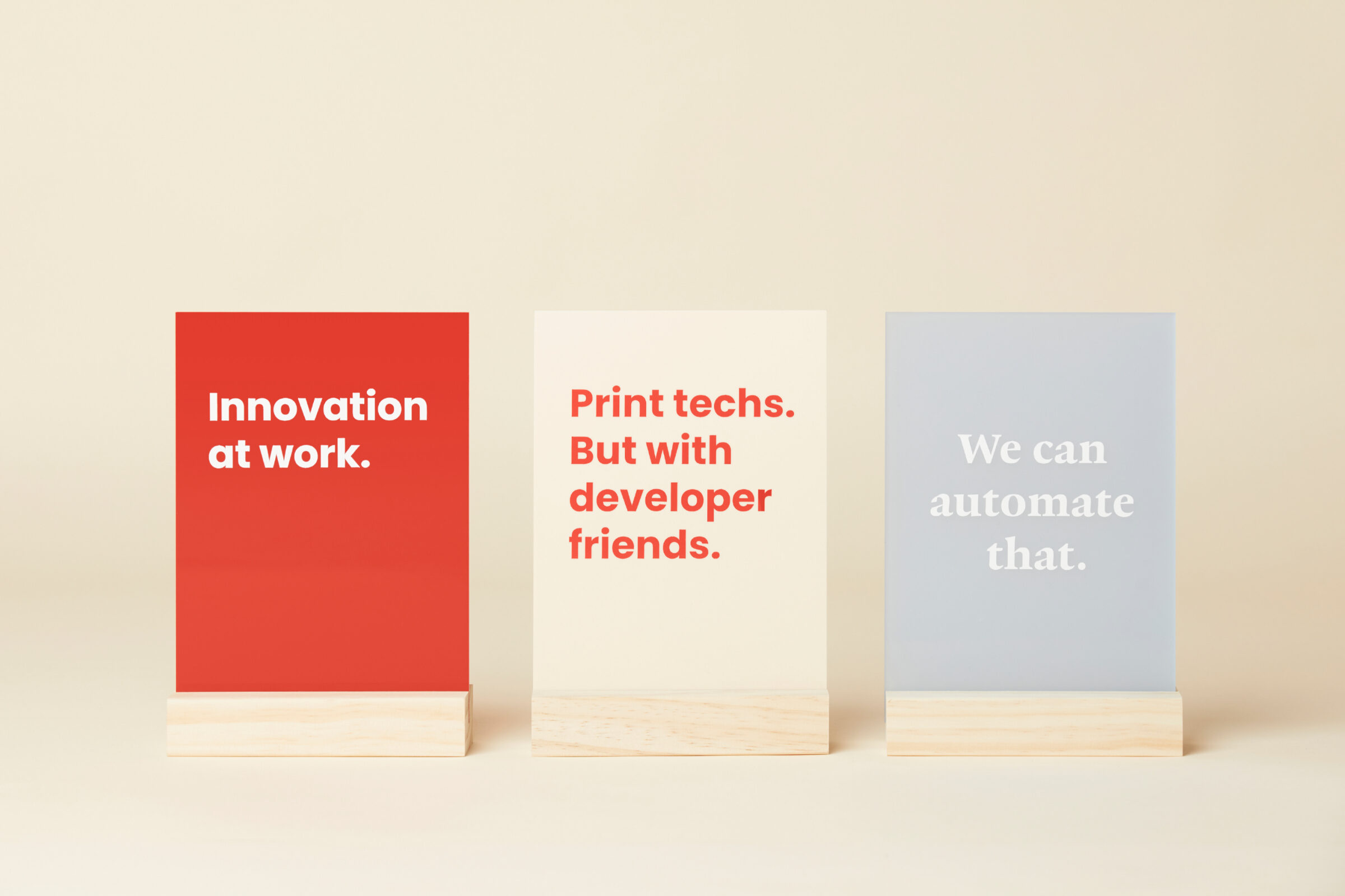
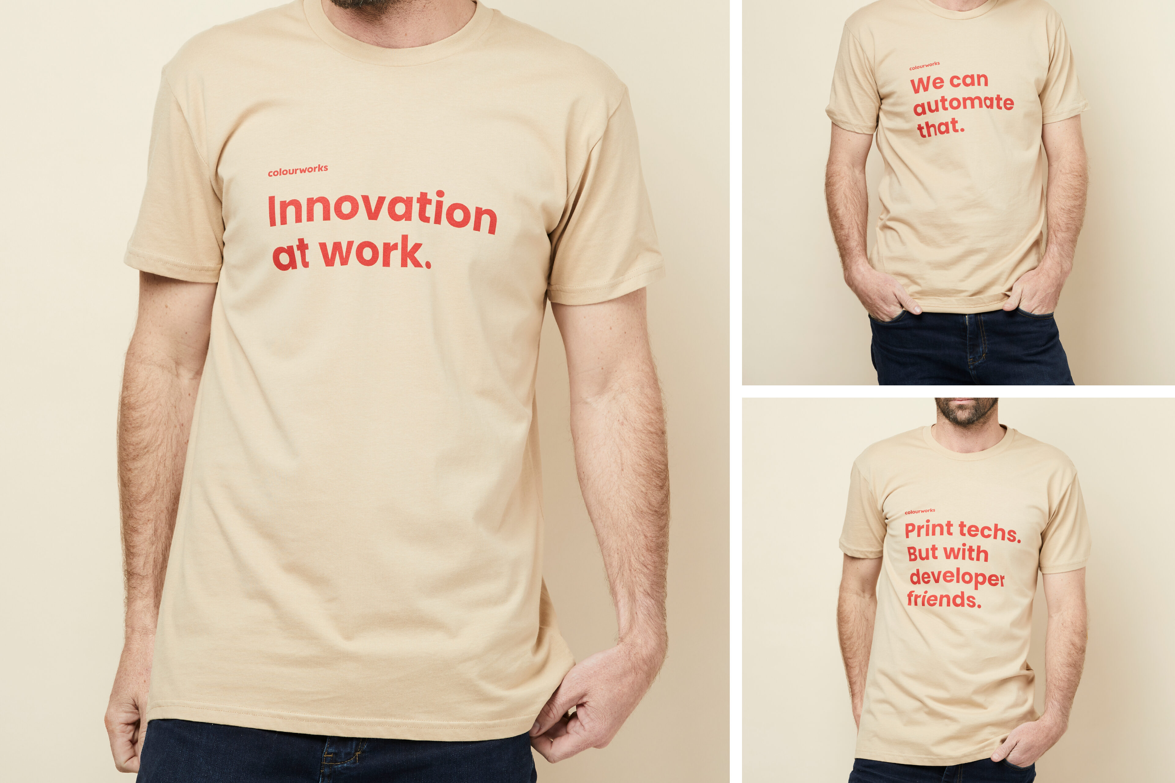
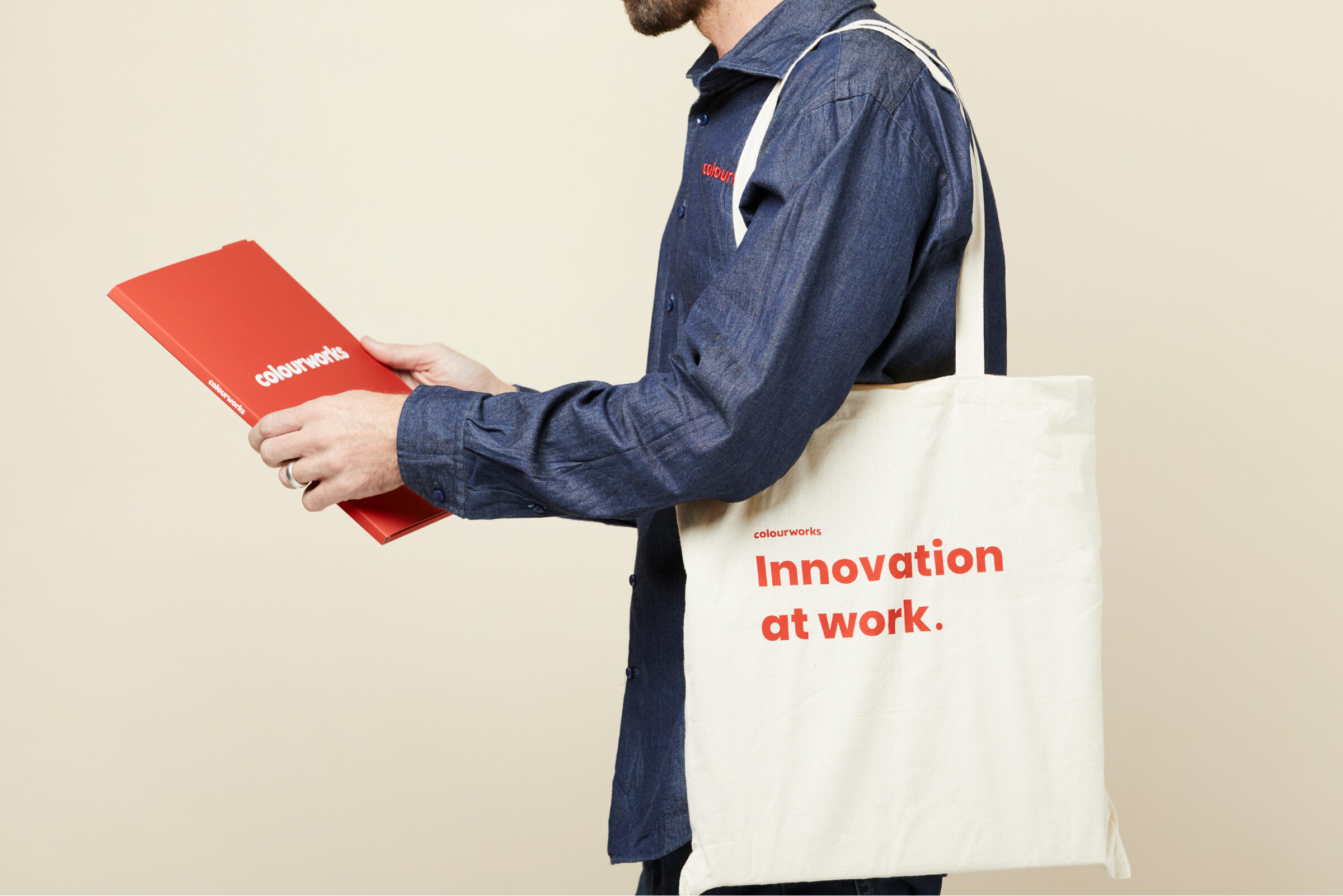
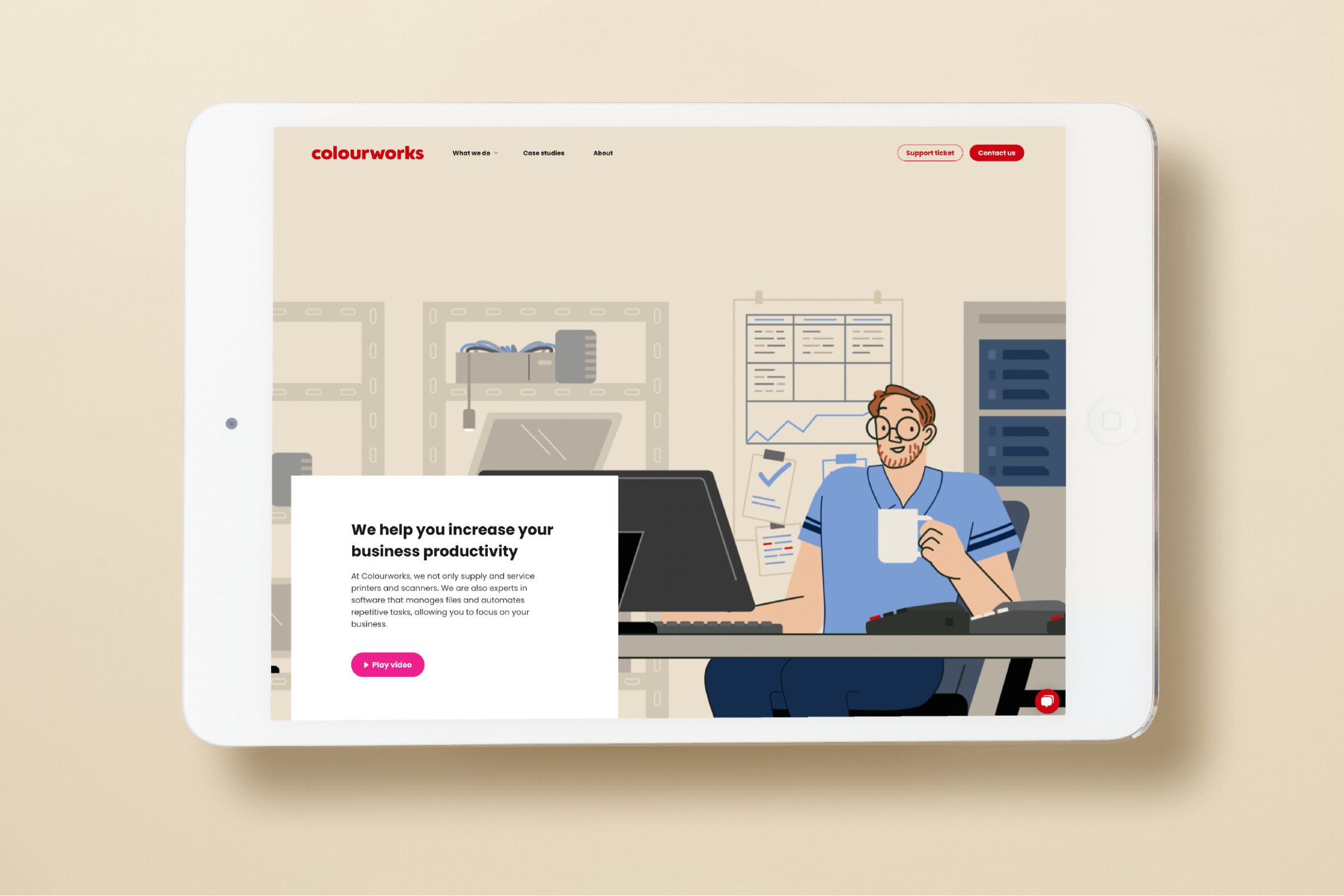
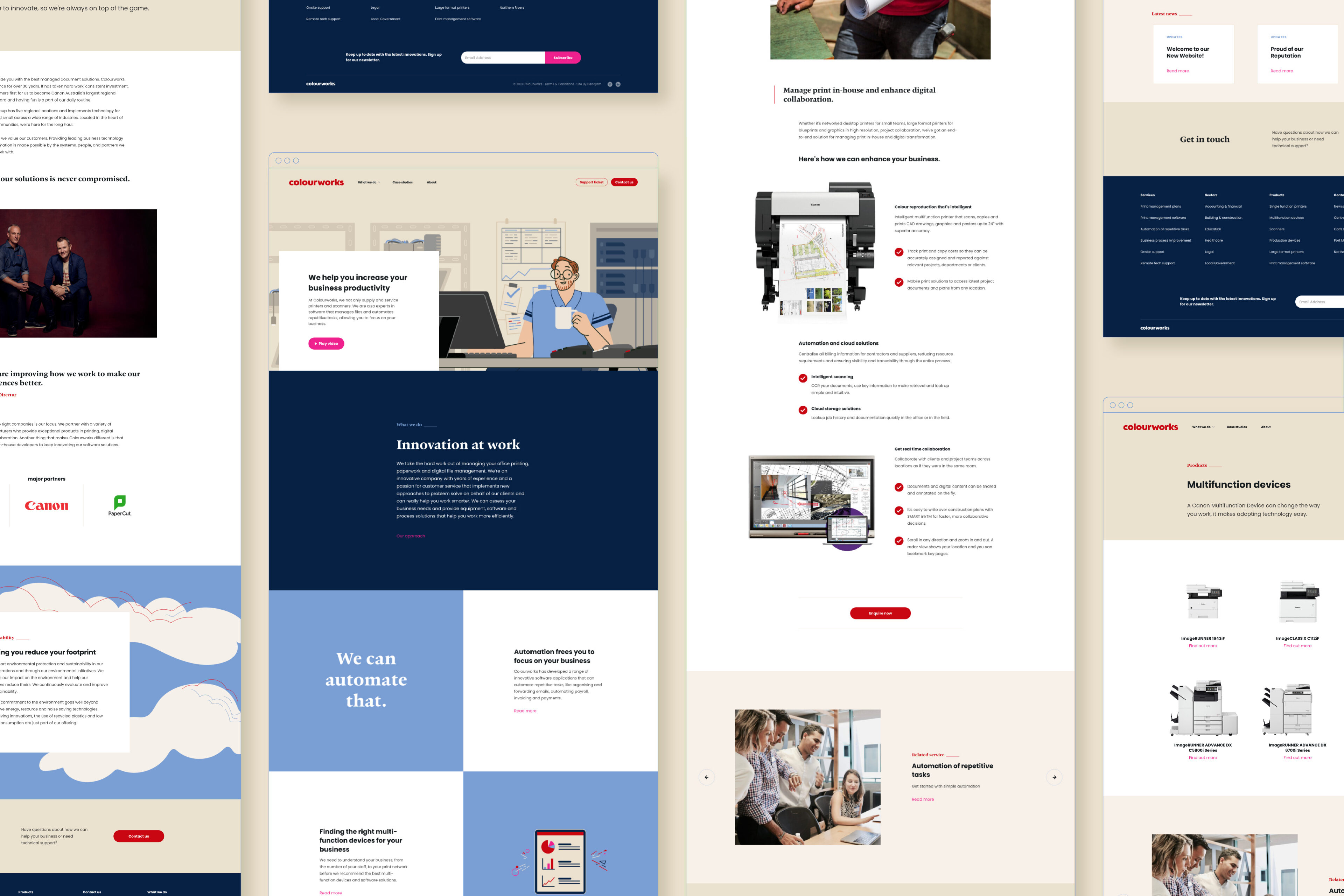
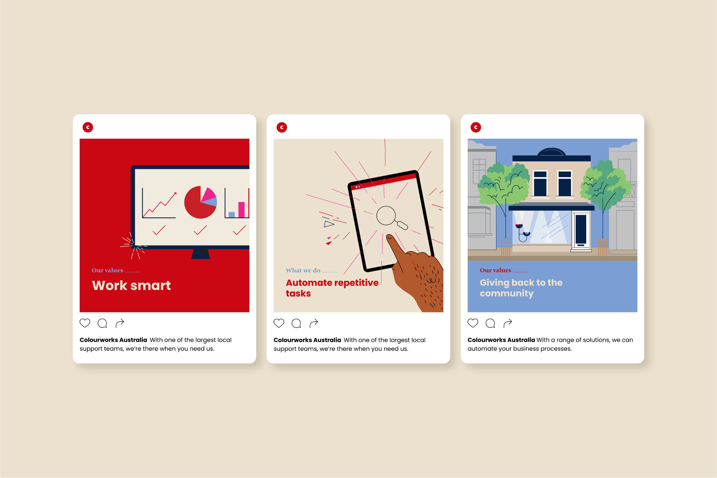
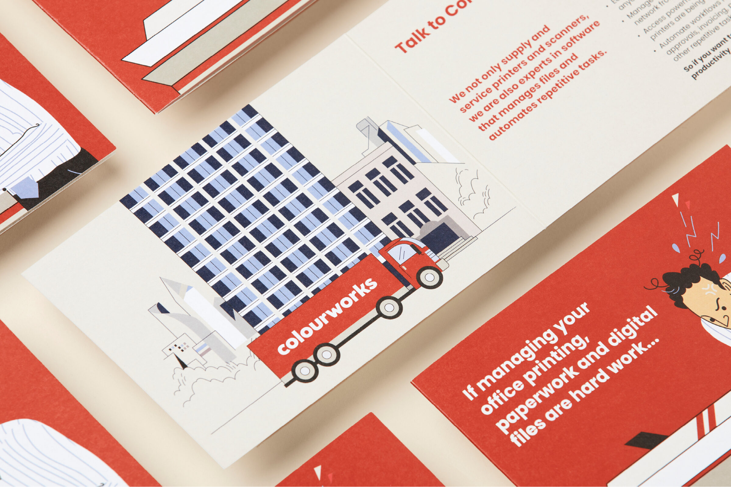
Refreshing the logo involved modernising the typography, removing a CW monogram device and selecting a suite of supporting colours. We captured the sense of fun of the Colourworks team using an illustration style, to be used in branded collateral and for a series of animation videos and commercials. We also developed the campaign line ‘Colourworks. Innovation at work.’
Read Hide the full case studyBackground
Colourworks is a document management business whose clients are other businesses. They sell Canon printers, and software and hardware applications for sharing and storing documents.
It's a regional business with over 30 years of local knowledge and experience.
They currently have 50 employees and are interested in growth.
Their competitors are all major brands of printers.
Primarily their sales come from sales people making meetings, but they also use social media, direct marketing and YouTube to market their business.
Objective
Reposition their business to be the leader in the print and digital document management support.
Target Audience
Small to medium businesses in the Newcastle, Central Coast, Northern Rivers, Port Macquarie and Coffs Harbour areas.
Consumer Proposition
Helping businesses efficiently manage print and digital information.
Desired Consumer Response
I understand what Colourworks does and trust them to enhance my business while considering community and environment.
Creative Solution
To express the new Colourworks direction as an innovative and fun document management solutions company, we weighed up the pros and cons of keeping the existing name or developing a new name. The value in the existing name tipped the balance. Refreshing the logo involved modernising the typography, removing a CW monogram device and selecting a suite of supporting colours.
To capture the sense of fun of the Colourworks team, an illustration style was developed for use in brand collateral and for a series of animation videos and commercials. We also developed the campaign line ‘Colourworks. Innovation at work.’
Client
Colourworks
Project
Branding, website, animation and marketing
Processes used in this project
Advertising campaigns, Portrait photography, Branding, Brand identity, Brand positioning, Logo design, Illustrations, Digital marketing, Marketing campaigns, Marketing automation, Booklet design, Brochure design, Print advertising, Project management, Co-design, Animation, Audio production, Broadcast, Editing, Film direction, Motion graphics, Storyboarding, User experience design, User interface design, Website design, Website development
Seeing the Colourworks branding come to life has been more amazing than we could ever have hoped. Internal feedback is trickling in and it's made selling printers and scanners a bit more fun.