TiNA
Case study
Recognised as a leading contemporary Arts Festival in Australia, Newcastle's TiNA took on a whole new look for 2015, and Headjam were the lucky ones that got selected for this revolution. Read Hide the full case studyBackground
Produced by Octapod in Newcastle since 1998, This is Not Art (known to friends as TiNA) has grown to become one of Australia’s leading contemporary and emerging Arts festivals.
The annual festival attracts thousands of people, who gather in Newcastle over the October long weekend to share ideas, test work, and to meet like-minded creatives or potential collaborators.
TiNA is made up of over two hundred smaller events, from panel discussions to hands-on workshops, performances to parties. It provides a space for artists, culture-makers, performers, writers, thinkers, theatre-makers, dancers, and tech-heads to gather, play, share ideas and innovate.
Headjam were engaged to develop a new Brand identity for the festival and also to create an awareness campaign for this leading contemporary Arts Festival.
Objective
The first objective was to build a core visual identity for TiNA that could be used into the future and adapted over time.
The second objective was to raise the profile of the TiNA 2015 Festival to Newcastle locals and other Australians, in order to take it from an underground ‘secret’ festival, to a festival that everyone knows and talks about.
Target Audience
The primary audience for TiNA exists within the Arts community within Newcastle and around Australia. Identified as academics/innovative thinkers, both local and national, teens, travellers, cultural junkies, performers and the art-curious.
The secondary audience is the wider community looking for new experiences for themselves and their families.
Consumer Proposition
The secret is revealed.
Desired Consumer Response
‘I want to visit or learn more about the TiNA Festival’.
Creative Solution
The key considerations for the creative were:
+ The execution must be high impact and raise visibility of the festival to the broader population of Newcastle.
+ The project must be budget savvy (there isn’t much).
+ Due to the nature of the budget, the designed collateral must be robust enough to be printed at professional printeries or equally impressive when printed on someone’s home printer.
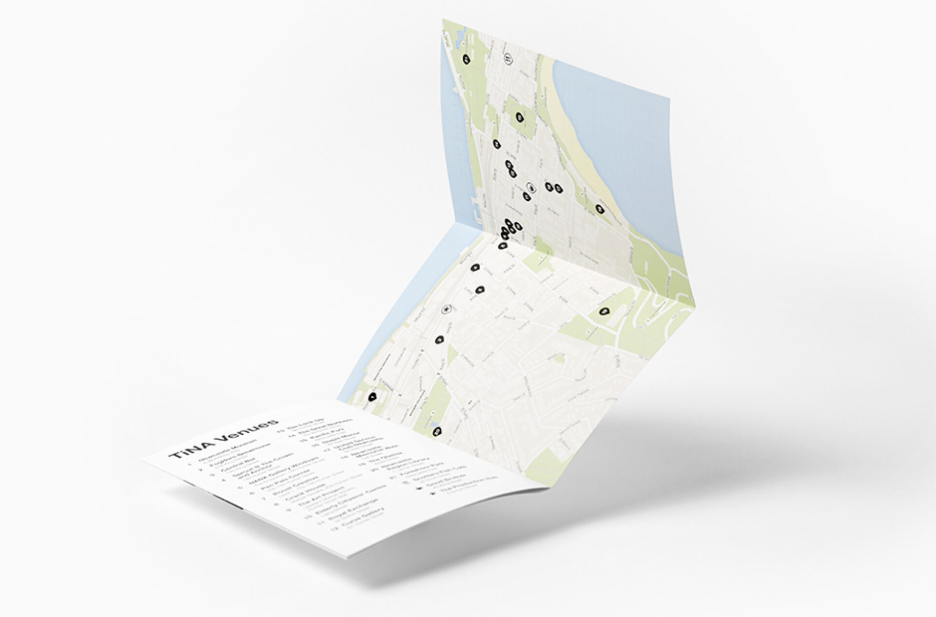
+ Ensure way-finding and navigation of the festival was emphasised. How are people going to find over 20 different locations hidden around the city?
Our creative solution for this project was two-fold.
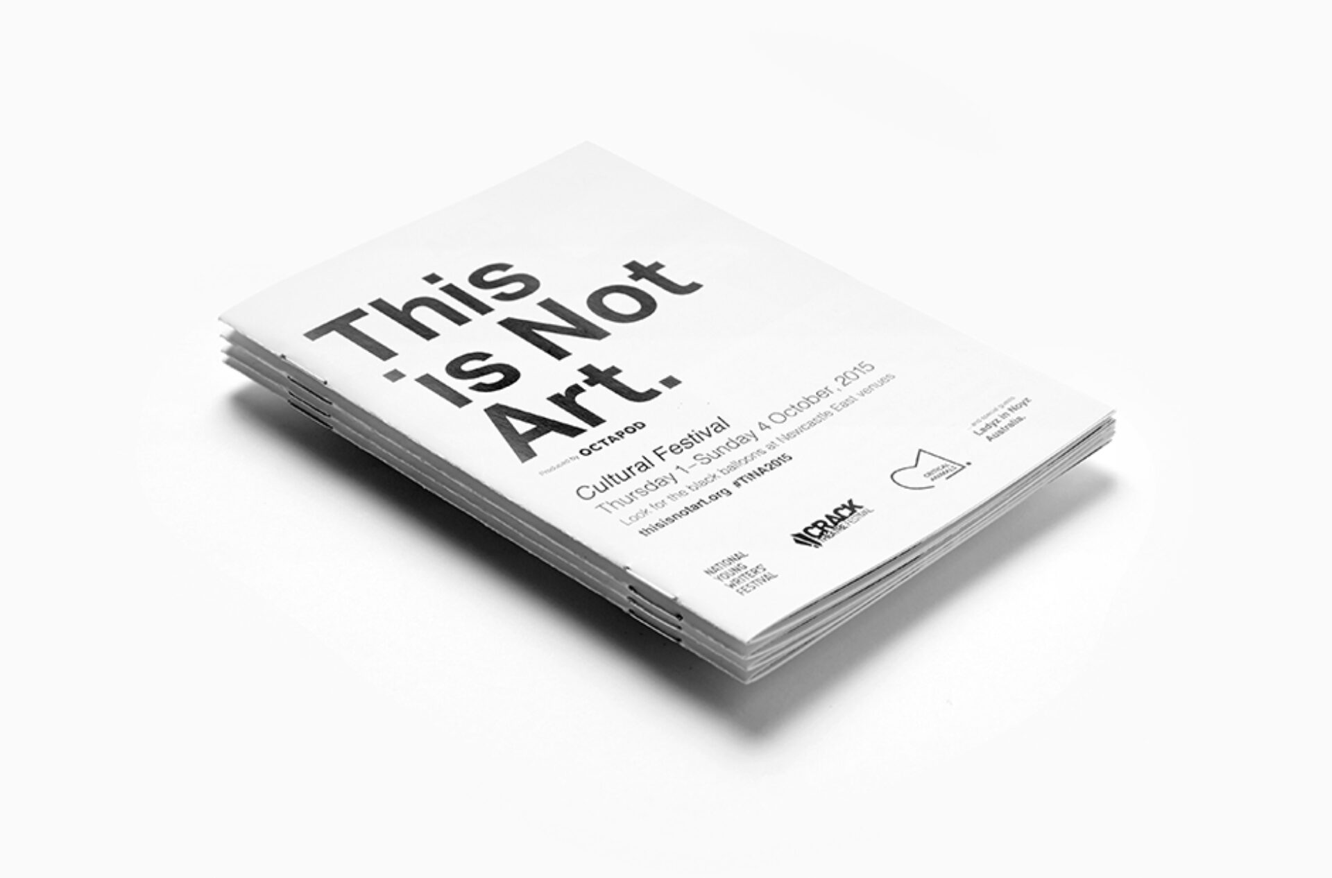
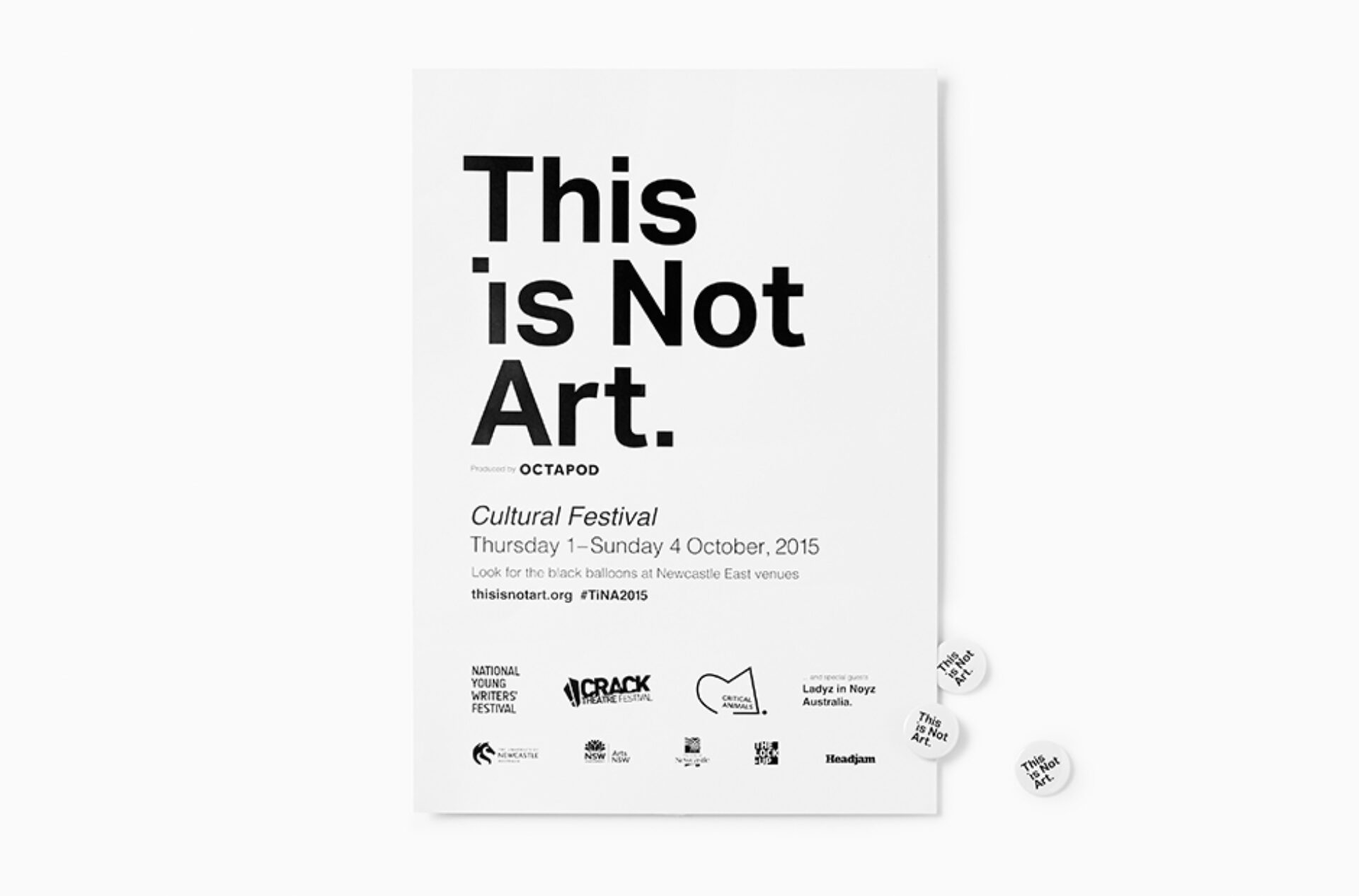
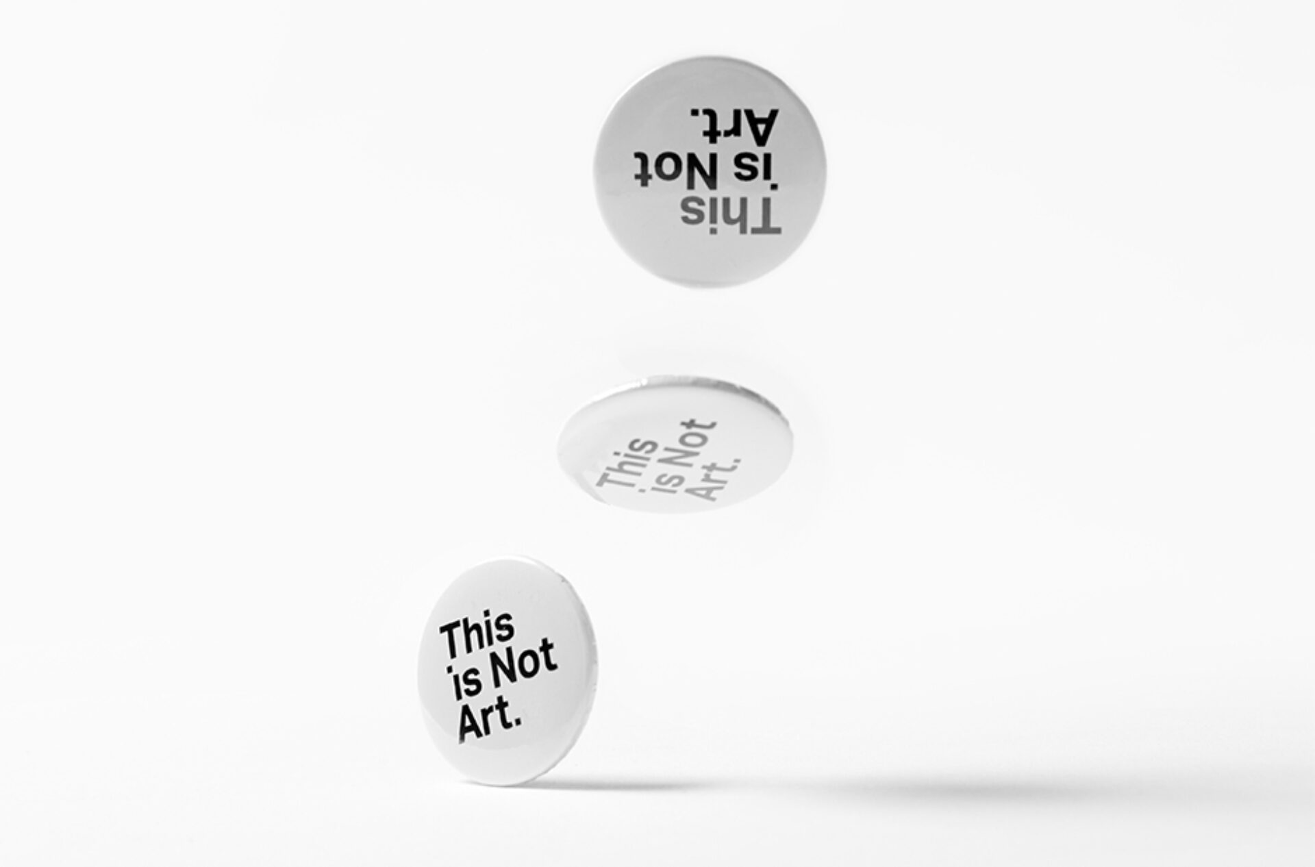
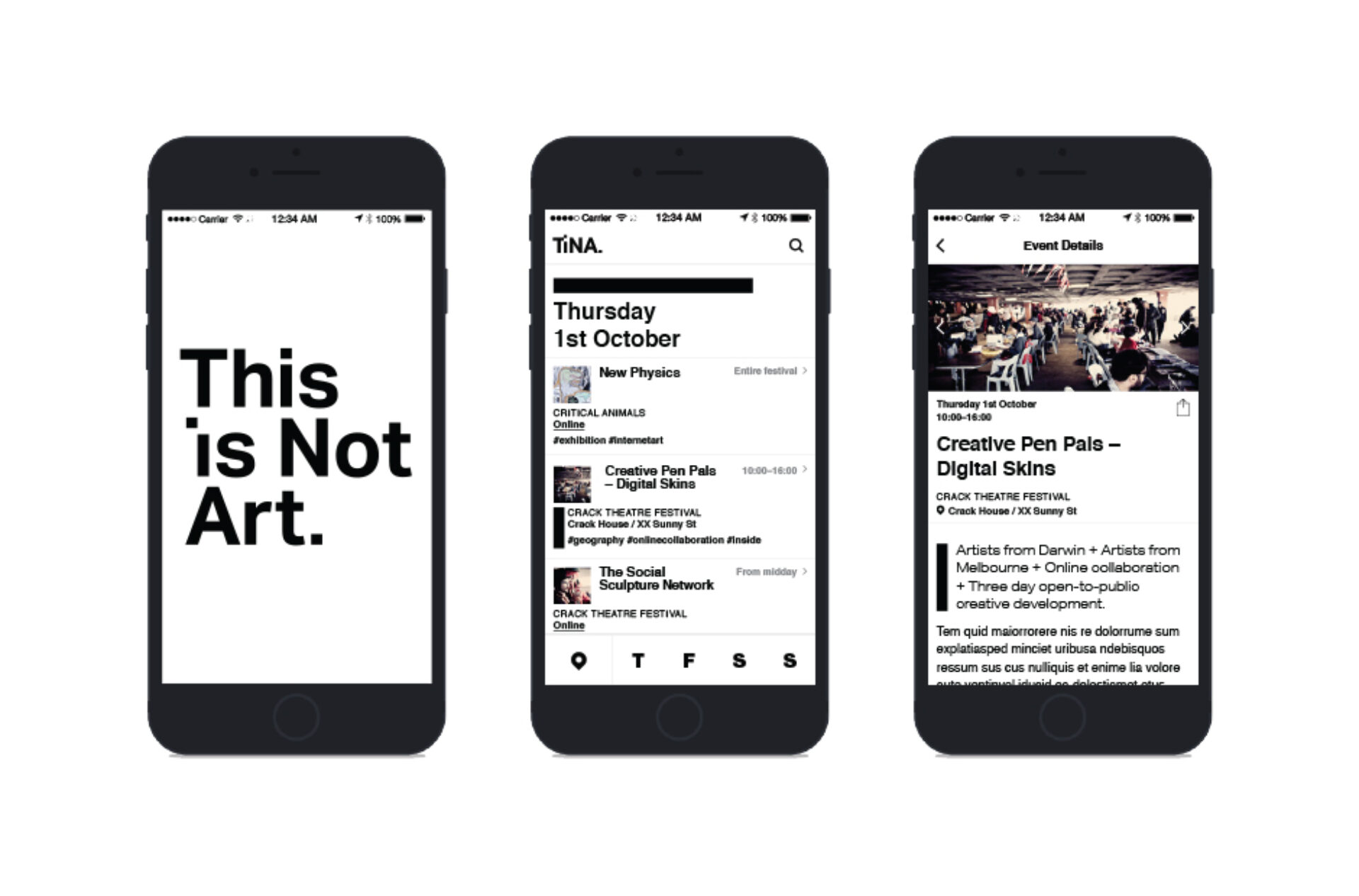
Firstly, we had to address the Brand identity. We wanted the visual identity of TiNA to have high impact, to stand out and raise visibility across all media, way-finding and navigation to the various festival event locations; it had to be discoverable.
To alleviate our tight budget constraints, our concept and designs were explicitly simple. The Brand identity and colour palette were created as single colour, which meant that posters could easily be printed on A3 or A4 paper on office printers and our clever design meant that the posters did not need to be trimmed, and no matter where they were printed, they were identical.
Secondly, we had to create a campaign for TiNA. This gave us a tremendous opportunity to start a dialog with the broader community, reinventing what the festival is and its place in the community. Our biggest challenge was to shift preconceived notions of ‘who’ in the community TiNA is relevant to.
We designed a physical printed program that was printed and distributed in the local press ‘The Follower’. We also designed and developed a responsive website and app to support the printed programs, with the app allowing festival-goers to access up to date information on each event, and its geo-location across the duration of the festival weekend.
We developed a simple concept with balloons, given that balloons are the universal symbol of fun and celebration. From this, we created a 30second video that would be used across social media to raise the profile of the TiNA festival and reach a wider audience than had ever been reached before. It was here that we introduced the balloon for the first time.
To reflect the ‘secret’ side of TiNA, the balloons were coloured black. Bunches of black balloons were placed at the entrance of each venue and delivered great visual impact for a relatively modest cost. This created a visual connection between the 30 second video and the physical spaces used for events and performances.
Evaluation
The festival was a great success in 2015. Over the course of the festival there were over 15,000 app sessions, 18,000 unique visitors to the website, 52,000 printed and distributed programs and an amazing army of 700+ black balloons scattered around town. We were lucky enough to win three national MAPDA (Museums Australasia Multimedia and Publication Design Awards) in 2016 for the effectiveness of the design and promotion of the festival. These included; Highly Commended for our Multimedia Promotional Video, Winner for the App Design and Development and Winner of the Exhibition Branding Package.
Client
This is Not Art
Project
Brand, website, app and campaign
Processes used in this project
Advertising campaigns, Advertising photography, Portrait photography, Studio photography, Branding, Brand identity, Brand management, Brand positioning, Brand strategy, Logo design, Graphic design, Environmental graphic design, Illustrations, Signage, Marketing, Digital marketing, Marketing campaigns, Marketing plan, Marketing strategy, Media buying, Social media marketing, Print media, Book design, Booklet design, Brochure design, Print advertising, Print design, Print management, Print production, Project management, Video production, 3D animation, Animation, Audio production, Broadcast, Compositing, Editing, Film direction, Motion graphics, Storyboarding, Visual effects, Android app designers, Android app development, iPhone app designers, iPhone app development, Mobile app development, User experience design, User interface design, Website design, Website development