The Edwards Brand
Case study
The Edwards is a venue that has become an artistic and cultural nexus for the City of Newcastle, providing top quality experiences, yet remaining accessible to everyone in the community. Headjam was engaged in the rebrand of the venue to reflect the richness and variety of its offer a launderette, a bar and a record store next to a motorcycle shop.
Challenge accepted!
We took the existing logo for The Edwards and evolved it. Inspired by abstract art, we used geometric shapes, elements of the previous logo and a variety of colours to bring together all the unique parts that form The Edwards. For the collateral, we played with different layers of design elements, to build up a visual language that has consistency and flexibility.
Read Hide the full case studyBackground
The Edwards is one of Newcastle’s most exciting venues. It is the brainchild of Chris Johnston, owner/operator of both Suspension Coffee and Good Brother Espresso in Newcastle, and Chris Joannou, entrepreneur and former bassist of the locally formed Newcastle band, Silverchair. In 2013, they joined forces to turn Joannou’s parents’ former dry-cleaning business on Parry Street into a beautifully crafted bar and restaurant for local residents.
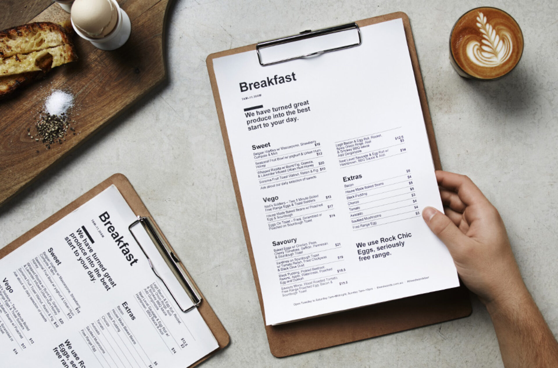
It provides beautifully roasted coffee, craft beer, great hearty meals that are home made in stone ovens with a sumptuous offering of mainly meats and wholesome veggies prepared with a twist, and a series of large serve share plates. At the time of Headjam being engaged, The Edwards was made up of three distinct spaces which included a bar area, a table service restaurant and an old car park area, with this space being used for exciting events such as dodge ball team challenges, art exhibitions and design talks.
The Edwards initially engaged Headjam to collaborate in 2014 to design and develop their website, which was a huge success.
In 2016, Chris and Chris planned to launch 2 new bar areas within the space, re-open the laundrette, complete the refurbishments of the coin op laundry, add a record shop and invite ‘Butler’s Customs’ to open their motorbike shop, all within The Edwards complex.
Due to this radical change moving from a bar/restaurant to an environment that is similar to that of an old market or meeting place that could house hundreds of small artisan shops in the future, The Edwards looked to collaborate with Headjam to evolve their Brand identity and communication materials to better reflect each area of their business, and not just the initial offering.
Objective
To visually represent that The Edwards is a multi-disciplined venue, who are constantly growing and evolving for the local community.
Target Audience
The Edwards is created for the people of Newcastle. Its demographics are vast and reach most of the local community. There are many different events that appeal to different people throughout the year. They share the mindset of coming together, of sharing either experiences with other humans through conversation, food, coffee, drinks and generally fun times.
Consumer Proposition
The expression of imagination, was developed as the proposition for The Edwards. Everything that The Edwards do, is driven by this statement. It is also the definition of art and the definition of creation of all art practices.
Desired Consumer Response
The Edwards is a great spot to eat, drink, socialise, work, catch up and hang with friends no matter what day of week or time of day.
Creative Solution
To effectively address the challenge of creating the new Brand identity, we broke our thought and development process into three parts: essence, structure and Brand aesthetics.
We wanted to convey within the essence of the project that The Edwards is more than just a bar….it’s a concept; a concept of providing spaces or experiences for people to come together. At its core, it’s an expression of Chris & Chris and all of their adventures. Their wild and wonderful ideas are what makes up the essence - the outlet is The Edwards; the expression of their imagination.
From this essence, came our communication challenge; to create a Brand identity to reflect such a varied, wild and exciting concept. So next, we focussed on the structure, how would this work?
There was no point in us evolving the Brand identity to reflect what The Edwards were doing today, as it would not be relevant in 5 years’ time when their offering had changed. We had to ensure that the structure was future proofed, to allow for any ventures that Chris and Chris chose to execute in the coming years.
At the core of the business is The Edwards, and revolving around this is all of their ventures, old and new. We defined the difference between ‘the core’ and ‘the ventures’ as ‘the Brand’ and ‘the products’. This allowed for the Brand to always remain consistent, whilst also allowing for new products to be introduced or removed at any time under the Brand umbrella.
Bringing everything together in this way made it easy to communicate a strong and unified message, whilst having the ultimate flexibility to grow the business without consistently having to invest in creating a new name and Brand identity for each new venture. It’s also practical to apply across a variety of applications including web and collateral.
Once we had considered the Brand essence and defined the structure of the business, our final challenge was to develop the new Brand identity to reflect all of this.
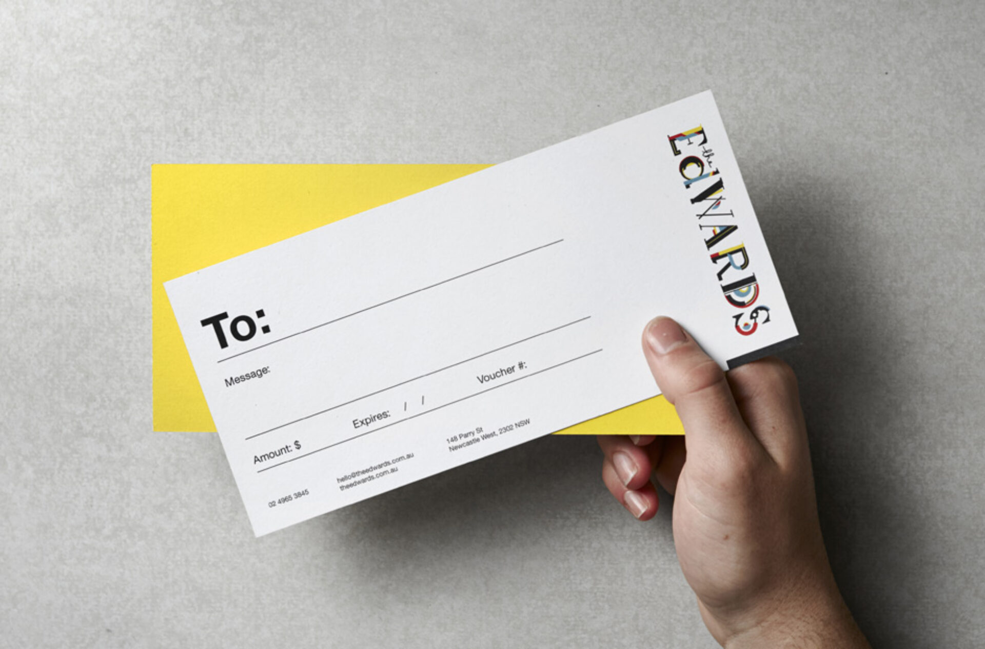
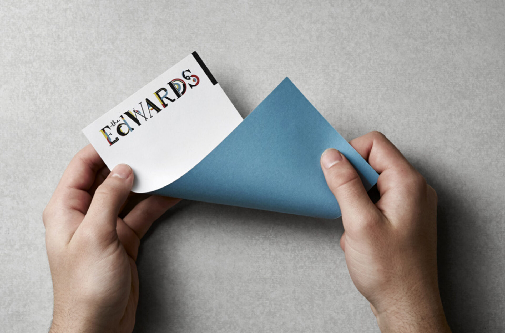
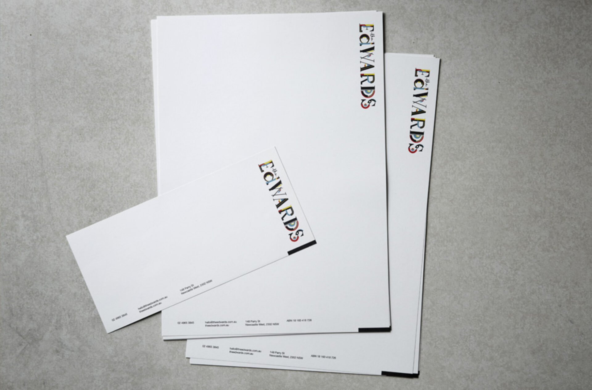
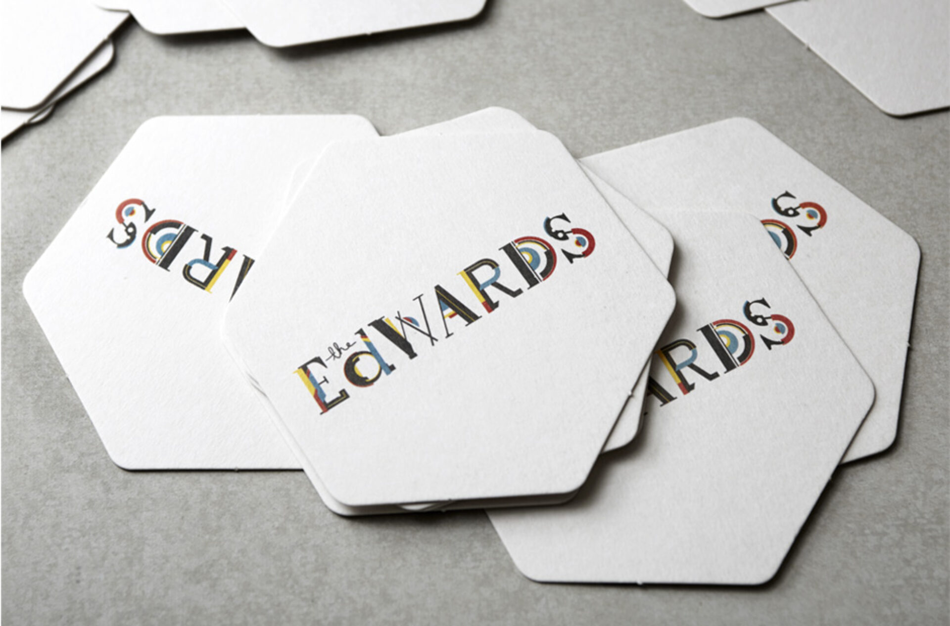
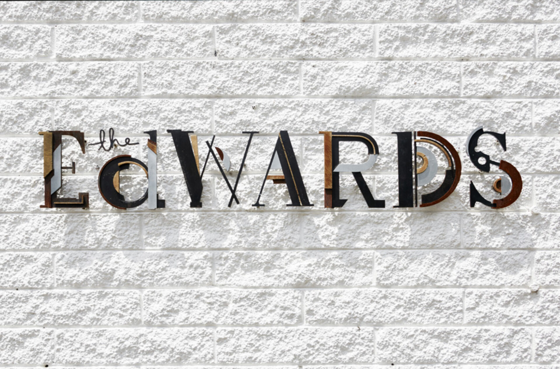
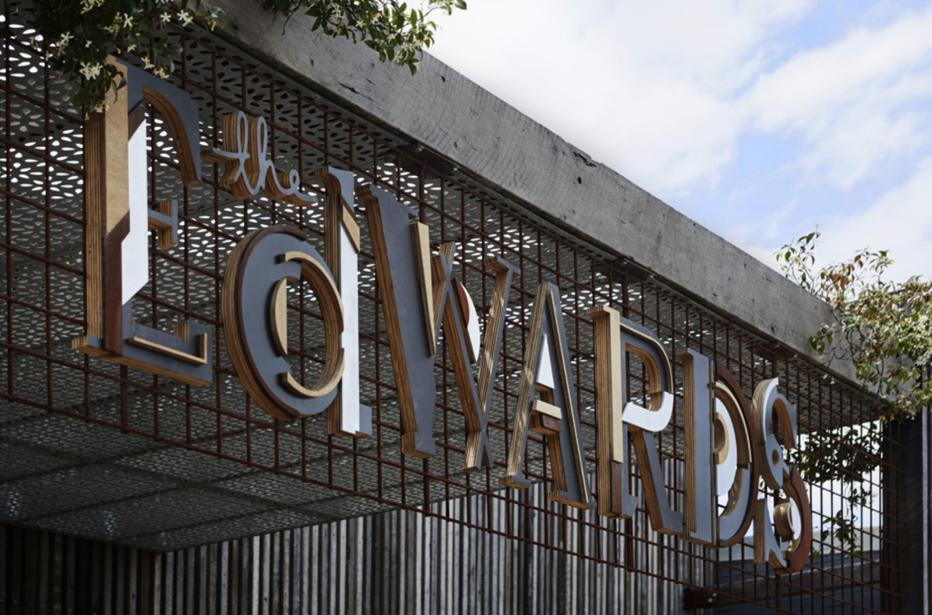
We began by working with the font. We took the existing logo for The Edwards and evolved it by applying new elements of design over the top of the letter forms. This was a visual representation that The Edwards had evolved. Each letter maintained an element of the original logo, and is filled with colours of the imagination.
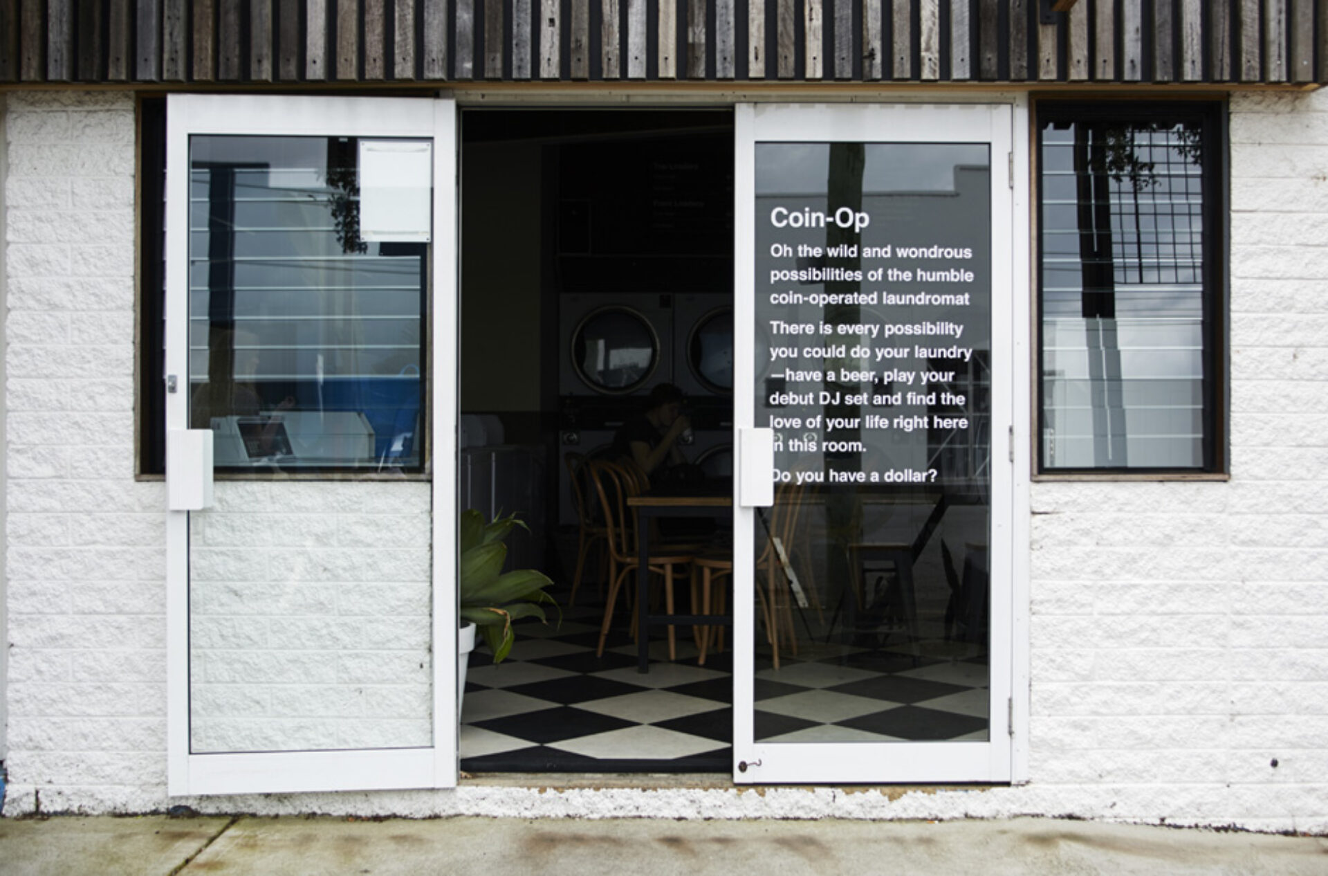
Once the Brand identity was locked and loaded, we began to look at individual elements that were required within the signage and collateral. How could we explain what each of these spaces are and why they are there? After all, having a laundrette next to a Bar, with a record store in sight, is slightly unusual to say the least!
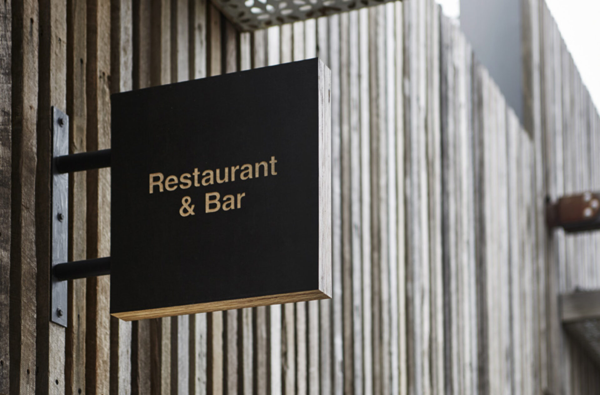
The signage required was threefold. We created The Edwards Brand signs, which were constructed from natural woods of varying colours to replicate the colours we had chosen within the logo. Over time, all of these materials will age and evolve much like the business itself.
Individual ventures were marked by unified timber signs, that clearly marked what they were. For example the shop’s name is ‘shop’ the bar’s name is ‘bar’. Sounds simple, and that’s because it is!
Thirdly, for each space we wanted to tell the story of why it was there and what its purpose was. To explain this, we created a story using the written word and placed these on each of the shop front windows that people could read and experience.
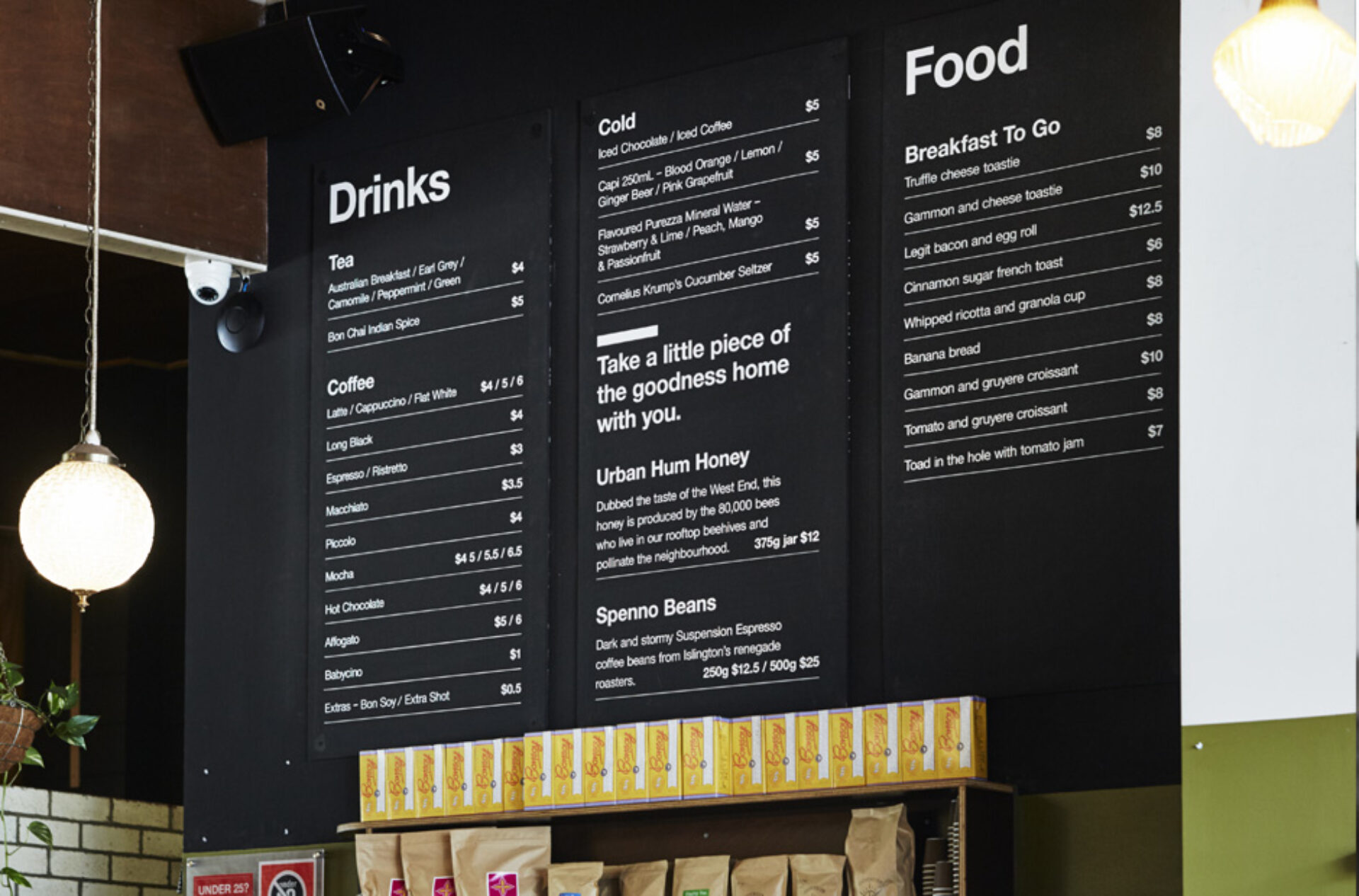
Finally, we developed the suite of collateral you would normally expect, including business cards, letterhead, beer mats and rubber stamps.
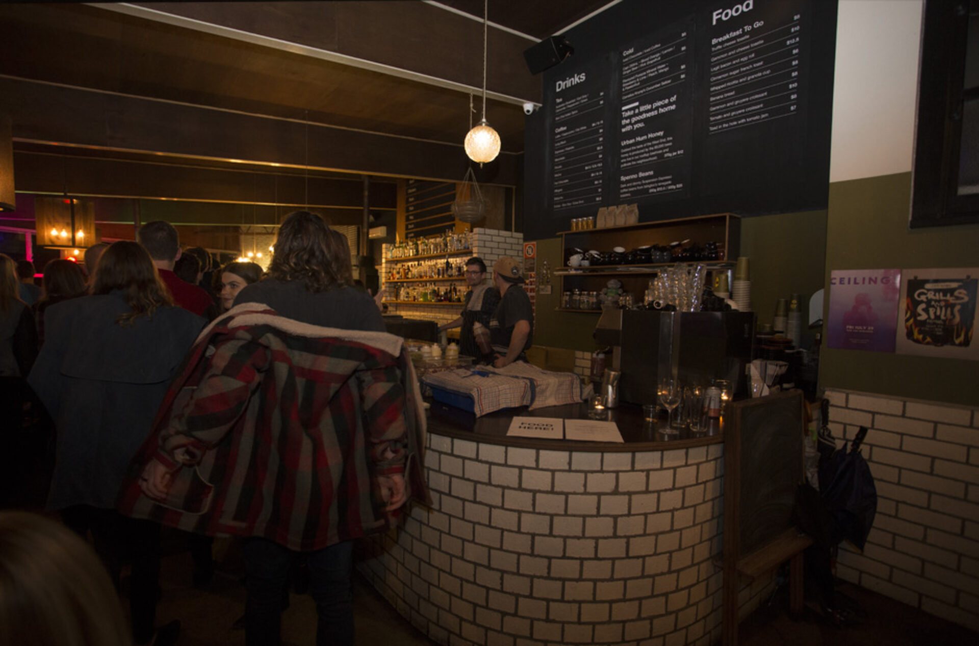
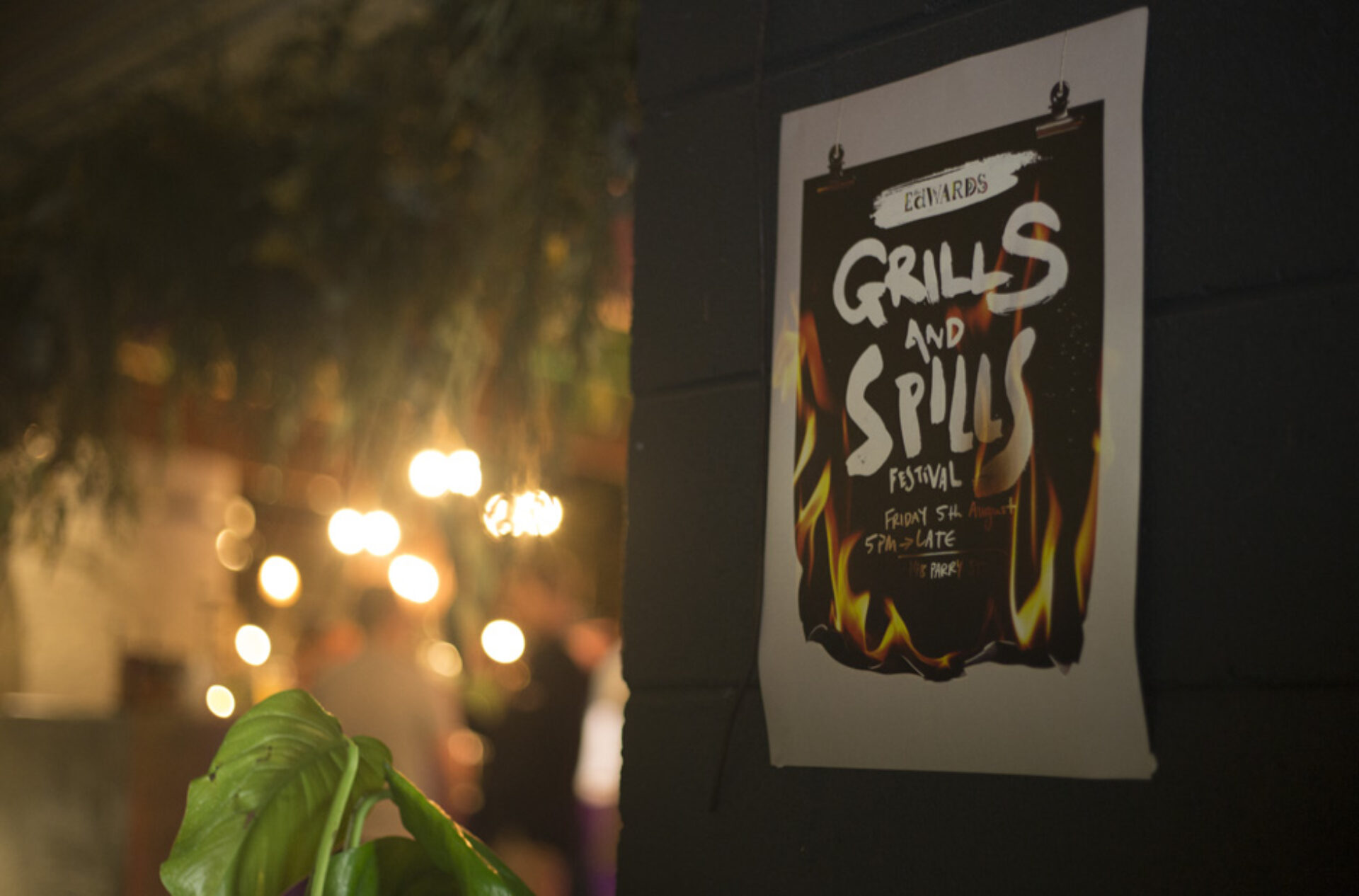
To launch the new Branding, along with the amazingly cool new ventures on which The Edwards’ team had been working so tirelessly, we created the event ‘Grills & Spills’. The night involved live music, silent discos, mulled wine, whiskey tasting, art installations, smokey cuisine, fire, vinyl, fresh laundry, local honey, motorbikes and a golden lucky dip, plus an incredible live performance from Grinspoon frontman Phil Jamieson.
Evaluation
The launch event was a huge success. Throughout the night, punters were queuing down the street and around the corner to gain entry. It was so much of a success that Chris and Chris are considering doing it all again…. so keep your eyes and ears peeled if you don’t want to miss out on an insanely good night out!
Since collaborating with The Edwards the business has grown year on year. The revenue produced has been placed straight back into the community to provide more and more events and spaces for people to explore and engage with. The venue continues to grow month on month is a sustainable way.
The website for The Edwards is now boasting 300 unique website visits a day, within its first 12 months it had 50,000+ unique visits, over 500 unique enquiries for venue hire and over 600 table bookings through the site. We all feel very privileged at Headjam to have contributed to this venue’s growth and look forward to collaborating long into the future.
Client
The Edwards
Project
Brand, Collateral, Signage & Launch Event
Processes used in this project
Advertising campaigns, Branding, Brand identity, Brand management, Brand positioning, Brand strategy, Logo design, Graphic design, Environmental graphic design, Illustrations, Signage, Typography design, Marketing, Digital marketing, Marketing campaigns, Marketing plan, Marketing strategy, Media buying, Social media marketing, Print media, Brochure design, Print advertising, Print design, Print management, Print production, Project management, User experience design, User interface design, Website design, Website development