Peaberrys
Case study
Peaberry’s is one of Newcastle’s oldest and finest coffee roasters, and in late 2013 they chose Headjam as the creative agency to rebrand and reposition them in an increasingly competitive marketplace. Read Hide the full case studyBackground
Peaberry’s is owned and operated by Adrian Rigon whose family have been importing and providing quality teas and coffee to Australian consumers since the early 90’s. He was one of the first artisan roasters in the region, and over time has built rigorous processes and a great team that ensures a high quality product arrives on time every time.
In late 2013 Adrian invited Headjam to be the creative agency to rebrand Peaberry’s from the “ground up” (pardon the pun)!
Objective
Peaberry’s were already a very popular local coffee roaster, and since their product was being used in many local cafes, boasted a high level of brand recognition.
But the rise in demand for small scale, boutique roasting meant cafes began to see the successful distribution of Peaberry’s coffee beans as a negative. Cafes were seeking new and unique coffee roasters to compete in the vibrant coffee culture taking shape in Newcastle.
The objective of the rebrand was to realign and educate the local marketplace about Peaberry’s point of difference, and to enhance their national presence.
Target Audience
Cafe owners, coffee lovers and roasting-process crazy individuals were the target audience – people who align with the Peaberry’s story of a caring, hand crafted process behind a unique product.
Consumer Proposition
The consumer value proposition for Peaberry’s was developed to capture their story in a simple sentence; one that ensured everyone could understand why they exist. Here, ‘hand crafted’ was used to align everything we produced to Peaberry’s method.
Desired Consumer Response
Shifting consumer perceptions of Peaberry’s brand involved a huge change for the business. We wanted to capture the imagination of the smaller, boutique cafes of Newcastle and aimed for surprise, intrigue and to promote a ‘consider Peaberry’s part of your family’ attitude.
Creative Solution
Headjam set out to revitalise their branding starting with their brand positioning via a careful strategy that would guide their final identity.
Everything we developed had to reflect their dedication to small scale, high quality roasting for a primarily wholesale market and delivery to some of the finest cafes on both local and national scales.
You have probably noticed that cafes advertise their suppliers behind or in front of coffee making machines. It’s a collaboration, where the cafe is proud to promote the roaster and the roaster must keep doing what they do best.
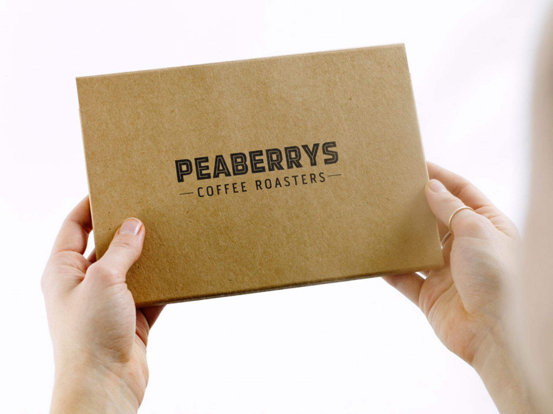
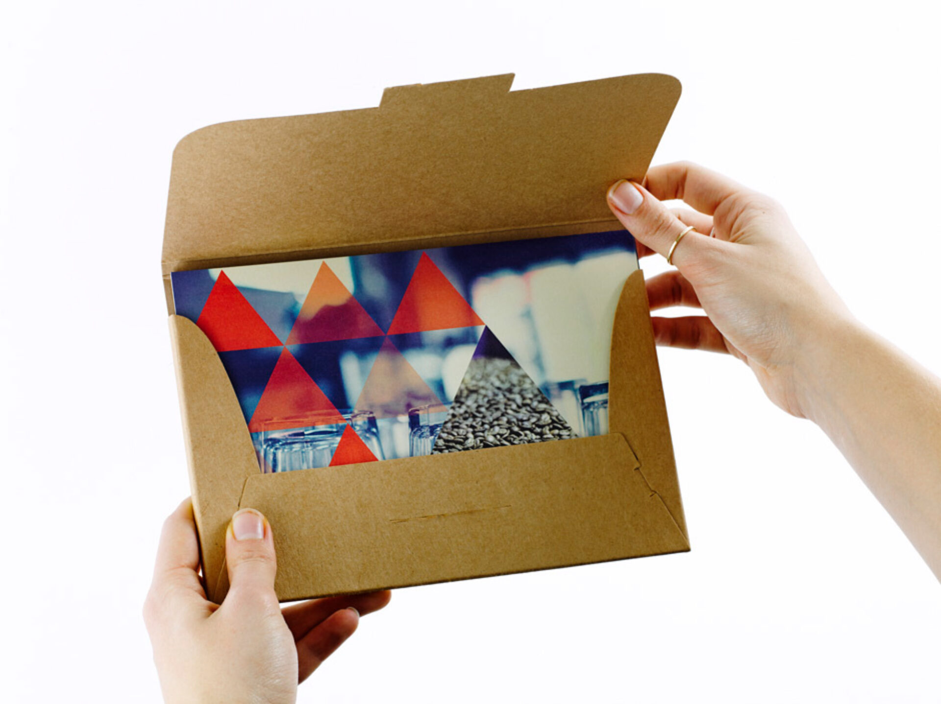
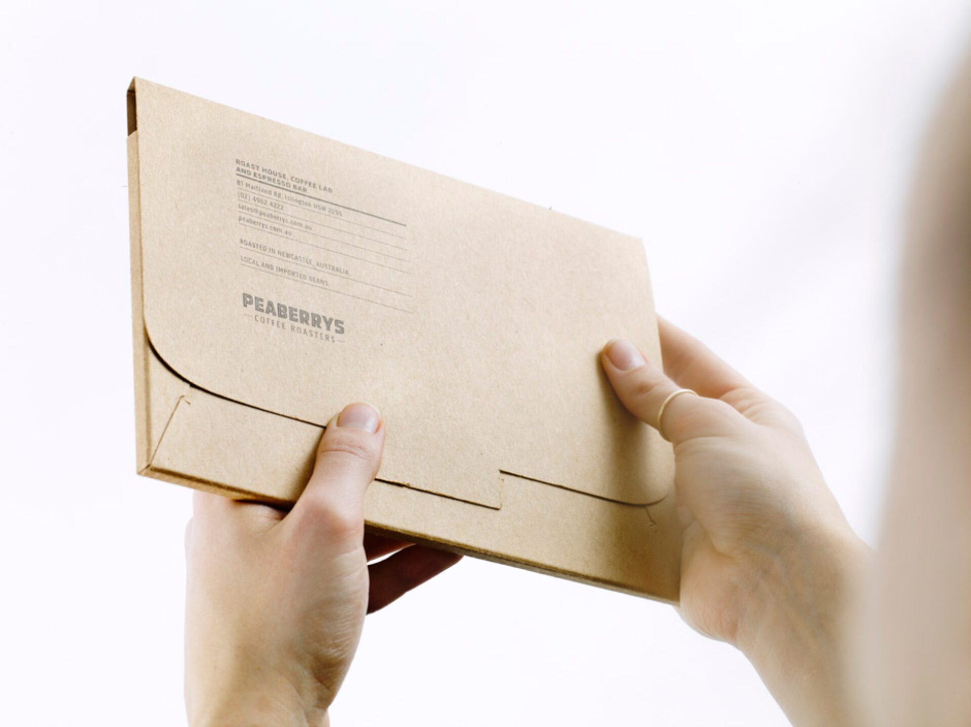
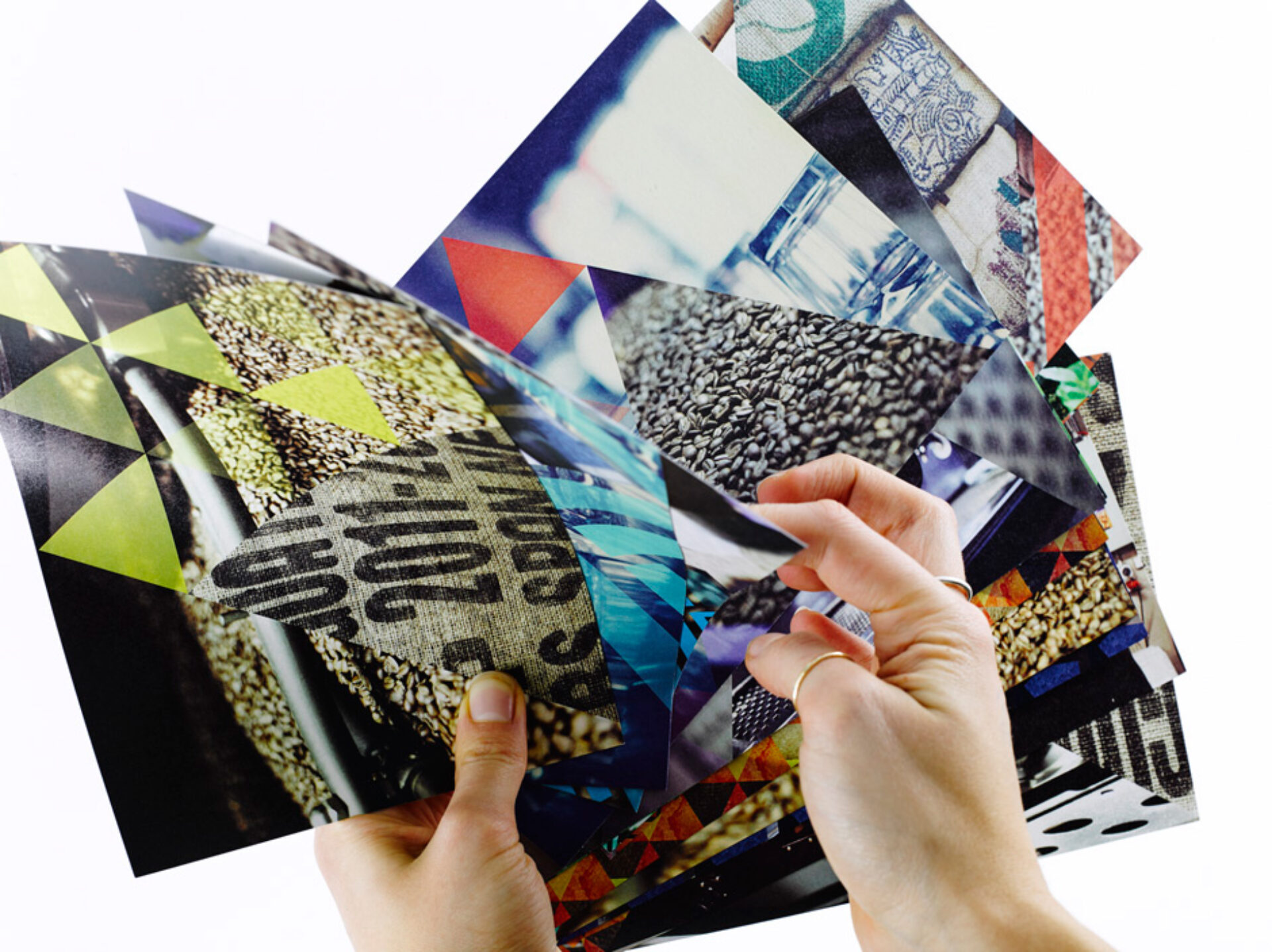
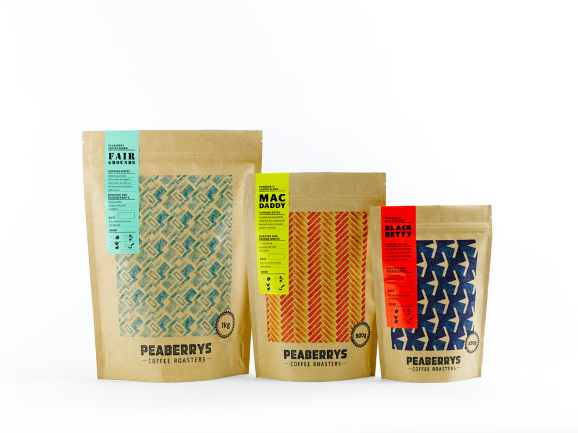
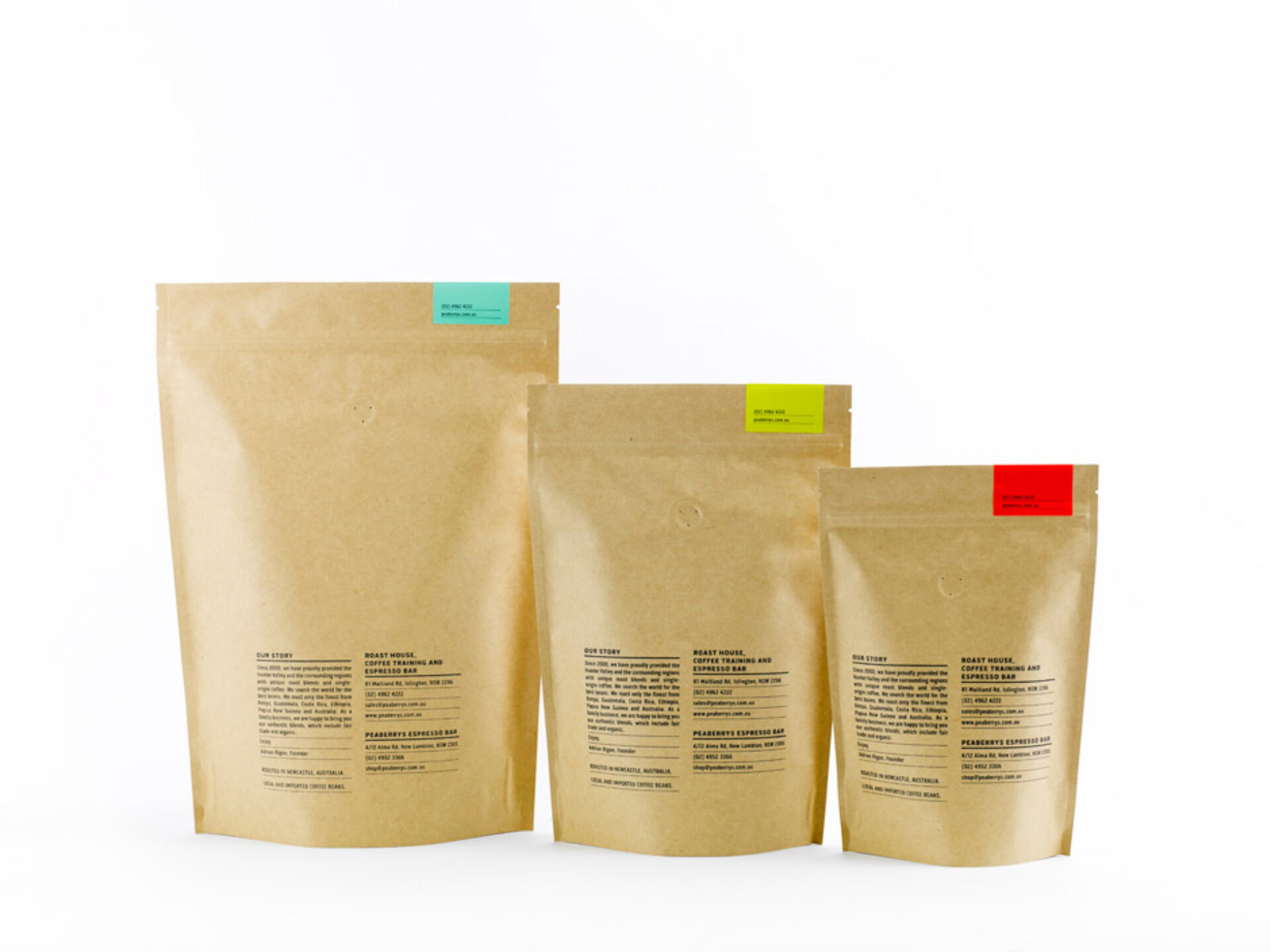
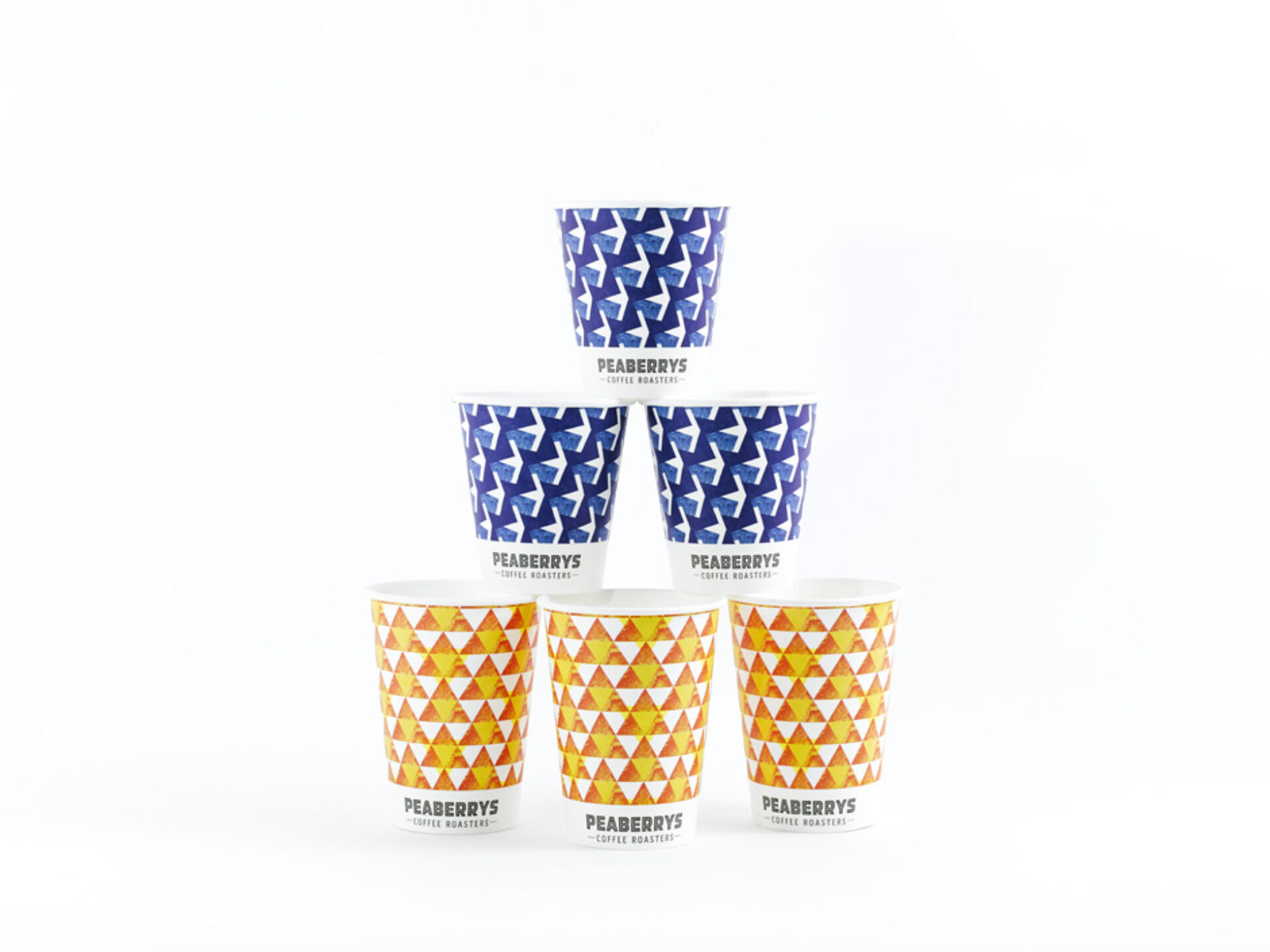
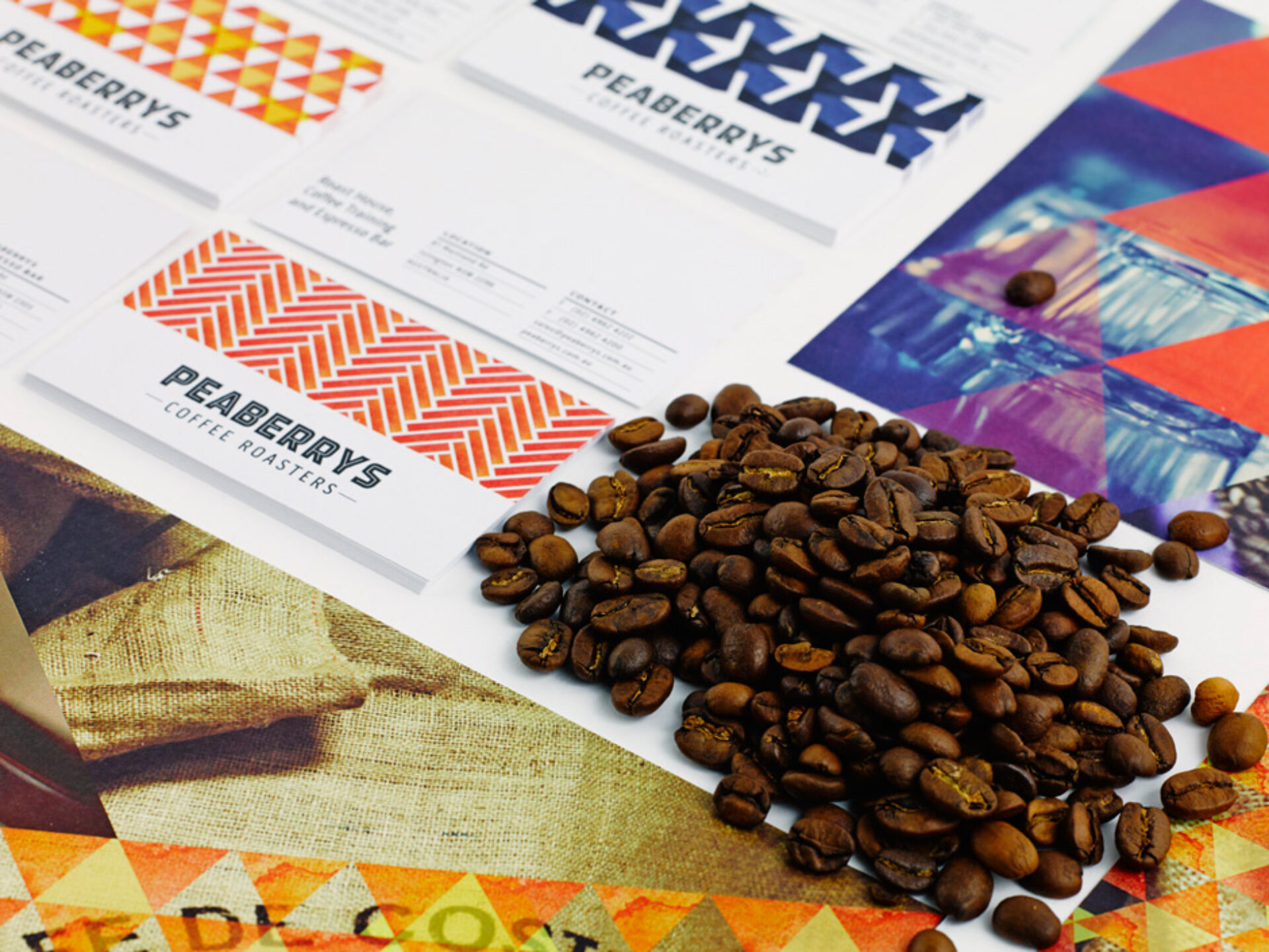
So the first challenge was to create the brand identity, logotype and packaging. Peaberry’s was tired, so we set about providing coffee houses with a range of beautifully hand crafted patterns for their coffee bags that could be applied to Peaberry’s different blends. Each blend has it’s own pattern and colour pallet, printed on beautiful natural brown stock to emphasise the artisanal process.
You have probably noticed that cafes advertise their suppliers behind or in front of coffee making machines. It’s a collaboration, where the cafe is proud to promote the roaster and the roaster must keep doing what they do best.
When these packets are placed on the shelves or in front of the coffee machine today, Headjam’s elegant design solution encourages people to take a second look, adding to the aesthetics of the café.
To top everything off a 100 page style guide was created that presents all supplier details for simple re ordering of printed collateral when needed. This document permits the same materials to be used in design and print processes, creating long-term brand consistency for Peaberry’s.
Evaluation
Peaberry’s brand positioning, look and feel was literally transformed.
Long time customers made positive comment on the transformation of the Peaberry’s persona, lapsed customers were inspired to return, and Headjam and Peaberry’s were nominated and became a finalist in the Australian Graphic Design Associations (AGDA) award for the unique packaging design in 2014.
This is a major achievement for a regional agency, and recognition alongside some of Australia’s best design and advertising companies.
And the Coffee? Well taste for yourself. If you’re in Newcastle be sure to check out their blends, head down to Headjam’s client, Snows., and try some delicious cake with Peaberry’s scrumptious beans.
Client
Peaberrys
Project
Brand + Packaging
Processes used in this project
Branding, Brand identity, Brand management, Brand positioning, Brand strategy, Logo design, Graphic design, Digital signage, Print media, Book design, Booklet design, Brochure design, Corporate printing, Print advertising, Print design, Print management, Print production, Project management